")
You’re a blogger, which means you understand the importance of interaction. You recognize that the success of your blog, to a large extent, depends upon how effectively you communicate with your audience – and how easily they are able to communicate with you.
But what if I were to tell you that you are inadvertently putting up barriers to simple interaction? What if I were to say that one simple omission can leave your visitors frustrated and disinterested?
That is not the end result you are looking for – and today, I want to reveal what you can do to fix the problem.
The Blogger’s Dream
People who are new to the blogging scene dream of automation and passive income. But the reality is entirely different – whilst blogging can be enormously beneficial both on a personal and business level, it is certainly not passive and shouldn’t be automated.
It often takes a considerable amount of time for those false dreams to fade, and even when people accept that blogging requires hard work like anything else, they can find it hard to let go of old habits.
But I digress. The point is this – we are often looking for the easy solution. But the easy solution almost always comes at a cost. And that brings me to the topic of this post today.
Seeking Efficiency, Losing Subscribers
When it comes to people contacting us, we want it to be organized and efficient. The problem is that organized and efficient in our eyes can come across as cold and artificial in the user’s eyes. And ultimately, how they feel about the experience is far more important.
Many a blog’s contact page looks something like this:

As a reader, I couldn’t imagine anything less inviting. Let’s say I’ve been reading through the blog and I like what I see. I want to reach out to the blogger, so I click on the rather uninvitingly-titled “Contact Form” page. Lo and behold, I am presented with precisely what I was promised – a contact form.
And that in itself is the problem – many people do not like using contact forms. From a usability point of view, you are taking control away (a big no no). There are multiple reasons why people will want to use their own email client (they’re used to it, it means their message will be saved to their sent items folder, they may be using a mobile device which makes the contact form difficult to fill in, and so on).
It’s this simple – if you only put a form on your site, you are driving potential evangelists away (I spoke about evangelists in last week’s post on building an email list). The people who hit your contact page are often the ones most likely to generate income, either directly or indirectly. They are the ones reaching out to you – the ones who are engaged enough to spend time contacting you. So you should facilitate that process in as inviting a way as possible.
Your Contact Page
So the one thing that you must include on your blog page right now is a contact page. I’m guessing you already have one. But it is the implementation that makes all the difference. Take a look at this:

Alexis Grant’s contact page is warm and inviting. She doesn’t put up barriers – on the contrary, she makes it clear that she actually wants to interact with her readers. And most importantly, she gives them multiple ways in which to do so.
Creating a good contact page is not complicated in the slightest. Just tear the barriers down, reach out to your readers with a personal message, and allow them to contact you in as many ways as you feel comfortable. Choice will not be overwhelming in this instance – people will simply go to the option that they favor the most.
Adding your email address to your contact page is a must. If you are concerned about security issues, check out these plugins:
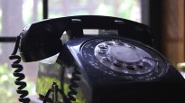
From there, the sky is the limit. Add as many methods of contact as you feel comfortable with. The more the better. For instance, a telephone number serves to heighten the perception amongst your readers that you are in fact a “real” person. If you’re not comfortable handing out your personal number, just pick up a spare SIM card. Don’t be afraid to think creatively.
Over to You
What’s on your contact page right now? Are you happy that it represents a free-flowing passage of communication between you and your readers, or do you think it’s about time that it got an overhaul? Let us know in the comments section!
Creative Commons image courtesy of Delwin Steven Campbell
Leave a Reply