
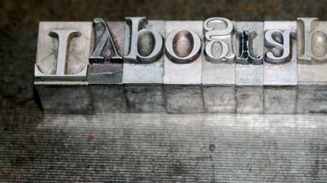
Building a WordPress site can be really fun.
After all, it’s your chance to start from scratch. From selecting a theme to developing content, a lot of care and consideration goes into launching a new blog, so it makes sense you’d pay equal measure to the font selection process.
With the above in mind, let’s spend some time going over the rules of the web when it comes to selecting fonts — even if you’re a web design beginner — and how to implement them once you’ve made your picks.
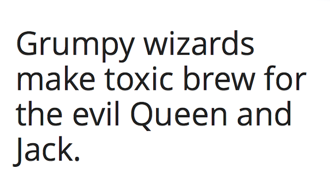
What Fonts Are Best for the Web?
Back in the day, you were limited to just a handful of fonts when designing for the web. For the sake of usability across numerous browsers and the often clunky transitions between them, you were stuck using good old standbys like Times New Roman, Arial, and Helvetica.
While there’s still nothing wrong with using these fonts, you do have a little bit more leeway nowadays thanks to CSS and Google Fonts.
To get started selecting the right font for your blog, you need to know a few things. According to Smashing Magazine, there are 5 basic groups of typefaces you need to know about. They include:
- Geometric Sans: These fonts are minimalistic and modern. They are geometric and feature strokes with the same width. Popular examples include Helvetica, Futura, and Gotham.
- Humanist Sans: These faces retain something of handwriting in their makeup, even if they’re very clean and structured. Stroke weights vary and offer a more personal touch. Examples include Myriad and Verdana.
- Old Style: Based on calligraphic style writing, these are the oldest of all the typefaces, have little to no variation between thick and thin lines, and have consistent kerning–the spacing between letters. The best example is Garamond.
- Transitional and Modern: To wax historical for a moment, transitional and subsequent modern fonts were born out of a desire to move away from the Old Style look. These fonts are best described as geometric and sharp and are characterized by bold contrasts between thick and thin strokes. Examples include Times New Roman and Baskerville.
- Slab Serif: These fonts are a bit of an anomaly and feature even strokes with very bulky serifs — the feet at the bottom of letters. Examples include Courier and Archer.
For further reading on typography, check out more in depth typeface classifications at Typedia.
Rules of Font Usage
Many WordPress themes come with fonts pre-installed. Many people choose to just keep them and ignore this element of customization altogether.
That’s perfectly fine if you like them well enough, but what if the preset fonts don’t suit the subject matter of your blog? If you’re building a very corporate, all-business blog, a loopy, script font is probably not going to cut it. The same can be said of a more informal blog — a very rigid, in your face typeface like Baskerville is going to be off-putting.
I hate to fall into “How does this font make you feel?” territory, but design decisions are often more creative than technical. How a font makes you feel is actually a very big part of whether or not you should use it.
But you likely need more direction than that, so here are a few do’s and don’ts for picking fonts:
- Do keep like with like. That is, if you’re debating on using more than one font in your design and they’re both similar, stick to just one font. Don’t pick two fonts from the same categories described in the previous list.
- Do be bold in your choices. If you decide to use more than one font, make sure they’re substantially different from one another, like Baskerville and Helvetica or Gotham and Archer.
- Don’t pick contrasts for contrast’s sake. What I mean is don’t pick really different fonts at random just because they’re really different from each other. Make bold contrasts between fonts that share a visual aspect. Both fonts having the same stroke weight, is one example.
- Don’t go overboard. It’s easy to get excited when you find a font you love, but take a step back and make sure it’s even practical for the application in which it’ll be used. Cooper Black might look great for headline text but it’s garish and much too blocky for standard paragraphs.
Of course, these are just guidelines, and as the saying goes, rules are meant to be broken. Just make sure you understand the rules before you set your heart on ignoring them!
Integrating Fonts Into WordPress
Remember before how I said the Internet used to be really limited in terms of which fonts would appear in what browser resulting in more often than not clunky designs that defaulted to Times New Roman? Yeah, we were a primitive lot back then.
But thanks to webfonts (and some substantial getting it together on the browser front), the Internet is now a typography nerd’s field day. And wouldn’t you know it, you can pull fonts straight from Google Fonts into your theme?
To do that, head over to Google Fonts and have some fun looking around. You have plenty to choose from but try to keep the guidelines discussed above in mind as you browse. Click Add to Collection next to each font you want to use. Then click Review to go over your selections and decide which ones will make the final cut. Finally, click Use. Make any final options selections and scroll down to the bottom where it says Add this code to your website.
You’re going to copy this code under the Standard tab then paste it into your main theme file. So, first thing’s first: back up your website. Don’t worry. I’ll wait. 🙂
Once you’re done with that, go to Appearance > Themes > Editor > Header.php from your WordPress dashboard (a better alternative is to use your FTP client to edit this file).
Paste the code at the top of the file, as early as possible. WPBeginner has a great tutorial on how this should be done.
Once you’re finished, save the page (or re-upload it via FTP). Then all you need to do is implement the font(s) you’ve selected in CSS.
While still in the Editor, open the main stylesheet (usually called style.css or something similar) and look for the part of the code that looks similar to the following:
body {
     color: #777777;
     font-size: 14px;
     font-family: Helvetica, Arial, sans-serif;
     line-height: 1.6;
}
See where it lists a couple of different fonts? That’s where you’d plug in your new font selections. Let’s say you’ve selected Open Sans from Google Fonts and that’s what you’ve linked to in your Header.php file. You would edit your CSS file to look like this:
body {
     color: #777777;
     font-size: 14px;
     font-family:'Open Sans', Helvetica, Arial, sans-serif;
     line-height: 1.6;
}
Go through your CSS file and look for all the spots where you’d like your new font to appear. Then, just call it out by name as in the example above. Keep whatever standard fonts were listed just in case something goes awry so your visitors will have an experience that’s at least approximate to what you intended.
You can select different fonts for headers and body text. Just make sure to link them properly in your header.php before you utilize them in CSS.
Conclusion
That’s really all there is to it. Webfonts have made typography on the Internet a thing to be proud of. And the best thing about it is you don’t need to be a design expert to do it right.
What is your favorite font and/or font combination? Do you use Google fonts? Share your thoughts on web typography with us in the comments section below!
Photo Credits: Relly Annett-Baker, Josh Self
Leave a Reply