
“As long as I have a web presence, I’m good to go.”
So say a lot of business owners out there who think that having any old website is better than not having one at all. And you know, that’s true to some degree. Even a poorly designed site will give potential customers a way to reach you, which is something I suppose. But more often than not, bad design – bad home page design, in particular – can cause people to click the “back” button in a nanosecond.
Whether you like to think so or not, design plays an essential role in how your site is perceived. And that split second perception can determine a whole lot of things. Like whether or not a prospect stays on your site or clicks back. Or a visitor clicks on links in your navigation menu.
To get your site’s home page on the right track, here are 4 things you should consider including.
An Eye-Catching Header
The very first thing visitors to your site will see is the header.
That’s the area at the very top of the page where you’ve placed the name of your site, and often, a tagline. Depending on the theme you’ve selected, the header will display differently.
In many themes, all you have to do is change the title and tagline text to what you want and it’ll appear in the appropriate spot. Take the free Twenty-Thirteen theme, for instance:

This theme is very simple but provides you with a prominent space to display your site’s title and tagline. Its built-in graphic is attractive and really calls attention to your title.
Another free theme with a prominent header is the Hemingway Rewritten theme:
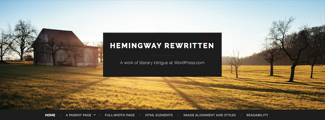
Not only does this theme display your title literally front and center, it’s on a parallax slider for an extra dynamic element.
A third and final example of excellent headers is from the Sweet Life theme. This one will cost you a fee but it offers an attractive header that suits the template and will complement your content:
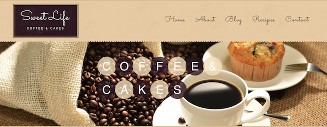
All of these themes have something very important in common: the headers can be completely customized. If you want to fit in your company’s logo or other brand identifying information in the header space in these themes, just got to Appearance > Header and upload your file.
If you’re not sure about how to create a header, not to worry – The Daily Post does offer a quick tutorial for creating custom headers to pop into themes that allow for them. This won’t give you the fanciest header in the world but it will demand attention and that’s precisely what’s necessary to lead visitors onto the next thing your page needs.
Consistent and Easy-to-Spot Navigation
A visitor comes to your site and sees the header first. If you’ve done it right, that visitor will take note of what your site is all about then look for where to go next. That’s where your navigation comes into play. But if a visitor can’t find your navigation (or finds it too difficult to navigate) he’ll bounce from your site in a heartbeat.
Often, the navigation appears directly below the header, as is the case with the Yumblog theme:
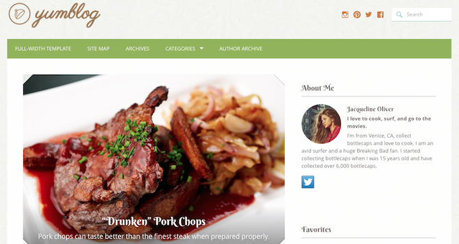
As you can see, the navigation is apparent even on first glance. It’s also apparent what each page the visitor will be led to by clicking will contain. That’s another thing: your menu items need to be self-explanatory, too.
In some cases, navigation appears on the left-hand side of the screen, like with the Twenty-Fourteen theme:
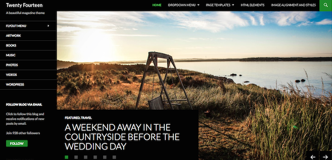
Yes, you have the ability to display menu items across the top, too, but the addition of the left navigation allows you to offer more menu options without overwhelming visitors.
Beyond where the navigation is physically located on your site, you also need to think about what pages you should be featuring there. It doesn’t have to just be “About,” “Blog” and “Contact.” Rather, you can mix it up and include a menu link to one of your more popular blog categories or a particular post. Think about what makes the most sense for your site.
Contact and Social Media
Making it easy for your site’s visitors to get in touch with you is imperative. How else can you expect to receive feedback? How else can you expect to get new customers?
One of the best ways to accomplish this is to publish a dedicated “Contact” page with an embedded contact form. The Jetpack plugin has an included form module that’s super easy to setup and use, so I highly recommend that if you want to get your contact page set up in a matter of minutes.
Another good way to make it easy for people to get in touch with you is to add a text widget to your sidebar with a link to your email address. Even a small email form can be appropriate in this space.
And don’t forget to make yourself easy to reach on social media, too. Make sure to include social media buttons or stickers on your site so people can connect with you across all of their accounts. I mentioned the Twenty-Fourteen theme above because it offers multiple menus. You can easily utilize that top navigation for social media links, as is the case in an example listed in a post on the Hot Off the Press blog:

Or, if you want a more streamlined design that fits your brand, create some custom social media buttons that include design elements and/or colors from the rest of your site. A good example of this can be found on Jess Marks’ wedding photography site:

Yes, they appear at the bottom, which isn’t necessarily preferable, these social buttons are definitely in keeping with the site’s overall design aesthetic. Which is actually a perfect segue into the fourth and final thing you need to make your site’s home page stand out.
A Consistent Design
Let me say this upfront: you don’t have to be a web designer to launch a WordPress site. That’s why there is a thriving premium theme market out there, after all! Even so, you need to be able to evaluate your site both objectively and subjectively. For the former, ask yourself if all of the components of your home page are in a logical place. Does the placement and organization make sense for user flow?
The subjective elements, by their very nature, are a bit harder to pin down. Even so, you need to take the time to think about how the home page makes you feel, and will in turn, make your visitors feel. It might be best to just show you a few examples.
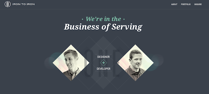
Iron to Iron offers a simple color palette complemented by clean design:
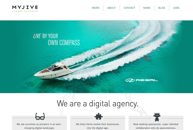
And Myjive offers intuitive and straightforward navigation that sets off the bold slider featured front and center:
More than anything else, home pages with consistent design just feel right.
Conclusion
Hopefully, you now have a pretty solid idea of how to construct a WordPress-based home page that gets your message across and encourages visitors to stick around for a while. By using a visually appealing header, clear navigation, prominent contact info, and a good design aesthetic, you’ll hook visitors in and get your best shot at turning them into customers.
What do you think makes a good home page?
Image source: Rocpoc

John Wilson
Some really good points here, often overlooked, in the effort to make a site look “pretty. Good reading!
Melanie Shebel
I have a little work to do on my navigation and as of right now, I have zip for a contact form. Building from the ground-up here. Well, it’s still a baby!