
There is nothing more frustrating than knowing you uploaded a correct image size and seeing it come up blurry on your website, especially when it’s clear on some devices or screens and blurry on others.
Welcome to WordPress responsive development and the wonderful world of retina displays!
This article is going to show you how to avoid having your images come up blurry on some screens even if they look clear and crisp on other screens.
This article won’t delve into intricate technical details though, mainly because many sites on the web have done justice to this topic already. For example, I highly recommend checking out Smashing Magazine’s very extensive explanation of the ‘why’ behind images being blurry on responsive screens (in short, there is no perfect solution available for it today, but we have some workarounds). Smashing Magazine also wrote extensively about various responsive image solutions to choose from. Also check out this article on boagworld titled, “Why your site graphics look crap on the iPhone.”
Before I start, I have to give my accolades to one person who helped tremendously in forming this resource. I couldn’t have completed this article without the voluntary, forth giving expertise, input, and collaborative brainstorming of a developer friend of mine, Stacey Cordoni, who makes responsive sites professionally as her full time freelance job for agencies out of Vancouver. I will be quoting her in this article.
Get Your WordPress Media Settings Right
You’ve got two options here — pick whichever one suits you.
Option 1
Stop using image size settings in WordPress to force yourself (or your client) to upload correctly sized images. Calculate the sizes you want your content area images to scale at individually and manually. This means you should not be trying to use an image that is “medium” size or “large size” in WordPress anymore. To disable this:
- Go to Settings > Media
- Where you see the image size settings, turn all the values to zeros.
- Click to “Save Changes.”
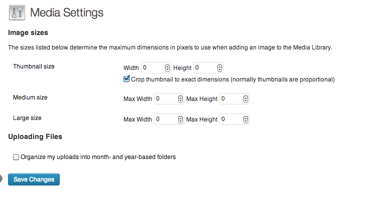
This will stop your WordPress installation from creating multiple versions of the same photo.
If your theme has image sizes it uses, you will need to ignore these or delete them (if you know how; look for “add_image_size()” in your functions.php). Later in this article I will show examples of how themes like the Genesis Framework (which I use) can have their own image sizes and we’ll learn how to not use them.
Option 2
This is going to sound like contradictory advice to what I just said in “Option 1” but you can use the “Thumbnail,” “Medium” and “Large” image sizes in WordPress if you want, except they need to be set to match your site’s breakpoints. If that is a sentence that made no sense to you and you’re not a developer (and not trying to be one), I’d say go for “Option 1” above (or use some plugins we mention later on).
But if you are a developer and want to figure out how to allow your media queries to only load specifically sized photos meant for particular screen sizes, configuring these settings according to your breakpoints is going be useful later on in this article.
So for example, let’s say that on your iPad landscape screen size your photo scales to 760 pixels. Then when it’s displayed on an iPad portrait screen size the photo scales to 640 pixels. On an iPhone the photo will be a theoretical 380 pixels.
Your Media Settings sizes should be set to 380, 640 and 760 pixels by whatever heights you need accordingly.
If you need more sizes, you can add these in your functions.php file. How? Google is your friend, search for “add_image_size()” to get headed in the right direction.
Why Images and Icons Become Blurry On Responsive Screens
There are two main reasons why your images may be showing up blurry on responsive WordPress sites.
The first reason is basically a user (or developer) error.
The second reason is not your fault; it’s just the way the device was made, using a retina, High Definition (HD) screen display. One day soon all device manufacturers will put these HD displays in their products. We are now in that transition phase. These two reasons usually affect different areas of your site during development. I’ll explain them below.
1) The User Error
When you design for a responsive site, you need to keep in mind that elements on your page are going to shrink and enlarge as your website scales based on your media queries. They won’t stay static. Your sidebar for example, might take up 30% of the width of your entire site on a desktop computer (i.e. while viewing at a ‘regular’ screen size). When it’s displayed on the iPad or iPhone, the sidebar will likely fall beneath your content area and stretch to full width. Now it is going to be 100% of the width of your site.
It is supposed to do this, don’t panic. This is responsive design, and this is why the way we design websites nowadays has to consider the expandability and shrinkability of all its elements. (I made that word up. I like it, “shrinkability.” Don’t you?)
Ok so this is fine and dandy when your widget background, for example, is just a plain HTML hex code color (especially with the advent of ‘flat’ design taking hold as a trend this year). But what if you want to showcase an image or photo on your sidebar? Photos have finite widths and heights, so this makes things a bit more tricky.
Here is an example:
The sidebar design on our ‘regular’ full size, desktop view is just over 300 pixels wide:

Now the sidebar on the iPad and iPhone stacks to the bottom of the page and becomes full width:

By mathematical logic, if our image background were 300 pixels wide on full size screens, then on the iPad it would become at least double that size. So how can it display clearly on mobile devices without becoming blurry, since a 300 pixel photo will not take up 600 pixels of space? Exactly, it can’t.
How Do We Fix It?
There are two ways. One of them is kind of a cheater way, but lots of us do it because it’s easier. The other way is more advanced, more proper and helps your site load time. But it’s not a novice thing to do.
Let’s start with our cheater, easy way:
Basically, what we need to do is find out the largest size that our image will display on various devices, and scale the image sizes we need backwards from those dimensions.
Let’s start with more visual examples. Here are images that, on full width screens, are 380 pixels wide:

But here you can see these images enlarge on responsive screens:
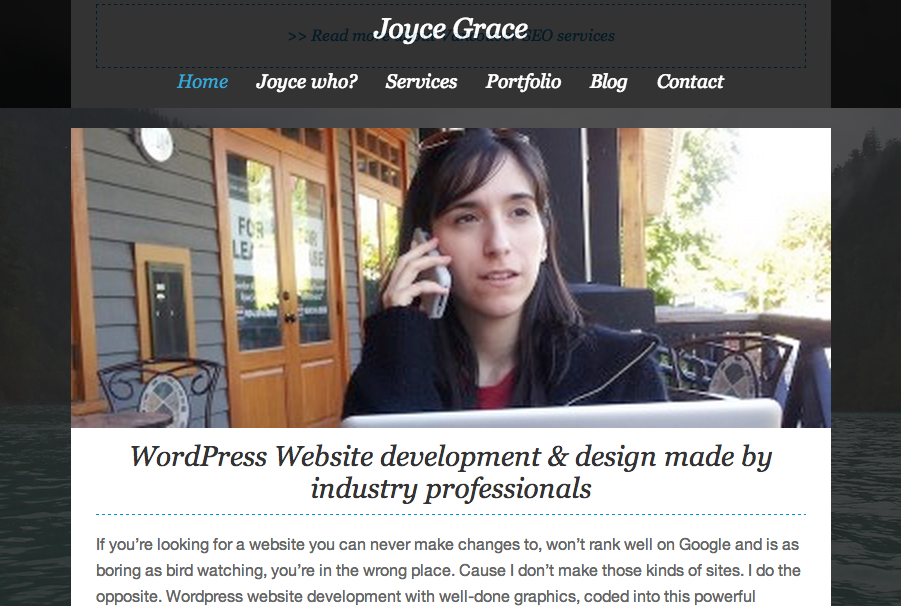
If you look closely, my sample image above is totally blurry and pixelated on responsive screens. That’s because it’s trying to be 760 pixels but it only has 380 pixels to work with.
If I try to upload a huge file that is just really large so that it will always be clear on any size, then I might upload a file that will slow down my site’s load time. We don’t want that. We want a photo that is big enough (while keeping in mind that too many large photo files could slow down the site).
We need to find out what ‘big enough’ is for your site. The way to do this is:
- On your desktop, drag your browser screen smaller until the image sizes change.
- Find the ‘break point’ where your image resizes to its largest version. You can use your eyeballs for this step unless you think it’s a close call between two sizes, then do a more precise measurement (the steps of which are explained below).
- Right click on the image and select “Inspect Element” (this should work in most browsers, but we’ll use Chrome as an example).
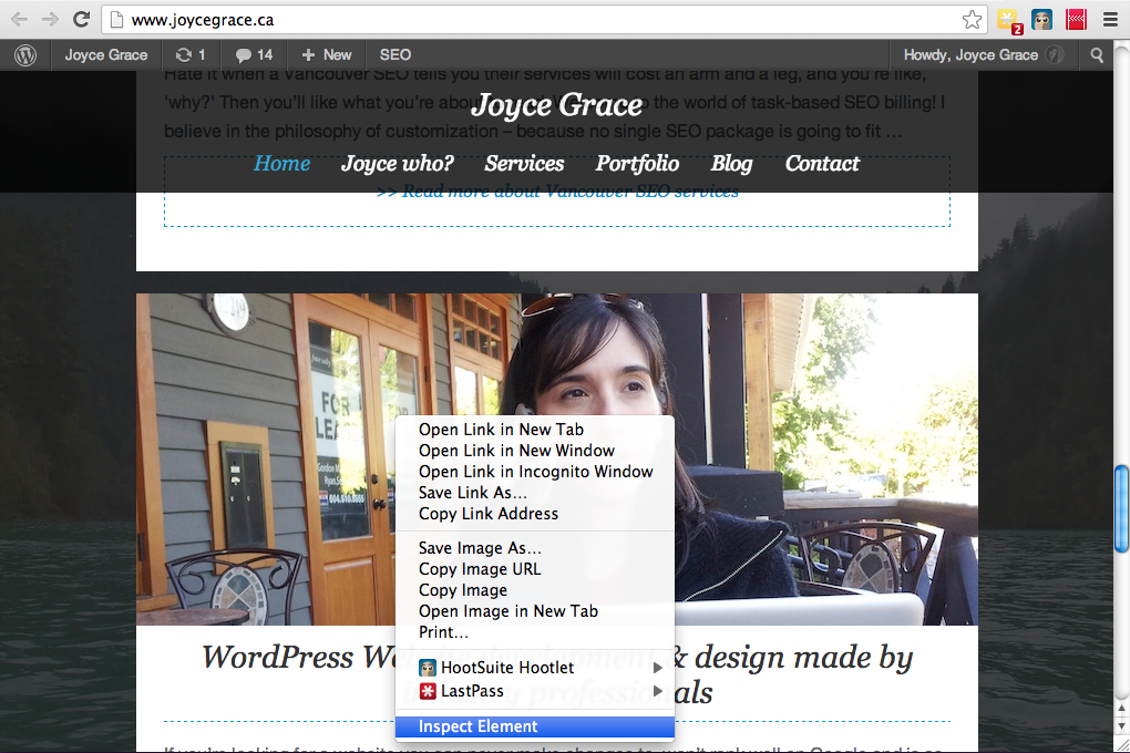
Now you’ll need a bit of skill to know how to find the image size with these browser developer tools, but basically, for Chrome (and it will be similar in Firebug for Firefox and others) you want to click on the search icon, then scroll over your image until it tells you its size.
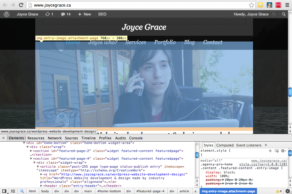
This is how I know what the largest dimensions are going to be for the image I need to upload on this area of my site. In this example, I need to make my image 760 pixels wide by 300 pixels in height, because that’s what the responsive code is trying to expand it to at most. It will naturally scale down to 380 pixels on full size screens if I code it right…which I’ll get to next.
Now comes the tricky part, if you don’t know HTML. But I’ll try to show you.
When you use this image in a page, post or text widget in WordPress, you need to set the width to a percentage that you want it to occupy on the page or <div>. In our example, formerly our image was uploaded as a 380 pixel wide photo. Now that the image is going to be uploaded at 760 pixels wide, if we don’t set its width in the HTML, it will show up as 760 pixels wide on full sized, desktop versions of your site. Obviously that won’t be the effect we’re going for!
Here is an example of how we would write the HTML for the image, or at least how it should look in “Text” editing mode after you’ve used the “Add Media” button in WordPress to insert your image:
See, all you have to do is add the correct width you want it to be in all instances, but use a percentage, not a pixel size. Using “100%” will display the image at the maximum width it can go within the <div> it is contained in. If that last sentence confuses you, just try applying the example above to your image and test different percentages until you get it right 🙂
Note: If you are used to using CSS, you can alternatively add “max-width: 100%” to your theme’s styles.css file where these images are styled. If you have pre-purchased a theme, your theme may already have this built in to its code, which would mean you don’t need to worry about adding the “width=100%” to your HTML “img” tags.
(Also a minor note: The above example URL assumes that you’ve unchecked to have your photos organized into year and month based folders in WordPress Media Settings, in case the file path confuses you. That being said, this could be any URL where the image resides on the web; it doesn’t have to be uploaded to the WordPress site in particular.)
But Wait, These are WordPress’s “Featured Images”!
Ah ha! If you’re using a widget feature from a plugin or theme to display content, and that widget is pulling the “featured image” from a WordPress page or post, how do you control the width of the image without a place to change the HTML? Good question, I’ll tell you.
This is where it comes in handy to have disabled all the image sizes in your WordPress Media Settings and in your WordPress theme.
Using the Genesis Featured Page Widget as an example (available when using Genesis themes), you can see that if I want to display the content of one of my pages in the widget area designated for this spot, using one of the theme image sizes will force my image to be that specific size on all display sizes.
We don’t want this because according to our test above, our image should should be smaller on full width screens and larger on responsive screens. Remember my words “expandability” and “shrinkability” above? I’ll bet they make more sense now 🙂
Using the screenshot below as a reference, if I select that my featured image should show up at 380 pixels by 150 pixels, which is a theme image size, then it will try to be that size even when it’s supposed to be 760 pixels, and will result in blurry photos again.
So I will now select the image size to be a value of “0” which I set up in my Media Settings earlier:
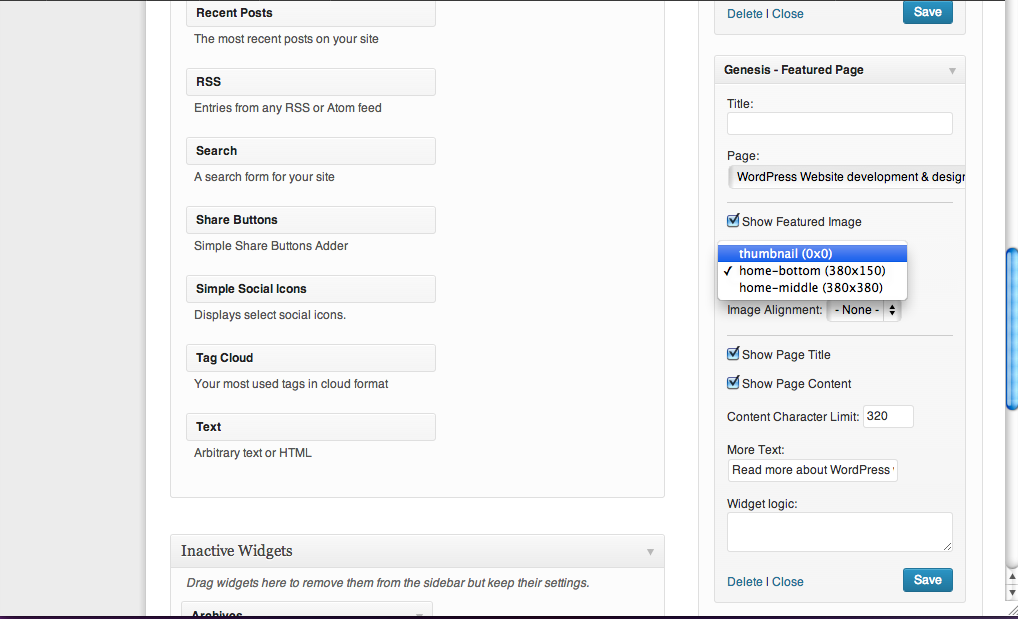
This basically gives it no precise size that it needs to be, and allows the image to appear at 100% width all the time.
If you want to get rid of these theme image size options, you can look in your theme files to get rid of them (or add more, if you chose “Option 2” above). They are likely in the functions.php file. For example, in my site I would find the following lines of code and delete them or comment them out if I know what I’m doing (or just leave them there and ignore them I guess, that works too!):

The Better Way
Wondering why I gave “Option 2” above in our Media Settings? This is where solutions like Picturefill and Adaptive Images come in handy. The idea here is that for every screen size we make a media query for, we have an image file to go with it. WordPress plugins like this one aim help you by allowing your WordPress Media Library image sizes fall into the right screen size, when they’re needed.
I’ll be honest with you, this is a complicated matter, and takes some knowledge of coding, but to give you a general idea of how it works, here is Stacey’s explanation:
Although 99% of sites won’t have the same picture dimensions (since they all have different designs), a pattern example to follow can be seen on GitHub here, as posted by scottjehl: https://github.com/scottjehl/picturefill#markup-pattern-and-explanation
With responsive images, for example, when you size your window down, if you had three modules spanning full width versus displaying in three columns, you would have a media query in place to change the image source to a different version for a particular screen size.
If you think ahead, you can use responsive sized images for your retina image versions (explained below), to decrease on the number of images you need to store on your server.
Stacey’s additional resources:
- http://www.sitepoint.com/responsive-images-using-picturefill-php/
- http://designshack.net/articles/css/focal-point-intelligent-cropping-of-responsive-images
- http://adaptive-images.com/
2) The Retina HD Display Problem
This second reason why images appear blurry on responsive screens is mostly seen with icons and logos and images used during development (such as backgrounds coded into the CSS, for example, which are referred to as “user interface graphics”). This is a bit of a tricky one because it can drive you nuts until you discover that it’s not your site that is showing the images blurry, it is the retina screen it is being viewed on.
iPads, iPhone and other mobile devices nowadays are coming out with retina HD displays. In short, they’re trying to be really high quality so that we cannot see the pixels that form digital images with our human eyes.
The problem is that some of our older desktops and laptops are still showing screens at the so-called ‘old’ resolutions so they look clear on some screens but not all of them.
How to Fix It
There are a few ways we can deal with this. One of them is another cheater method: by uploading really large yet slow-loading photos…so we shouldn’t do that too often.
The second way is by telling our retina devices to use high quality images that we’ve specially made for them.
The final way is with icon fonts, but this only works with icons 🙂
The Cheater Method: Back to Image Sizing Again
Even though it’s kind of rebellious to go with this method, I think it’s still good to know about it so you know where our ideas to do things differently are coming from. If you are not a developer and feel like you’re a technophobe, this is going to be the route you want to take, to make life simpler on yourself.
Our example:
Here is a sample of a logo that looks clear on desktop browsers but is totally blurry on iPhones and iPads:
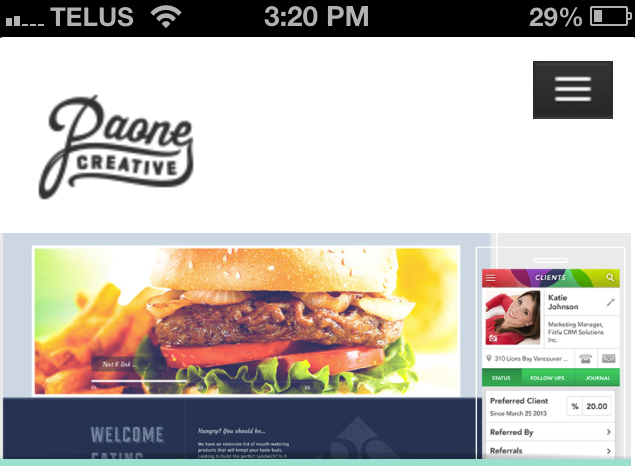
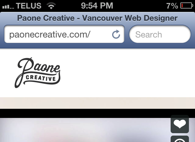
To make it clear on retina screens, you can double the pixel size of the logo or image that is blurry, upload it to your site, and set a precise width for it (in pixels) that is half the size in the CSS file or HTML. Now the retina screen will display twice as many pixels in half the space, fixing the resolution problem. See our logo is fixed below:
You can use this technique for other images (like backgrounds) but my advice is to use it sparingly and only when you absolutely have to. If I were you, I would not use it anywhere else except the logo, if you’re going to use it at all. Stacey says:
Often, a high-resolution image makes for a larger file size (more kilobytes). But it doesn’t have to! Daan Jobsis of Netvlies, in his article titled, “Retina Revolution” talks about how you can have a smaller file size and better quality on both screen types.
However, there are other, less resource-sucking ways to make images clear on your site (even with backgrounds). That’s where our ‘better’ way comes in.
The Better Way: Using Retina.js
Retina.js is a script, which is made of JavaScript code and basically allows your website to give special image files to a browser or device when it tries to load your site’s pages for a user. In this case, Retina.js tells devices that have retina screens to load an image that is sized double than its original. Where does it get the double-sized image and ‘normal’ image? From you! You upload two versions to your site, and then you let Retina.js do the rest of the work for you.
Where to get the script and the script tag:
You can visit retinajs.com to download the script and follow their instructions on how to use it. But I warn you, these are not dummy-proof instructions and if you’re not used to JavaScript file naming conventions or using open source scripts, it won’t be obvious what you should do right off the bat.
Thanks to Stacey’s resourcefulness, we now have a way to make life easier on you. Simply add this code from GitHub Gist to your functions.php file. This is the best and most correct way to add a script to a WordPress site.
However, an easier way would be to add the following script tag to your site before the closing </body> tag, and it will take care of everything (it will find the script on another server on the web and apply it to your site):
For HTML5 sites:
(You will need to find out how to add a script tag to your site’s footer. This is the not the footer area where you edit text in a widget for example. It is a file on your site called footer.php or, if you use a framework there might be special instructions for how to access your footer. You want to enter a new piece of code into an area that is before the closing </body> tag. In the Genesis Framework, for instance, it will be a field you can use in the Theme Settings page on your WordPress dashboard.)
(Note: The reason we are using this URL in particular is because it just so happens this script we need is hosted on cdnjs.com which is a content delivery network that hosts up-to-date popular libraries. At the time of this article 1.0.1 is the latest version of retina.js, but you should check to make sure that a newer version is available if you plan to employ this method.)
Now let’s starting using this baby!
Here are Stacey’s instructions:
Once the retina.js script has been added to your website, you simply need to upload two versions of each image file you have as an <img> tag on your website: one at its normal size and one twice that (@2x). Both images must have the same filename, but the high-resolution version must have @2x appended to the filename. For example: “filename.jpg” and “filename@2x.jpg.” Retina.js checks each image on the page to see if there's a high-resolution version available (for example, it looks for that “filename@2x.jpg” image on your server) and the script will swap the regular image with the high-resolution image on retina screens, if one exists.
What’s the difference between using Retina.js and the cheater way? Why would I upload two version of the same image? Isn’t that a waste of time?
This is where I hand the mic over to Stacey, who I knew would be better able to explain this than I could 🙂
Retina.js will only load the high-resolution version of your image on retina screens if one exists on your server. The benefit is you're not forcing your site users to download a high-resolution image if they don’t need it.
You may also choose to use conditionizr so you can specifically load the script on retina-only screens, and save the download & http request for others.
You'll need to use media queries and the background-size property to apply high-resolution background images in your style sheet so they don’t look fuzzy. If you use Sass, there are mixins available to make retina support easy-breezy.
Now that you have a retina-compatible website, you may be wondering what happens when you hand it over to your client. It’s important that you (the developer) implement a solution for when your client adds new content images to blog posts or pages. One easy WordPress solution is to use the “WP Retina 2x” plugin. This plugin creates the image files required by retina displays and uses the retina.js script. That said, if you are using this plugin you do not also need to include the retina.js script, as it will do that for you.
Now that our image looks fantastic, our site loads slow on retina devices.
Let me be frank: you’ll need to be brave and willing to enter into new technical territory if this is a site you’re making by yourself as a solopreneur. There are many complicated ways of solving this retina issue if you’re really into perfection, but they are probably going to take a long time, a knowledge of Photoshop or photo editing tools and image file types (like, you’d need to know what an SVG format is). Plus not all of them will work well on all browsers, which means you’ll need to learn some coding tricks to make your site universally accessible.
If you’re a developer, I think you should employ the wonderful services of great designers at this point. If you’re a designer, you should look at hiring some great developers now too. If you’re a solopreneur, it’s time to start looking at hiring both 🙂
The thing to know is that there is hope for the designers and detail-oriented people out there that I know will care deeply about this matter. Daan Jobsis of Netvlies (from my favourite country in the whole world, goedso Holland!) wrote an article where he tested different resolutions of a photo against different file sizes until he figured out there is a way to have the best of both worlds. His article titled “Retina revolution” was referred to earlier.
Personally I don’t see the difference in a lot of the sample images he gives, but hey, I know you designers out there see things that I will never be able to see. Designers must have special eyes made of magnifying glass or something.
(By the way you can “Tweeten” Daan’s article at the end of his post. I just noticed there is a Dutch translation for the verb “to Tweet.” Wow.)
There is also this article by Scott Hanselman you can check out, if you like reading and toying with code-ey things:
Icon Fonts: The Best thing to Happen Since Sliced Bread
Now that I’ve said not to use the logo technique anywhere else on your site, you might be thinking, “but what about all my icons, which also show up blurry? Should I double their size and set widths for them too?”
No, but I’ll do you one better!
Thankfully, our iPads, iPhones and retina displays can read @font-face embeds (phew!). By that premise, if your font character looks like a symbol instead of a letter, it can display crisply and clearly on retina HD screens, just like it would display any other HTML writing on the page clearly.
Enter icon fonts! (Applause)
There are some genius people out there who have made font sets that don’t contain letters at all. They are made of symbols. Remember the Wingdings font we used in elementary school while playing with Windows 95? It’s the same idea except now we have more fonts that are like Wingdings and we know what to do with them (I always used to wonder what the point of that font set was, now I know!).
Then some bigger geniuses took this a step further and made it super easy (and free!) for us to create our own icon font sets! Why would we need to do this? Because sometimes you don’t want all the icons contained in a font set for your site, and sometimes you want to mix and match from various font sets. The more font embeds you have, the more load time it takes on your site. So it’s better to have one, custom-made icon font set.
If you don’t know how to set up an @font-face font embed on your site or what that is, you should Google it now, or refer to these resources:
- http://www.w3schools.com/cssref/css3_pr_font-face_rule.asp
- http://www.fontsquirrel.com/help (links to more tutorials and resources)
Let me show you an example of a demo site that uses some icons as images, and some as icon fonts (using the Simple Social Icons plugin, which is amazing). Here you can see the difference in how they display on an iPad with a retina screen:
![]()
Where Do We Get Icon Fonts and How Do We Use Them?
That is a golden question. You can likely Google a bunch of resources for “icon fonts” or “icon font generator” and find something suitable for your needs.
Some plugins on the WordPress repository will also offer you a way to use icon fonts on your site.
I personally prefer to custom install and code them. To do this, you will need at least a working knowledge of HTML, CSS and how to use the “before” selector (or the “after” selector I guess). You also will need to know how to make your own CSS classes and ids. In some instances (like when coding your breadcrumbs in a PHP file for example), it is helpful to know how to use HTML character codes as well.
If you need a little head start, the awesome icon font generators listed below will do most of the work for you. They allow you to download a package that has nearly everything you need – CSS classes, HTML character codes, font files and the whole shebang.
These tools also allow you designers out there to import your own icons so you can make your own font sets out of them. Cool eh? (We say “eh” in Canada, where I’m from. It translates to “huh?” or “right?” …just for your reference).
I won’t get into further detail about how to use the icon fonts here, since I’m sure the web already has a myriad of tutorials on this. The icon font generators also give you demos and everything you need to ‘figure it out’ (if you already know CSS and HTML). They may seem intimidating at first, but they’re not that hard to use and I hope many of us start employing them more often so the web will look so much nicer!
Once you get the hang of them, they’re actually even easier to use than image icons. They save a lot of time trying to make sure our sites look good on all devices. Sizing them and coloring them is as easy as setting a font size and color in your theme’s style.css – what could be simpler than that?
To Conclude: What Have We Learned From This Article?
This article covered a lot; I hope I’ve still got you with me!
To recap, here is what we’ve learned on how to prevent images and icons from becoming blurry on WordPress responsive sites:
- You need to stop using WordPress’s image size settings and disable them, or set them up to match your site’s breakpoints and use a Picturefill plugin.
- You need to ignore or delete your theme’s image sizes. Or add more to match your break points, depending on the WordPress responsive image method you chose.
- You need to find the largest image size your site scales a blurry image to and re-upload the image at that size, then use HTML to set a width percentage so it will scale automatically. Or better yet, use Picturefill or Adaptive images, which will take some knowledge of coding.
- Retina displays are not your fault, and you’re not going crazy. They will make the web awesome soon though, and all our devices will have them. It’s time to future-proof our websites by using methods in this article, and others, to solve the fuzzy-graphics problem.
- The way to make logos and backgrounds clear on retina HD screens is to use the easy-peasy retina.js script.
- Icon fonts are da bomb and make your icons clear on retina displays.
Additional Resources
- How to Convince Your Web Development Clients to Go With a Responsive Site When They Just Don’t ‘Get It’
- A Practical Approach to the Issue of Responsive Design
- 4 Ways to Make Your WordPress Photography Website Mobile-Friendly
Do you have more tips to add to this article? Please, by all means share in the comments below! No one article is going to cover every detail about a topic, so your comments and suggestions are very valuable to our readership!
Photo credits: Featured image by Thom Weerd. The rest are screenshots 🙂
Before you comment:
We love your comments, and thank you for enhancing our discussion on these topics. Please remember however, before you post:
1) The author can not provide you with free personal consultation or advice. Keep your questions in the comments for the whole community to get answers to them too.
2) We are not the support team of any plugin or software discussed in these articles. Please direct your questions to the appropriate code authors.
3) Please don't attempt to get link bait in the comments, or by writing to the author to ask for a link to your site on this topic or others. Once published, articles are finalized and we would rarely change them except in extreme circumstances to do with errors.
If you notice something is really, really not right in these articles, and you have no intention of getting a backlink to your site by making contact, please contact the editor of the site, not the author. The author can not help you.
Other than that, chat away, and let's keep the discussion going!

Leave a Reply