
This is a guest post from Scott Wyden Kivowitz of Photocrati.
More than ever, WordPress users are looking for ways to make their websites mobile-friendly.
For photographers, it’s a tough situation because they want and need their photographs to shine. Their portfolio is their gold. It is one of the two website factors that attract clients. (FYI, the second factor is the blog.)
With that in mind, in this article I am going to discuss four different ways that you can make your photography website mobile-friendly.
1. Responsive Design

The first way is to choose from the many responsive photography website themes available.
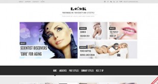
Responsive design is when a website adjusts seamlessly to different mobile devices. A great example of this is The Boston Globe website (as seen above). While it’s not a photography website, it does show you the power and flexibility of such a design. Loook (featured at the top of this post) is an example of a responsive photography theme.
One of the issues with responsive designs are that they’re not quick to implement. In fact, they require a lot of additional CSS styling to work. ManageWP have in fact written a couple of posts on why responsive design isn’t the right choice under certain circumstances.
To learn more about responsive designs, I recommend checking out this website, which has many case studies on the topic.
2. Mobile-Friendly Design
As you may know, Flash is not mobile-friendly. That is why we use jQuery for slideshows and galleries in the Photocrati theme. Because of that, each Photocrati theme is mobile-friendly by design.

A mobile-friendly design is one that keeps its look, branding and layout no matter what device it is viewed on. Effects, like a gallery or slideshow, will also display because they are viewable by any browser or device. With mobile-friendly designs, the website will not adapt to platforms in the same way that a responsive design does.
The catch with a standard mobile-friendly design is that a viewer may have to pinch to zoom to get a closer look at your content.
3. Mobile Plugin

Plugins are used to add functionality to websites. There are three plugins available that have great reputations for transforming a website into a quasi-mobile app.
- WPtouch has a free and paid version available and is the most popular.
- Obox mobile is only available as a paid version and is similar to WPtouch.
- Jetpack’s mobile theme adds a second theme, only viewable when on a mobile device.
The downside to using these is typically the loss of branding and control over the design. Your logo remains, but the different design can turn users off.
4. Mobile-Specific Site
This method is becoming more popular. The principal is that you have a second website that is designed for mobile viewing. Then, by adding a script in the main site’s .htaccess file, viewers on a mobile device will be redirected.
I have personally tested iFolios and it does an amazing job. However, Lotus and Touch Mobile are also great examples of a mobile specific designs.
The advantage to this method is the ability to keep branding in place (for the most part). The disadvantage is having to maintain two websites and portfolios.
Making a Decision
In the end, it comes down to your personal preference and of course, your visitors and customers. Part of the photography business is knowing your customers inside and out. As much as I would love for everyone to purchase the Photocrati theme, it’s not right for everyone. So do some searching — visit the ManageWP themes archive or sites like WordPress Photography Themes to do your research.
Review your site’s analytics to see what kind of mobile devices they are browsing on. Talk to your visitors about their preferences when viewing websites on mobile devices.
Once you understand your customers needs, you will know exactly where to go with your mobile-friendly website.
Scott Wyden Kivowitz is the Community & Blog Wrangler at Photocrati — developer of the WordPress theme for photographers, the NextGEN Gallery plugin, and the Photographers SEO Community.
Creative Commons image courtesy of Antoine Lefeuvre
Leave a Reply