
The new default WordPress theme for 2012 has arrived.
Just a few days ago, Twenty Twelve was made available to WordPress.com users, and it will be released on WordPress.org “very soon“. Designed by ex-NFL player turned web designer, Drew Strojny, it has a lot to live up to. After all, this is the theme that will be bundled with every single new installation of self-hosted WordPress upon its release.
New default WordPress themes are typically greeted with a lukewarm response from certain sections of the WordPress community. They are seen by some as nothing more than a theme for beginners – not something that one would actually plan to use. But reading Strojny’s posts over at The Theme Foundry blog reveals a desire to develop a strong standalone theme that anyone would consider for their own site.
The question is, did Strojny achieve what he set out to do?
Responsiveness
As you are no doubt aware, mobile web usage is a major consideration for web designers these days. One must consider how a design looks across multiple platforms, screen sizes, and resolutions. And whilst Twenty Eleven features responsive elements with its design, Twenty Twelve is the first default WordPress theme to offer a fully responsive experience.
In fact, the official WordPress.com blog goes as far as to call it a “thoughtfully crafted mobile-first layout”, demonstrating how important mobile design was considered during the development of the theme.
Twenty Twelve’s desktop layout remains largely intact on iPad-style screens, as you can see from the following screenshot:

The portrait display on such devices results in the navigation bar wrapping onto a second line, which looks somewhat unappealing to my eyes. That is however a minor complaint.
Twenty Twelve devolves especially well to iPhone-sized screens:

The way in which the navigation menu is hidden and revealed is far more elegant than the drop down menu option that you see on a lot of responsive designs.
Responsive design is a complicated and potentially costly area of theme development, but Twenty Twelve offers up a near-flawless responsive design, and will be available at no cost.
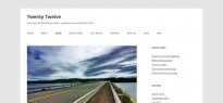
Typography
I would be the first to admit that I am a huge fan of typography. And yet, it is something that many theme designers do not seem to prioritize. In my opinion, the attractiveness and readability of written content should be one of the most important considerations in web design. With that in mind, I was delighted to see how important typography clearly was in the development of the Twenty Twelve theme.
Twenty Twelve showcases the Open Sans typeface, displayed via the Google Web Fonts Directory:

In short, it looks fantastic. Elegant and perfectly readable — the two things you want from a good font. Not only that, but Twenty Twelve comes complete with inbuilt language detection, and will deconstruct to a more suitable font if the user’s language is not supported by Open Sans.
Minimalism
Any web designer worth his or her salt knows that the primary function of a content-driven website should be to facilitate the easy assimilation of said content. This is achieved by a number of means, such as the aforementioned typography, but also by the layout and navigational elements of the design.
Twenty Twelve’s minimalistic design is an excellent example of how to prioritize easy navigation and content assimilation. The navigation bar is prominent, and the abundance of whitespace makes reading the content a comfortable experience. Furthermore, the sidebar is now available on all pages, so that you can easily provide additional navigational elements such as categories and tags.
But that’s not all. Twenty Twelve has taken a big leap forward from its predecessor in offering full customize ability regarding the placement of the sidebar. Whilst it is displayed by default, you can remove the sidebar from specific pages by choosing the “Full width page, no sidebar” page template. Alternatively, you can remove the sidebar altogether by emptying it of widgets.

Finally, the oft-maligned banner-style custom header images and featured images are now turned off by default (but can still be activated).
Post Formats
One of the great features of Twenty Eleven was its multiple post formats, which gave users the power to create Tumblog-style blogs whilst retaining the power and extensibility of the WordPress platform.
Twenty Twelve has picked up the baton from its predecessor and ran with it, as the new post formats don’t disappoint:

Each post type offers up its own unique look, which remain consistent on both list and single post views.
Versatility
Whilst WordPress is primarily a blogging platform, it is capable of doing far more — it can easily be utilized as a fully-featured content management system.
Twenty Twelve has clearly been designed in part to showcase WordPress’ versatility (and also perhaps as an advertisment that it is not just a blogging platform), by offering a static homepage template. You can now add introductory content (be it text, images, video, or a combination) at the top of the page, and utilize a homepage-only widgetized area below.
This is demonstrated by a WordPress.com blog already using the theme, Blue Crab Yo-Yo:

Will You Explore Twenty Twelve?
I consider Twenty Twelve to be a great option for WordPress users. It is certainly a great beginner’s theme, but that does not define its sole purpose. It is an excellent standalone theme in its own right, and serves as a great example of how to design websites with functionality and ease-of-use in mind.
With that said, do you agree? Will you be taking a closer look at Twenty Twelve? Let us know in the comments section!
Leave a Reply