Content may be king but design is extremely important when it comes to your blog making an impact.
When it comes to design I consider typography to be the most important element by a distance. The manner in which your text content is presented and arranged can make all the difference. You could have the best content in your niche, but if it is difficult to read, 80% of your potential readers might never know.
Having seen more sites than I can count with pretty good cosmetic designs but atrocious typography, I thought I would weigh in with what I consider to be 4 key steps for getting typography right on your WordPress blog.
1. Legibility
If your blog relies largely upon the written word, your content’s legibility is literally the most important element. The last thing you want to do is place a barrier between your content and the reader that can easily be avoided.
The first consideration when it comes to legibility is that substance beats style every time. Whilst it can be tempting to utilize a “pretty” font for your blog, doing so could be a huge mistake. For potentially large blocks of text (such as paragraphs, lists, blockquotes, and so on) you must use a highly readable font.
When I say readable, I am not referring to a battle between serif and sans serif fonts:


On the contrary — studies are largely inconclusive as to which is more easily readable. So go with either type of font but just make sure that it is easily read.
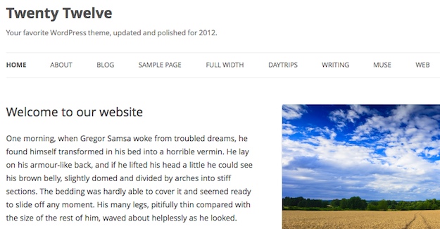
One suggestion I have is to check out the fonts supplied with default WordPress themes such as Twenty Eleven and Twenty Twelve — the fonts are very deliberately selected to be highly legible:

You can be less picky with headers — because the font will only be used to display a handful of words at a time and the typeface will be relatively large, you can if you choose pick something a little more “flashy” and impactful.
Finally, make sure that your font sits on a nicely contrasted background. I advise that you keep it simple and stick with a regular black on white color combination — nothing is more readable.
2. Size
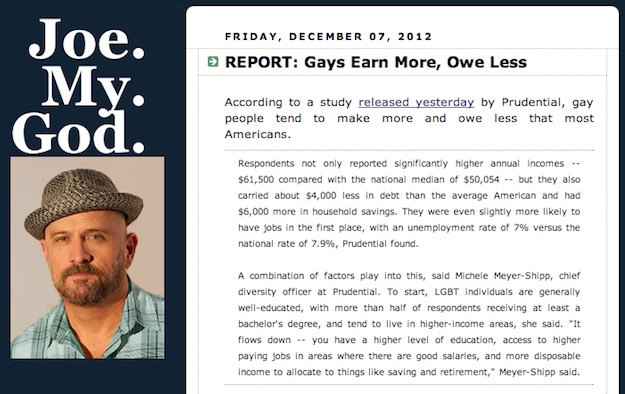
Nothing is more frustrating than a blog with a great design and a decent font combination but a laughably small font size. Having browsed through the Technorati 100 for a couple of minutes, the fourth site I found was this:

I’ve got perfectly good eyesight but I still have to strain in order to read the quoted text. What’s all the more frustrating is how easily avoidable the issue of font size is.
In my opinion, any text on your site should be 14px or more. Body text should be 14px or 16px. Header size should evolve nicely from there, with a clear distinction in size between each header tag. You should only need three levels of headers (if your content needs more then the structure of your writing may be too complicated), so you could for instance pick 20px for <h3>, 26px for <h2> and 32px for <h1>.
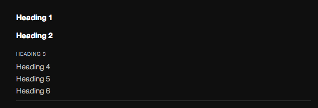
What you don’t want is an lack of distinction between headers and body content, which was an unfortunate issue in the Twenty Eleven theme (a shame given that I previous applauded it for good typography):

3. Spacing
When it comes to typography online I probably notice spacing (or “leading“) issues more than anything. The separation between lines of text can make all the difference to its readability as well as the aesthetics of the site.
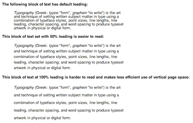
I recommend 1.5 linespacing between all body content. Any more starts to look a little “spaced out” (for want of a better expression), and any less negatively affects legibility, as demonstrated in the following excerpt from Wikipedia:

Furthermore, ensure that the line spacing is correct between all of the various HTML tags that you will be utilizing on your blogs. I often see irregular spacing between the following tags:
- <ul> -> <p>
- <img> -> <hx>
- <blockquote> -> <p>
I would recommend that you create a post that combines all possible HTML tag combinations and make sure that everything is in order.
Finally, ensure that there is a suitable margin (10px minimum) around images that appear within your content. The last thing you want is for text to butt up against images — not only does it look bad, it’s tough to read.
4. Formatting
As you may have ascertained if you are a regular reader of the ManageWP blog, I am a big fan of formatting. The use of bold and italics to improve readability and “scanability” is a powerful tool in the blogger’s armory.
However, such tools are easily (and often) abused. I consider the optimum use of the two aforementioned formatting tools as follows:
- Bold is for selectively highlighting key phrases within your content
- Italics is for emphasizing certain words, as you might when speaking them
You can see examples of this in all of my posts here on ManageWP, including the one you are reading right now.
In an ideal world, a reader should be able to scan a post, reading only the header, sub-headers and text in bold, and understand the key message and/or teachings of the post.
Always Prioritize the User Experience
Many web designers fall into the trap of making sites “pretty” at the cost of usability — this is something you must strive to avoid.
I would much rather browse a completely minimalistic site (like Zen Habits) in which the content is easy to assimilate than be confronted with a gaudy site that has clearly forgotten what is most important — content.
Do you have any suggestions regarding typography for WordPress bloggers? Let us know in the comments section!
Creative Commons image courtesy of Luigi Crespo Photography

Tom Ewer
Interesting thoughts Claudia — thanks!
Claudia Hall Christian
Because I write serial fiction, this topic is a major focus of my thought, Tom. One thing I learned when I was mentored in publishing was that the tails on Serif fonts (at the bottom of each letter) drags the eye horizontally where as the lack of tails in San Serif allows the eye to move up and down. Thus Serif fonts for books; San Serif fonts for the web. (We even take the hyphens out of all web postings to help keep the readers eye moving up and down.)
However, how that books and electronic/web documents have merged in things like the Kindle and iPad, we’re finding that people’s eyes tend to move side to side on this type of reading. Thus, serif rules the eBook world. So – serif for books, eBooks; san serif for the web and .pdfs. Phew!
Poor Gregor Samsa – too bad so many people now are as armored and thus compassionless as the beetle. Do you think it’s due to metamorphosis? just sad.