As always for WordPress geeks like me, the release of version 3.5 was a pretty exciting time — not least for the much-anticipated improved media handling functionality. I even went as far to write a post on that topic alone which was pretty glowing in terms of its capabilities. DynamicWP also did a great job of covering what is so good about the new features in their WordPress 3.4/3.5 comparison post.
However, time and experience can often reveal new things to us and while I am still a big fan of many of the media improvements introduced by WordPress 3.5, a number of less-than-desirable issues have revealed themselves to me in the past couple of months. In this post I am going to reveal what I don’t like about the new media functionality in WordPress 3.5.
1. Default Settings
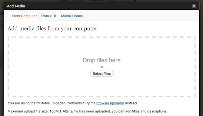
Back in WordPress 3.4, you clicked on the little media icon above the rich text editor and you would be presented with an upload screen:
Now, in WordPress 3.5, you are presented with your Media Library:
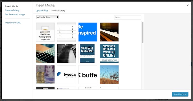
I suppose this must benefit some people, but I am far more likely to want to upload an image than grab one from my Media Library. I hope that I am wrong about this and that the majority of users would actually prefer to access their Media Library over uploading an image but I do not imagine that to be the case. This new feature adds an extra click to my process, which is obviously not a major issue, but is a minor irritant nonetheless.
2. Adding a Featured Image is More Convoluted
Back in WordPress 3.4 you could choose to add a featured image as you were uploading and formatting an image:
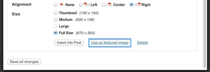
Simple, no? Not so much in WordPress 3.5 as this option has disappeared from the image upload screen in an apparent attempt to simplify the interface. If you want to set a featured image you now have to click on the appropriate link in the appropriate meta box on your Post Edit screen…
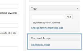
…then select an image from your Media Library and click to set it as the featured image. Given that I tend to set featured images for the majority of blog posts that I create, this seems like a needless increase in the number of clicks needed for a common task. I feel that this is a case of simplification gone wrong.
3. Inputting Meta Data Has Become More Difficult
I really miss the old 3.4 image editing screen:
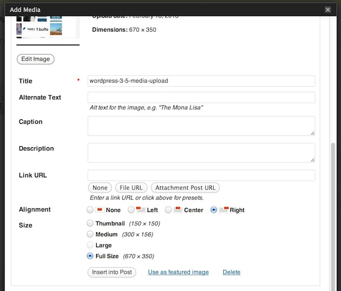
It had everything that I needed within easy reach — I could tab through the fields and add what I wanted as I went. Unfortunately, this ease of use has now been somewhat diminished with WordPress 3.5:
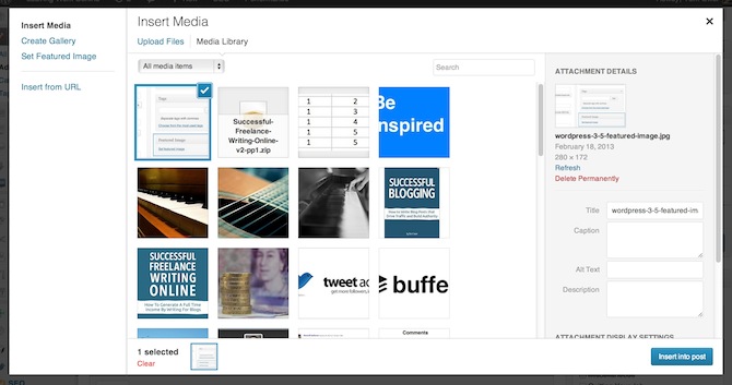
The edit fields have now been relegated to a compressed sidebar section. If you want to edit an image the relevant screen opens up in an entirely new tab, which in my opinion is inferior to 3.4’s inbuilt editing functionality. Adding the usual title/alt text and caption is easy enough but linking to images is now a hassle with the new drop down menu:
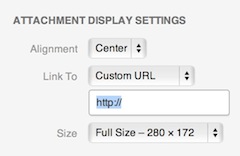
The old version was in my opinion far superior — just type in a URL or hit a button for one of the other options. Now you have to follow the clumsy process of selecting from a small drop down box. Again, I can’t help but feel like simplification has been prioritized over usability.
4. It Takes Longer to Insert Images
In my experience there was no noticeable pause between clicking to insert an image and it appearing in the rich text editor in WordPress 3.4. However, there most certainly is a pause in WordPress 3.5. For whatever reason it is more taxing for WordPress 3.5 to insert an image than it was for 3.4, which to me is inexcusable.
If there’s one golden rule that any developer should follow when upgrading a piece of software it is this: avoid increasing loading times whenever possible. Or to put it another way, if a new feature is going to increase the loading time then you should be damn sure that the positive impact of the increased functionality outweighs the extra seconds that users will have to wait. I don’t feel that WordPres 3.5 delivers as it should on this front.
It’s Not All Doom and Gloom
Please don’t conclude from this that I hate WordPress 3.5. On the contrary, I think that it introduced a bunch of great new features and overall represents another step in the right direction for the WordPress core. However, I was really disappointed to observe the issues above and consider it a great shame that they have creeped into what was otherwise a great update.
What are your thoughts on the new media functionality? Have you experienced the same issues as me or other issues I have not mentioned? Or are you completely satisfied with the newest version of WordPress and have absolutely no cause for complaint. Let us know in the comments section!
Photo Credit: Nikolay Bachiyski

Shea Bunge
When the media manager is open, you can upload a new image by dragging-and-dropping it anywhere on the page, regardless of which tab is selected. The only reason why you ever need to access the Upload Files tab is if you want to use the select files box.
When taking this into account, it makes sense to display a screen where you can either select an existing image or upload a new image rather then a blank page with a single button in the center.
Tom Ewer
Unless you don’t like dragging and dropping — I always work in full screen so that would be a real slow down for me.
Sara
I agree on all points. I do a lot of eCommerce sites and to get an featured image to appear on more than one product it really annoys me I have to keep uploading the same image time and time again. If anyone knows how I can do this differently please share your thoughts. Its driving me crazy and clogging up the server with loads of the same image.
Marko Heijnen
Hey Sara,
Not sure what version of WordPress you are using but with WordPress 3.5 you can have the same image as featured image.
Taswir Haider
Agree on all points – Especially the time it takes to insert the image. It’s good to hear someone else is experiencing this. I keep thinking I’ve cancelled the process somehow instead of inserting.
katrina
I’m with another poster in that the hardest (and most frustrating part) for me isn’t my own usability but explaining these changes to my clients, many of whom are just getting used to WP in the first place.
That said, I also think that the improvements are worth the hiccups in the interface, and I can’t help but think those will be addressed in a future release.
yuda
Agree on all points – hope at least some will be fixed in the future. BTW, it’s also a pain to explain to all current clients why and what have changed in the media library, especially when none of them find these changes as “improvements”…
Tony Boyce
My only gripe is that you can’t ‘insert into post’ and ‘set featured image’ both from the same window – as before. You have to do one or the other which closes the window and then you have to open the window again.
Learning to live with it though.
registrations
When I click on Add Media – mine comes up with “upload files” as the default. So I clicked on the media library and closed out. Then when I clicked Add Media again, it defaulted to the Media Library. I wonder if it “remembers” your preference from where you were when you closed out?
On another note, I can no longer FIND Featured Image reference. It’s not in the sidebar of any pages/posts page content areas for me to add. I’m having this trouble on a few sites and wonder if it went away in the 3.5.1??
Justin Kopepasah
Yes. It does remember what you were doing.
straitline
Funny, I find the most annoying factor in the new media manager is how it works with ManageWP’s iframe interface.
When I click on “add media”, I get dragged to the bottom of an unnecessarily long page. Scroll back to the top, add media, edit meta data, then scroll all the way back to the bottom to add media to the page. (add another set of scrolls if you are adding a gallery)
Compared to how the entire operation is nicely set into a single browser window when working in the admin natively.
Any chance we will see a fix for that?
Marko Heijnen
I’m tend to disagree on the default setting. I guess more and more users are moving to drag and drop to upload images and you now can just move images to the dialog. Even when you are in the media library.
Adding a feature image probably can be better. It is however not removed from the image upload screen. On the left you still can select “Set Featured Image”. Maybe when you select an image you will have a button or link in the right sidebar where you can make it the featured image.
From the dialog I personally hated the old dialog to input meta data to images. Especially when dealing with multiple images. So for a few people the new flow would not work but for the majority it will. I do agree that image editing is lame how it is now. And I’m also working on it to improve it as a plugin for 3.6. Maybe even before that.
That it takes longer to insert an image is something I didn’t noticed. I’m curious if that is a javascript issue from the new media code or if the problem is within TinyMCE. But if you really think it is a problem jump into it. At least make a Trac ticket or talk the right people in the IRC chat.
I can see to the people who responded that there aren’t going to be much changes in 3.6. To the people who complain about the interface I have to say the following: It’s you to blame that it isn’t better then it is now. WordPress is an open source project and you can help out.
Rob
I agree with all your points. Especially the time it takes to insert the image. It’s good to hear someone else is experiencing this. I keep thinking I’ve cancelled the process somehow instead of inserting.
McBart
The new mediauploader in 3.5 is a cosmetic not well thought upgrade. WP tends to these things like crippling the full screen editor.
It seams they think it’s about sleek interface. It’s not it’s about a well thought interface like OSX. A interface that works well in a wide variety of circumstances not only the one the programmer uses. Apple has overcome this problem by assigning people how are really good in coming up with good interfaces. Now it’s time WP get some user interface experts and get past the stage where they are in this point in time, which editors and interfaces that are in fact mediocre at best….
Marko Heijnen
I’m curious if you have any idea who work on WordPress? There are really some great minds working on it. The whole media flow has been changed multiple times and hundreds of hours discussions went before it was released. The new media flow in 3.5 is a major improvement of 3.4. It can have flaws but this step was needed. And from my other comment. If you want something too change reach your hand out and help making it better. It’s open source and everyone can help out.
Jeff Sauer
I love the new editor for one simple reason: I can upload multiple images at once, tag them and add them to the editor at one time instead of adding them individually. In image intensive posts, this is a lifesaver and a huge improvement.
So while these other items are minor annoyances, they will likely all be fixed soon in a future release. I can understand your frustrations, but these are really minor hiccups in the greater good of the product.
The new media management interface is by and large much better than what we had before, even if a few items are a little sticky.
The good news is that the WP community listens and hopefully some of the workflow issues get resolved. For example, I also dislike how the default view is to look at your uploaded assets vs. to upload something new. When I click on that button, I expect an upload dialog.
The other points are valid as well… I just view them as a small price to pay for a much better system for media management.
Kaz Augustin
I publish digital books and so have to, on a regular basis, set up a new page for each release, with links to existing etailers. The old Media Library was a real pain in that regard, with its dinky little pages of images. I much prefer the new large gallery that I can easily scroll through to get the logo I need. It’s saved me heaps of time.
Having said that, I agree about the metadata. That drop-down menu took some time to find and I’m still not too keen on it, even now that I know where it is.
Denisboi
Thanks for this post! I have the exact same problems with the new media uploader. It’s a pain in the a** to set the featured image now. Way too many clicks compared to WP 3.4. Why didn’t they implement a button in the editing screen when you uploaded a picture so that you can set it as featured immediately?
But it’s nice to see, that we all think the same and hopefully they’ll change it somehow in 3.6. Hopefully…
M1Creative
One of the more disappointing aspects has been when you try and make a quick edit to a clients site whilst on the move. You try and use it with a mobile device and it drives you mad.
jen
I hate that when I upload multiple images at once, I can no longer edit their title and alt fields in the same window. You now have to click out to a new tab for each image.
tpcmedia
You’re absolutely spot-on – my thoughts effectively translated into a post! One of the first and most utterly disappointing elements of the update was adding media…as someone who adds fresh images, a featured image and potentially some minor edits (rotate, etc.) with every post each time, this at least feels like a significantly more laborious process than before – not impressed!