
Whether you have lots of content or a few pages of content on your WordPress website, it can be hard to know how to organize and label your content so that it is easy for users to find.
With that in mind, here are some tips and tools you can use within WordPress to help visitors find your content, thus improving their experience on your site.
1. Use WordPress Menus for Specificity and Clarity
This should be the most obvious solution: your theme should have WordPress Menus enabled.
This has been a core feature in WordPress since version 3.0 was released in 2010. In the Widgets area of WordPress, you can add menus with the widget titled “Custom Menu.” However, these menus first need to be set up under “Appearance” > “Menus.”
Menus can also be programmed to show up in a “Theme Location.” For example, since I use the Genesis Framework, I am able to select a menu to show up in pre-determined spots that are coded into almost all Genesis child themes. For Genesis themes, these are traditionally called “Primary Navigation Menu” and “Secondary Navigation Menu.”
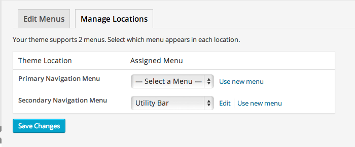
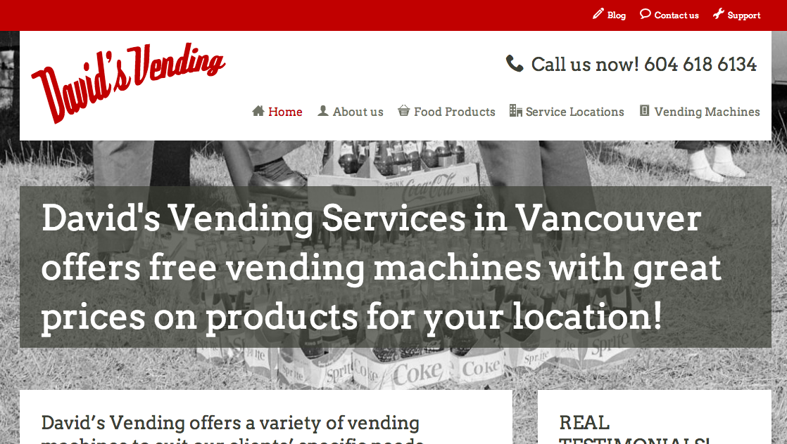
You can see how this Menu shows up only at the top of www.davidsvending.ca, because it was set up to go in the “Secondary Navigation” spot, which the theme’s code determined to be in that position.
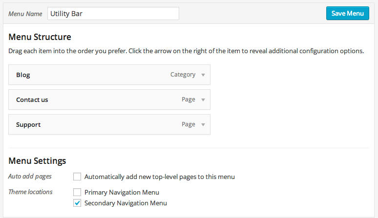
The result (see top red bar):
In the past, the “Primary Navigation Menu” (call it what you like in whatever theme you use), would only be able to grab your list of “Pages,” using the “Page Title” to label the navigation item. If you wanted drop-down menus to show less important content, you had to set up “child” and “parent” Pages in WordPress.
This is no longer necessary and Menus can help you easily control a few things:
Navigation Labels and Titles
The “Navigation Label” no longer has to be exactly the same as the Page or Post “Title” in WordPress. This means you can have Pages and Posts with longer titles than what shows up as the navigation menu link.
For example, your Page title could be, “About our great company,” but your “Navigation Label” can be changed to display only, “About.” This saves room on your menu while allowing for more creativity in your titles.
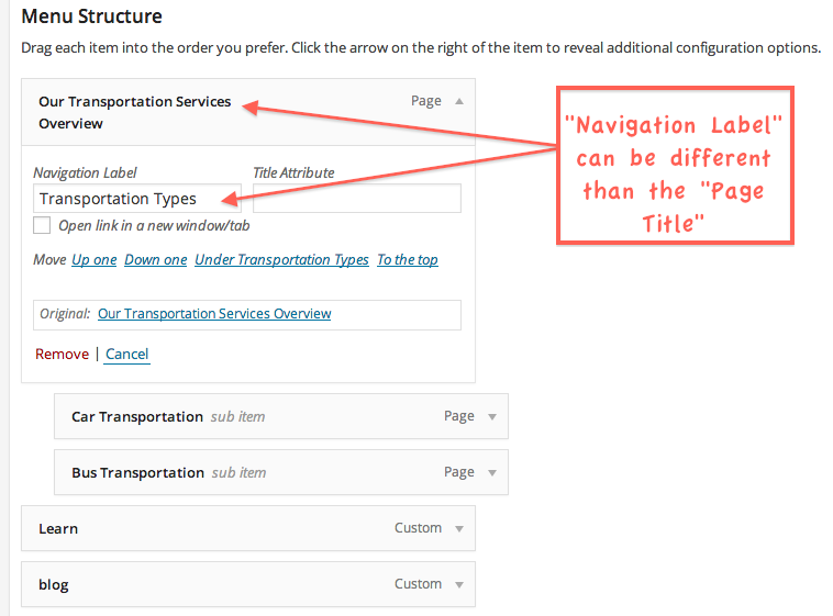
You should use this feature to label your navigation with precise titles. Instead of just saying “Services”, you can now enter the type of service you offer, to help users, and search engines, better understand what they’ll find if they click on that navigation link.
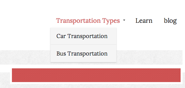
For example, a transportation company might offer different types of transportation. But each type will have its own page. There is no need to call the parent-level menu link “Services.” Why not go with something more descriptive and SEO friendly like, “Transportation Types.” When people scroll over that menu item, they can get a drop-down list with even more specific types of transportation services to explore.
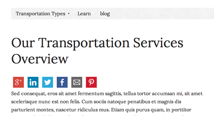
Let’s say a user decides to click on the parent-level menu item. No problem. They can be taken to a page where the Page title says, “Our Transportation Services Overview” or even, “Chose from one of our Transportation Types,” with links to sub-level pages within the content of that WordPress Page.
Specificity is key in helping users find the content they want to find quickly and efficiently. WordPress Menus’ “Navigation Labels” help you do just that.
Note: Never be ambiguous with your labels! Don’t get fancy with nicknames for your services that only mean something to you. Make sure anyone who visits your site will be able to understand your navigation menu without any guessing. If in doubt, stick with conventions like “Services” just to be safe.
URLs and Site Structure
If you have several pages, it would not be realistic to list them all in your main navigation menu (usually at the top of all pages) without a drop-down feature. The human brain can only remember about 7 things at a time. It goes without saying that ‘less is more’ because too many links on your screen can make a site look cluttered and confuse a user, rather then help them navigate through your content.
Before WordPress Menus became a core feature, to get drop-downs to work properly, you would have to specify in the WordPress editing screen whether a page was a “parent” or a “child.” This would necessarily create URL structures several levels deep on large sites. Using our example above, the page structure of different transportation types would appear like this:
www.examplesite.com/transporation-types/car-transportation
This is not a huge problem per se, but if you are aiming to heavily optimize your services as landing pages for search engine visibility, keep in mind these sub pages can become less important in the eyes of search engine crawlers. They are also given a lower “priority” in an automated XML sitemap (though some sitemaps, like that in the WordPress SEO plugin, will allow you to adjust this on a per-page basis).
It is preferable if the site’s structure were more horizontal, rather than vertical, especially for cornerstone pages. In other words, something like this:
www.examplesite.com/car-transportation
A necessary word on drop-down menus:
Some people are adamantly opposed to drop-down menus. However many (not all) professional articles you’ll find on the web saying they are a ‘bad’ thing are referring to forms, not to navigation menus. This has created confusion and misconceptions on the web, such as in this article.
I spoke to a friend currently getting his masters degree in Human-Computer Interaction and Design, to get to the bottom of this. In truth, whether or not drop-down menus are helpful for your site depends on the content, the design, and how well coded they are. There have been tests that show “mega menus” work well. Still, differing opinions abound out there…
2. Use WordPress Widgets for ‘Logical’ Linking
If you really don’t like drop-down menus, this one is for you.
Drop-down menus are not the only way to set up navigation to all your site’s pages. You can also help users find your content with links inside WordPress Widgets. In most themes, Widgets are usually used to control what appears on the sidebars of pages, though they can be used for displaying content in other areas as well, such as on home page blocks, headers, footers, and so on.
Widgets come in many forms, but we want to focus on a few that will create helpful links for your users:
- “Custom Menu” (use this instead of “Categories” and “Pages” for more customization control)
- “Text”
- “Tag cloud”
Note: there are plugins that extend widgets a great deal, such as those that display sub pages automatically, or those that only allow widget content to show up on certain pages. These are beyond the scope of this article, but do explore the WordPress repository’s “widget” tag for further options! Some themes come with built in widget features as well.
Custom Menus Widget
These are the same Custom Menus we mentioned above, except now we’re not just going to use them for a top-level navigation menu. You can create lots of mini menus for different areas of your site.
For example, you could use Custom Menus to show sub pages of a parent page on a WordPress sidebar. This could replace the drop-down menu effect on your top navigation. You could also use Custom Menus to display certain blog Categories that pertain to a particular topic, so it’s relevant to that page. You can even use Custom Menus to set up external links to other websites, such as your social media profiles.
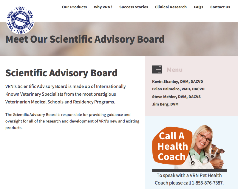
For example, notice how this site uses a Custom Menu in its sidebar to help users find further content related to particular people on their scientific advisory board (each name on the sidebar links to a new page):
One of the main advantages of using Custom Menu Widgets on your sidebars is that the links help search engine crawlers reach all the pages on your site. Many sites create pages that can’t be ‘followed’ by search engine crawlers because they are not properly linked to, or are linked much too deeply in the site architecture. On the other hand, over-doing the linking on a single page can look like spam, so watch out for that (ahem…don’t use date-based archives in WordPress!).
If you are up for trying some plugins and delving into a little bit of coding, you can also customize which Custom Menus appear on certain pages. Plugins like Widget Logic or Custom Sidebars will allow you to do this. Or if you are a Genesis user, something like Genesis Simple Sidebars can also make this quite easy.
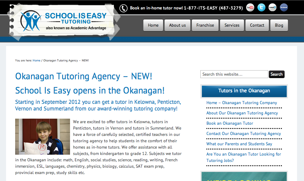
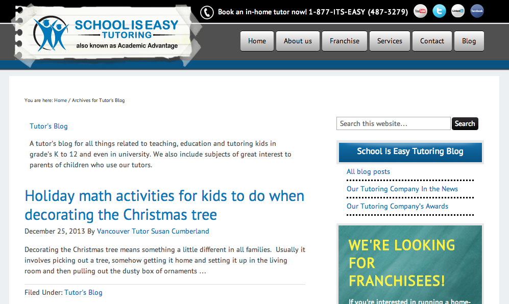
To show an example of the benefits of doing this, notice how the site www.schooliseasy.com uses different sets of links on its different sidebars. These links are Custom Menus that pertain particularly to the page the user is on. If they are on a location page for one of their branches, the sidebar lists pages that are relevant to that geographic area only. Meanwhile, if a user clicks on “Blog,” the menu changes to display Categories, since those relate particularly to the blog.
Notice the difference in these two sidebars:
The main thing to keep in mind is to only display Custom Menus that are going to add value to your readers. Don’t set up menus only for the sake of setting up menus.
Text Widget
The reason you would want to use a WordPress Text Widget is for when you want to display simple information or when you want to insert HTML or shortcodes into an area. This can allow for great design control, such as for adding button-style links.
Taking this a step further, you can also use Text Widgets to create stylized boxes for calls-to-action. Highlighting content into these call-to-action boxes, along with buttons, can draw attention to a particular page you want people to visit. It can also give people a ‘teaser’ of what they’ll find on a given page, after clicking the button link. This is a great tactic for increasing chances of people visiting the pages you want them to visit as they are browsing your site.
This is especially true if your site has a lot of content. Buttons like this help filter out the non-essentials while asking users to pay attention to specific highlights. Here are some examples from abc-lang.com



Tag Cloud and Tag Usage
The reason the Tag Cloud is mentioned here is because it can help people filter through your blog content. However, keep in mind that tags should not replace the “Categories” feature in WordPress. Also, tags are not a way to insert several keywords onto a post because of a false conviction that this will help your SEO. It won’t. It will only look like spam.
The proper way to use tags is explained in a ManageWP blog post titled, “WordPress Tags: Everything You Need to Know.” Basically, they are another way to help organize your blog content.
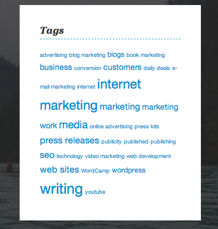
When you use the Tag Cloud Widget in WordPress, by default it will probably look rather plain, something like this, where the most used tags show up in larger fonts than the lesser used tags:
(Of course, this assumes you have ‘tagged’ your posts already, which should be done on a Post editing screen in the WordPress dashboard.)
Using Tags for Overlapping Content
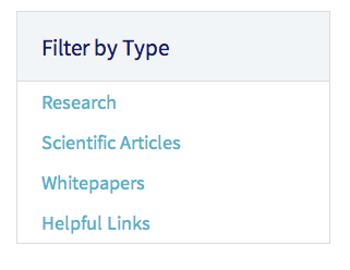
But the usage of Tags can get more interesting and useful. If you have overlapping content on your blog, you may want to distinguish your content with something other than mere Categories.
For example, on a health site, you might have several scientific articles about different health conditions, and each health condition could be set up as a WordPress Category. That will help users by giving them links to each health condition. But what if they wanted to filter your blog by the content type, and not just the Category of health condition? This is where WordPress Tags come in useful. You can use Tags to give each article a type of identifier, such as content that contains whitepapers, research, or links to other resources.
If you want Tag archive links to show up like ‘regular’ Menu items (i.e. not in a ‘cloud’), you will either need some knowledge of CSS and programming, or you can simply use WordPress Menus again.
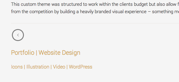
In another example of site organization using Tags, this designer’s portfolio can be navigated in two ways: by project type, and by task type. The project types use WordPress Categories as broader level navigation items for her users. For example, “Web design” and “App UI Design” are both set up as Categories.
But when a user reaches a Post that describes work done on a single portfolio item, the bottom of the Post also lists Tags as a further way for users to navigate the site. Now if a reader is looking for similar portfolio pieces that used specific types of design work, such as “Illustration,” they can find that with easy links leading to pages that segregate that info. The Tag page will show portfolio items in any Category so long as they contain the same Tag.
Note: Tags can have SEO implications if they are creating duplicate content on your site. It’s not that you will be penalized for using them, but they can dilute the power of your more important pages that you will want to rank for given keywords. More importantly, if they are being over-used (which many blogs seem to do), you may have a problem with your SEO, due to the ‘spammy’ nature of their usage, not because of the Tags themselves. Do your research on them to know how to handle them in the best way for your site’s ranking efforts.
3. Use the WordPress Permalink Editor to Make URLs Shorter
This is a short tip. Basically, if your URLs are too long, they can be hard to memorize or reach directly by your users.
Not only that, shorter URLs can perform better with SEO, among other tips you can read in the Moz.com article titled, “11 Best Practices for URLs.”
We are not talking about “Permalinks” in the “Settings” menu in WordPress. We are referring to the ability to change your URLs so they don’t automatically use your Page or Post Title, since that can get pretty long.
For example, the title of this page on my site is much longer than the Permalink that I set up:

If I had let WordPress use my title as its default Permalink, the URL to this page would have been:
http://www.joycegrace.ca/vancouver-web-copywriter—blogging-marketing-copy-press-releases
That’s way longer and way less memorable than simply:
Vancouver Web copywriter – Blogging, Marketing Copy & Press Releases
It can help your users find your specific pages after they’ve left your site and are trying to get back to where they were.
If you check out Chris Brogan’s blog, you’ll notice he edits his permalinks frequently. Some of his posts use just one word in their permalink. For example, the following article has the title:
Tablets in Education Brings Everything to a New Level – sponsored post
But the URL is simply: www.chrisbrogan.com/samsung
Note: If you plan to change your existing URLs, keep in mind this may lead people to 404 pages if they have linked to the pre-edited URL of the page, or are used to visiting a certain URL frequently (such as through a browser bookmarking feature). This will cause confusion for users. To help them get to the content they are trying to find, consider using redirects to lead people to the new URLs automatically. A plugin like Redirection can help with this, though there are others to choose from in the WordPress repository.
In Conclusion
While there are of course more tricks than these to help users find content on your site, the above three are some simple tactics you can employ with WordPress in particular, without having to install any plugins. Some of the availability of the areas where you can use these tools may depend on your theme’s coding, however.
In short, here is a summary of what we’ve learned:
- Use WordPress Menus. These should be enabled in most, if not all themes by now.
- WordPress Menus allow you to customize the labels of your navigation links, and you should use this to your advantage by being specific in your wording.
- WordPress Menus allow you to set up sub-level navigation for pages that aren’t necessarily “child” Pages. This can be helpful for SEO and site URL structure.
- Make use of WordPress Widgets, namely the Custom Menu Widget, the Text Widget and the Tag Cloud.
- The Custom Menu Widget allows you to place important links to other areas of your site in the sidebars of your pages. You can keep this content relevant and related to the current page a user is on. However, this may require the use of extra plugins or special coding.
- The Text Widget allows you to insert HTML or shortcodes into areas of your site, which is great for buttons and call-to-action boxes that highlight the content you want your users to click on.
- The Tag Cloud is a useful way to organize your blog posts with more than just Categories, but they should be used correctly. They are great for overlapping content types.
- Use the inherent WordPress Permalink editor on Post and Page editing screens to shorten your URLs so they are easier to remember. This will help make them SEO friendly too.
Do you have other tips on how to make your content easily findable with WordPress tools? If so, let us know in the comments below! Sharing is caring 🙂
Photo credit: Nationaal Archief

Leave a Reply