If you are reading this, you are probably a blog writer. As such, you will recognize that one of the most important aspects of writing is focus. If you are unable to concentrate on what you are doing, you will struggle to gain momentum and put together more than a few sentences at a time.
If you decide to read a few tweets or watch a YouTube video whilst you are writing, you are not only losing the time spent doing those things – you are also losing the time spent on regaining your focus once you come back to your task. So it is extremely important that you remove as many distractions as possible when you come to write blog posts.
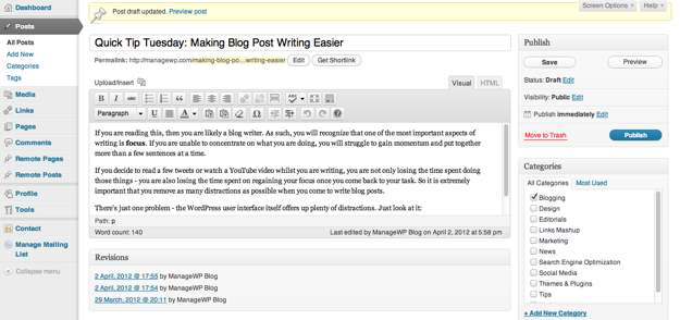
There is just one problem – even if you do close TweetDeck and banish YouTube, the WordPress user interface itself offers up plenty of distractions. Just look at it:

There is an awful lot going on. Not only that, depending on the size of your screen, you will only be able to see a small proportion of your post’s content. Constantly switching between the visual editor and a preview of your post to see what it really looks like is a pain.
The Solution
Fortunately, there is an easy way of removing all of these distractions and increasing your screen real estate. Just hit the “Fullscreen Mode” button on your visual editor’s toolbar:

Welcome to the Distraction Free Editor. There are so many things to love about it:
- You are left with a gloriously distraction free interface
- The screen is far more representative of what the finished article will look like on your blog
- No more switching between scrolling the visual editor and scrolling the actual web page (a particular bugbear of mine)
If you really want to keep things clean and simple, hit Control + Shift + F (or Command + Shift + F for Mac users), and your browser will also go into full screen mode. This is distraction free writing at its best folks.
The Under-Appreciated Distraction Free Editor
You may feel that this is a rather obvious suggestion, but bear with me. I am guessing that you may well have tried this feature before, but dismissed it because of its apparent lack of functionality. Although the Distraction Free Editor does remove all of the clutter from your screen and increase the amount of viewing space dramatically, it seems to do so at the expense of usability.
How so? Well, once you’re in the distraction free editor, all you get is a simple toolbar with the following buttons:
![]()
Compared to the standard visual editor’s toolbar, it is rather sparse. Most importantly, it is probably lacking features that you tend to use regularly, such as headers, alignment, lists, and so on.
Fear not – there are in fact two solutions.
1. Activate the DFE with the Full Toolbar
Try this – rather than clicking on the Distraction Free Editor button in the visual editor toolbar, use the keyboard shortcut instead (Alt + Shift + G).
Hey presto! You have the benefits of the Distraction Free Editor, in addition to the fully-featured visual editor toolbar. Just use the same keyboard shortcut to return to the normal display.
2. Learn the Shortcuts
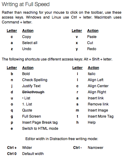
This is by far my favored option. Not only does it allow for a completely distraction-free environment, it also enables you to work more quickly. When in the Distraction Free Editor, click on the help button and you will be presented with a list of keyboard shortcuts for your favorite formatting features:

Spending a few moments to learn these keyboard shortcuts will save you an enormous amount of time in the long run.
This help screen is actually missing some of the best shortcuts. Rather than selecting headers from the drop down list (as you do when using the visual editor), you can just hit Ctrl (or Command for Mac users) + 1-6 to get your desired header size.
Room For Improvement
Although I am a big fan of the Distraction Free Editor, it is not without its faults. I would love to see the following improvements:
- Instant transition from visual editor to distraction free editor
- A keyboard shortcut for switching from HTML mode to visual mode
- An option to set the width of the editor to the width of your blog posts (this would essentially render the Preview feature obsolete)
Are there any improvements you would like to see in the Distraction Free Editor?
Is the Distraction Free Editor For You?
I personally use the Distraction Free Editor every time I write a blog post. It offers up far less distractions, and the keyboard shortcuts allow me to get my work done far more quickly than if I was using the toolbar.
Have you tried the Distraction Free Editor? If so, are you a fan, or do you not like it? Or having read this post, are you now going to give it a go? Let us know in the comments section!
Creative Commons photo courtesy of Rennett Stowe

Leave a Reply