A few weeks ago I published part one of this two-part series, in which I covered the basic steps I took in turning my online dating authority website from a dull default theme with limited functionality to a more impactful custom design with plugins galore.
However, I wasn’t done yet. While the site was already looking a lot better, there was still work to be done. In this second post I want to focus on the more bespoke elements of design and functionality that I worked on in order to produce a website that I am proud to promote as my own.
Implementing Custom Tweaks
My next step was to create a child theme so that I could implement custom tweaks without fear of losing them in the next Canvas update. If you want to know exactly why a child theme is so important and how you can set one up yourself (it’s a piece of cake), read this post.
Once that was done I could start getting my hands dirty. In reality I didn’t make a huge number of changes — I have modest HTML and CSS skills at best, with only a passing knowledge of PHP. But I knew enough to implement the changes that I wanted. Let’s look at each in turn.
Adding a Link to Author Bios
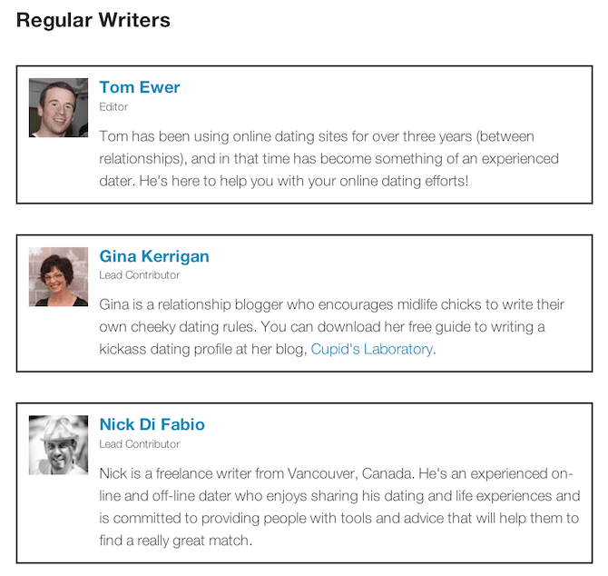
One of the great features of the Fanciest Author Box plugin mentioned in part one is that you can use it to present multiple author boxes on a single page. I did this for my About page so that I could easily provide profiles for all of my writers in one location using just some simple shortcodes:

However, upon installing Canvas I noticed that the author bio box at the bottom of posts looked awesome — I wanted to stick with it. There was just one problem: By default Canvas does not link to the author’s website within their name. For the owner of a multi-author blog, that’s a bit of a faux pas as far as I am concerned.
Luckily the solution was simple — I just added the following code to my child theme’s functions.php file:
/*-----------------------------------------------------------------------------------*/
/* Single Post Author */
/*-----------------------------------------------------------------------------------*/
if ( ! function_exists( 'woo_author_box' ) ) {
function woo_author_box () {
  global $post;
	$author_id=$post->post_author;
?>
Moving the Featured Image
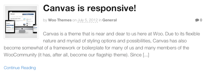
By default the featured image on the Canvas framework is aligned to the left and in line with the headline, like this:

I personally don’t like that. First of all I subscribe to the view that text should not be broken up from the left (as it disrupts the reader’s ability to quickly scan content), and secondly I wanted the image to be placed within the main content as opposed to alongside the headline (like it is within individual posts).
I’d already made some changes to images via Canvas’ simple customization options (mentioned in part one). But to perfect the effect I needed to place another piece of code placed within my functions.php file:
/*-----------------------------------------------------------------------------------*/
/* Move featured image on archive pages */
/*-----------------------------------------------------------------------------------*/

remove_action( 'woo_post_inside_before', 'woo_display_post_image', 10 );
add_action( 'woo_custom_post_image_hook', 'woo_display_post_image', 10 );

function woo_custom_post_image_hook() {
	do_action('woo_custom_post_image_hook');
}
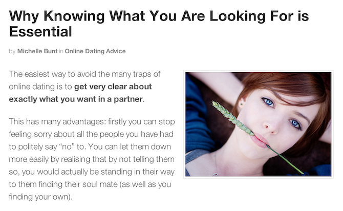
The result is what I consider to be a far sexier (and more practical) layout:

CSS Tweaks
WooThemes Canvas is great for so many reasons, amongst which are:
- There are so many customization options that it is often not necessary to get your hands dirty with custom coding
- It’s so well put together that you’re not likely to want to do much custom coding
That’s the position I found myself in. I loved the font, color scheme, link formatting, and so on. Most of the tweaks that I wanted to make could easily be made within the Canvas settings screens.
However, in addition to the tweaks mentioned above there were just a couple of changes I wanted to make that required a little extra code in my child theme’s style.css file.
The first was to hide the links to WooThemes and WordPress in the footer. This was simple enough:
/* Hide WooThemes and WordPress links in footer */

div#credit {
	display: none;
}
The second tweak was to remove bullet points from the categories list widget in the sidebar. Again, that was a piece of cake:
/* Remove bullets points from categories list */

div#categories-2 ul {
	list-style-type: none;
}
That was it! Apart from that, I was happy with how everything looked.
Getting a Logo
Let me tell you something — I am no graphic artist. As far from it as possible in fact. But I knew I needed a good-looking logo if my blog was to be taken seriously.
I started off by looking at 99 Designs — a designer from there did a great job on the logo for Leaving Work Behind. However, my budget was relatively limited and I couldn’t justify the cost. So instead, on the advice of one of my Twitter followers, I turned to a service I had not previously heart about: Logo Nerds. They promised a high quality logo design for just $27 — a ridiculously small amount of money.
This is what I ended up with:

For $27 I was delighted. If you want to know more about the options you have when it comes to logo design for your site, check out this recent comparison piece that I wrote.
The only other piece of graphical wizardry that I conjured was the author photos in the About sidebar widget:

This wasn’t so much graphical wizardry as copying and pasting the circular author bio photos that the Canvas theme generates for the bio boxes at the bottom of posts.
Any Future Tweaks?
Experience tells me that if you create clean and uncluttered design (like the one I have for my authority site), the vast majority of visitors will be delighted. Quite frankly, they won’t care less about any cosmetic tweaks that you decide to make, even if they do look awesome.
With that in mind, I have no particular plans to tweak this site further. The aim now is to get some traffic flowing — something that I may well discuss here on ManageWP in the future!
If you have any questions about anything I have covered in either part of this two-post series, please do not hesitate to get in touch via the comments section below!
Photo Credit: Ioan Sameli

Stephan
I thought this would be more about authority when it comes to ranking in search engine but this is an interesting read as well 🙂
Love the logo design.
Marko Tanaskovic
Take not that this is an older article and not all the information may be still relevant.
Abhishek
Hi, good article.Above and beyond building the site, you seem to have a team of writers.I really enjoyed it.
Keep up the good work!
Neeraj Kulkarni
These days there is a lot of discussion going about micro-sites focusing on a particular market or a product in general. But I think in the long run the only thing which stands the test of time is an authority site. When people find a lot of useful content on our site they will naturally bookmark it and will also share it with their friends.
Thanks for the post.
siva
I totally agree with your comment. While i am building some micro sites, i was searching in google “how to build an authority site” and found this useful article on top. Thanks a lot Tom.
Tom Ewer
No problem guys!
Doug
Hi, good article.
Above and beyond building the site, you seem to have a team of writers.
This looks great, and authoritative – but are these people you know that are all clubbing together to make this site with you, or are they people you have employed?
Thanks
Doug
Tom Ewer
Thanks Doug! These are people that I am paying — readers of my blog actually 🙂
Doug
Cool
Im going to add that to my authority site. It looks so professional!
Keep up the good work!