Among other things, WordPress is famous for its flexibility and wide array of customization options. A big part of those customization options have to do with design, which unfortunately for non-designers can be both a blessing and a curse.
On the one hand it’s always nice to be able to make a website (or theme) your own by changing colors, fonts, patterns, images and more. But with so many options it’s easy to make mistakes along the way and end up with a website that looks, well, less than professional.
So what’s a design-challenged WordPress user to do?
Three words: Keep. It. Simple.
If you can do that — and the tips below should help — you have an excellent shot at creating a WordPress website that not only looks passable yet professionally designed.
So let’s get into those tips!
Disclaimer: Explaining design is similar to teaching a language — most rules have exceptions. The tips below are not “all-encompassing laws of web design” but rather easy to follow advice that will work in most cases. The goal here is to help non-designers keep things simple and attractive.
1. Follow Basic Typography Guidelines
When it comes to good design, typography may not be everything…but it comes pretty close. This is actually a really good thing for non-designers because while you may not be able to create custom typefaces or graphics of your own, you can follow a few simple guidelines that will help you use existing fonts to maximum effect.
Here are a few things to consider when choosing fonts:
- Focus on readability. No one should ever have to guess what word they’re looking at on your site. To that end, body text should be set between 12-16px with many preferring 14px as the new standard.
- The fewer the fonts the better. Remember: keep it simple. You can do this by matching your navigation link font to your headline font and your body text font to your sidebar text font.
- Small variations like weight, style, and color can go a long way.
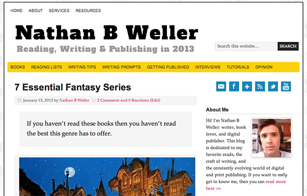
In the image above you can see these guidelines at work on my own blog. I’ve matched my navigational font (Arial) to my headline font (Arial Bold) and my post body font (Palatino Linotype) to my sidebar font, with point size varying accordingly.
If you want more examples of how to select and use fonts wisely, check out sites like The Best Designs and use tools that help you identify which fonts the featured designers used where. My personal favorite is the Google Chrome extension What Font.
2. Don’t Try to Re-Invent the Color Wheel
In my experience most people do not possess that special knack for knowing which colors go best together and how to use them properly in design. That ability is typically developed over years of practice as opposed to being inborn in special individuals, not to mention that a considerable percentage of people (and men especially) are literally color blind.
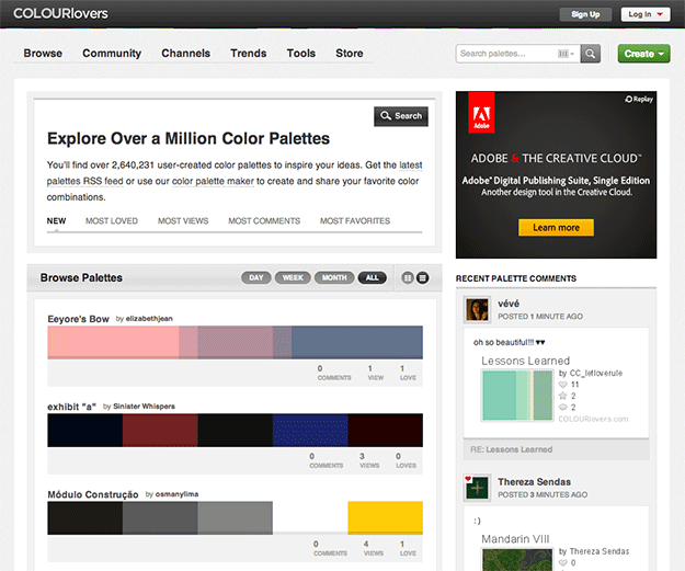
So instead of wracking your brain for ideas on which colors to use and how, try using a tool like ColourLovers.com. You can browse through a large number of designer submitted color palettes and choose the one that appeals to you most.
Another option is to install the color picker extension for Google Chrome and create palettes of your own based on your favorite websites.
3. Err on the Side of Subtlety
This tip goes for the application of the colors you choose as well as any patterns and/or images you might want to include in your site design.
It’s very difficult to do loud and busy well. But on the other hand it’s much easier to implement simple, subtle things that make a big impact.
Take the ManageWP blog for instance: notice the subtle pattern of diagonal lines at the top behind the blog name. And again behind the sidebar. It’s pleasing to the eye but not distracting from the main event, which of course is the content and calls to action.
And take note of the use of colors as well. There are several, they’re bright and fun, and yet they’re used as accents instead of background or main text colors.
You’ll find the same thing to be the case at the site I mentioned above: The Best Designs. When determining how to use the colors you pick out, I recommend exploring the galleries there and taking note of how top web designers are using color.
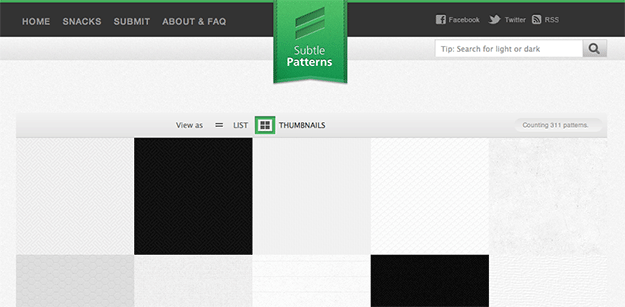
Lastly, I also highly recommend browsing for subtle background patters over at SubtlePatterns.com. They’re free and extremely effective.
In Closing
As I mentioned above, these three tips are far from everything there is to know about web design or even customizing WordPress. But again, that wasn’t the point. The point is to help those who are not design savvy make good design decisions when making customizations to their own WordPress sites.
Indeed to that end many premium WordPress themes come pre-designed with multiple font /color options and messing things up too badly is nearly impossible. Some WordPress users buy those themes specifically because they find those limitations helpful – and that’s great for them. But if you buy a theme framework like Genesis or Pagelines then I think there’s a lot to be gained by keeping the above tips in mind.
What do you think? Did you find these tips helpful or do you have tips of your own? Let us know in the comments section!
Creative Commons images courtesy of WordPress, ColourLovers, & Subtle Patterns.
Leave a Reply