I don’t think enough attention is paid to content creation in WordPress.
The problem is that it’s just not sexy enough. Designing and optimizing sites; working with pretty colors and advanced functionality – that’s what I’m talking about. Content creation? Meh.
But let’s face it – unless you are an out and out web designer with absolutely no involvement in content, you probably spend more time writing in WordPress than doing anything else. And as someone who spends a few hours every day creating content in WordPress, I am always on the lookout for any visual editor hacks.
And that brings me to today’s post, which essentially represents the road I have traveled to get to where I am now – which I feel is an optimum place for productive content creation in WordPress. Enjoy!
1. The Kitchen Sink
Let’s start with the absolute basics – that little button in the visual editor:

This is what WordPress calls “the kitchen sink”, and although you probably know about it, beginner WordPress users often have no idea that it exists. Clicking on the kitchen sink will reveal another line of formatting options, with helpful buttons such as font style, underline, justify, font color, undo, redo, and so on.
However, “the kitchen sink” is something of a misnomer, as there are still a few missing formatting options that are inconspicuous by their absence. Hence…
2. Extra Buttons
There are a few extra mystery buttons, seemingly not worth of inclusion within the kitchen sink, that you can place within the visual editor with relative ease.
Take the trusty horizontal rule, stalwart of 1990s web design, as an example. To get your very own <hr /> button, access your functions.php and paste the following:
function enable_more_buttons($buttons) {

$buttons[] = 'hr';

return $buttons;

}

add_filter("mce_buttons", "enable_more_buttons");
You can choose which buttons to add, as well as which row of the visual editor to add them onto. For more information, check out the original source of the code.
The full list of buttons you can add are as follows: bold, italic, underline, strikethrough, justifyleft, justifycenter, justifyright, justifyfull, bullist, numlist, outdent, indent, cut, copy, paste, undo, redo, link, unlink, image, cleanup, help, code, hr, removeformat, formatselect, fontselect, fontsizeselect, styleselect, sub, sup, forecolor, backcolor, charmap, visualaid, anchor, newdocument, and separator.
3. Alternatives to TinyMCE
 For those of you who don’t know, WordPress’ visual editor is TinyMCE – an open source WYSIWYG editor. And just like anything else in WordPress, it can be replaced.
However, there are rather a lot of good alternatives, and each one suits different tastes. Rather than me tell you my favorite, it would be far better for you to take a look at the different options and make your own informed decision.
With that in mind, check out my rather scathingly-titled article: Why You Hate the WordPress Text Editor and What to Do About It. There you will find what I consider the top alternatives to TinyMCE.
4. Keyboard Shortcuts
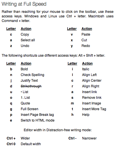
These will make your life so much easier. Trust me – although keyboard shortcuts can be a pain to learn at the outset, once you know them, you will save yourself a lot of time.
Here’s a selection:

I actually listed keyboard shortcuts as one of the reasons to use the Distraction Free Editor (DFE), even though you can use the shortcuts in the standard visual editor too. But my point was, once you know the shortcuts, there really is no logical reason not to use the DFE. Which brings me straight onto…
5. Distraction Free Editor Improvements
There are many reasons to love the DFE. As I revealed just a couple of days ago, it is my favorite thing about WordPress, and is far superior to the visual editor (in my humble opinion).
And with the following two clever tricks, it can become even better – essentially rendering the process of previewing your posts redundant.
I am talking about two simple adjustments – to the DFE’s width and formatting, to essentially replicate exactly how the post will look on your blog. Here’s the code:
add_action( 'after_setup_theme', 'wptuts_theme_setup' );

function wptuts_theme_setup() {

set_user_setting( 'dfw_width', 1000 );

add_editor_style( array( 'css/my-first-style.css', 'css/my-second-style.css' ) );

}
There are two things to pay attention to here:
- As you might have guessed, “1000” in the example above is the width of the DFE. Adjust it to suit.
- The array within the “add_editor_style” variable should point to the stylesheet(s) that you use in your theme. You should enter the location of the stylesheets relative to the theme’s root directory.
Once you’ve made those minor tweaks – hey presto! The DFE acts as a realtime preview for the blog post as it would be seen on your site. I cannot take credit for the above code – it comes courtesy of the clever chaps over at WPTuts+.
An Evolution of Content Creation
The above five tips, in order, essentially represent the evolution of my WordPress content creation process.
Like anyone else, I started out with the plain Jane visual editor. I soon found the kitchen sink, then dabbled with adding extra buttons, before checking out the alternatives to TinyMCE. Then I really started to get productive with keyboard shortcuts, before finally making the move to the Distraction Free Editor.
Where do you stand with regards to content creation in WordPress? Are you DFE stalwart like me, or do you prefer an alternative option? Let us know in the comments section!
Creative Commons image courtesy of pedrosimoes7

Leave a Reply