A lot of the work our software engineers do goes into making the UI better, customizing our dashboard so that it’s beautiful and practical. Today, I want to go over some of the changes they implemented to make browsing our dashboard neater. You can expect an improved thumbnail and list view, as well as top action bar, now all changeable depending on your screen resolution. Let’s get to it.
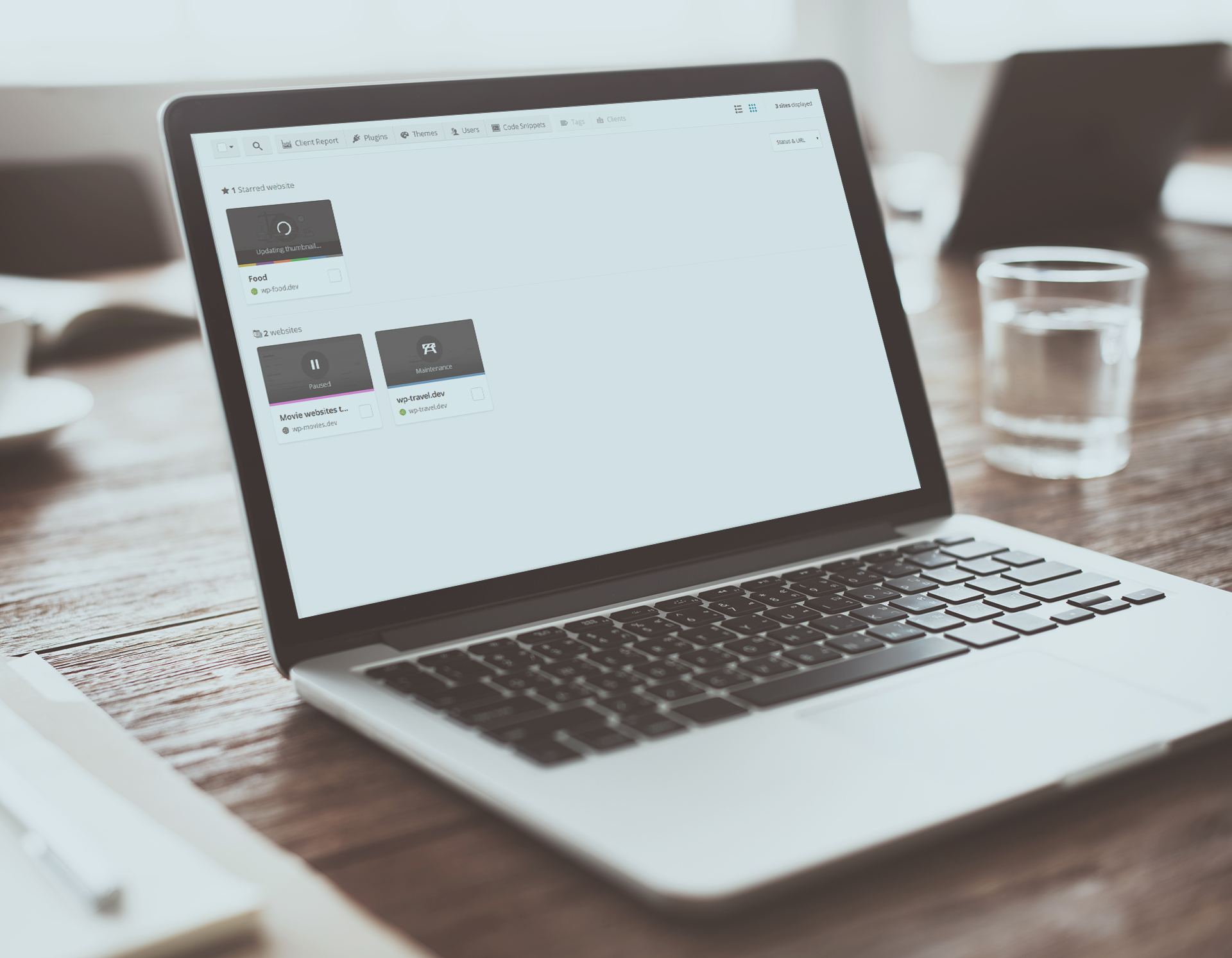
The idea behind the UI changes is to make sure that the thumbnail and list view are optimized for website management. You will be able to track your websites easier, and make bulk changes.
Thumbnail view improvements
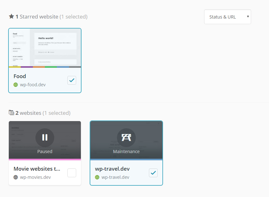
The main changes you will notice if you are a thumbnail view user is that we have made the current state of your website clearer. With a single glance you are able to see if your website is paused, in maintenance mode or live. On top of this, it is clearly marked what websites are selected, so that when you go to perform a bulk action, you are sure what websites will be affected. Here is our new view.
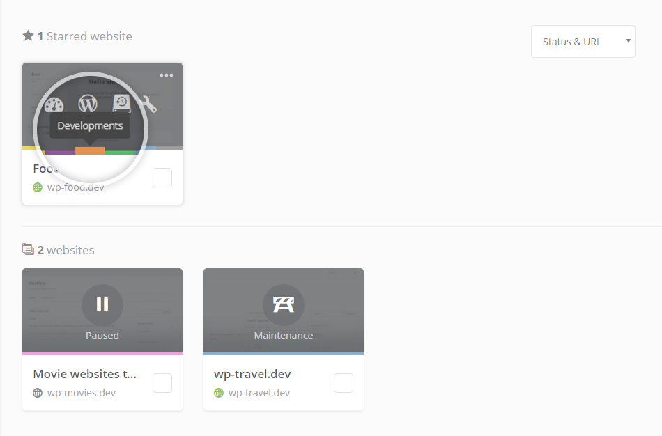
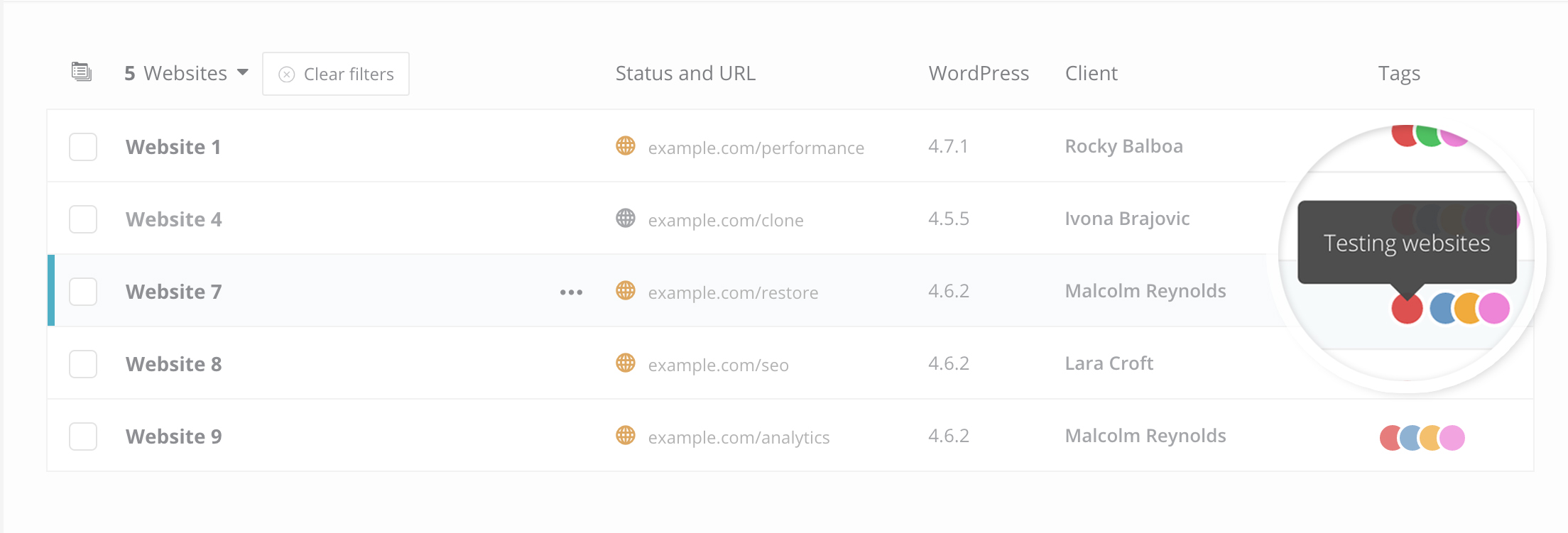
When we changed this, we realized that we needed to redesign our tags. Having just a single dot on your website might not be clear enough. So, we went back to the drawing board and came up with a different concept. Why not make tags more intuitive on each website by placing them in the middle and giving them a hover explanation. We tried it and we liked it.
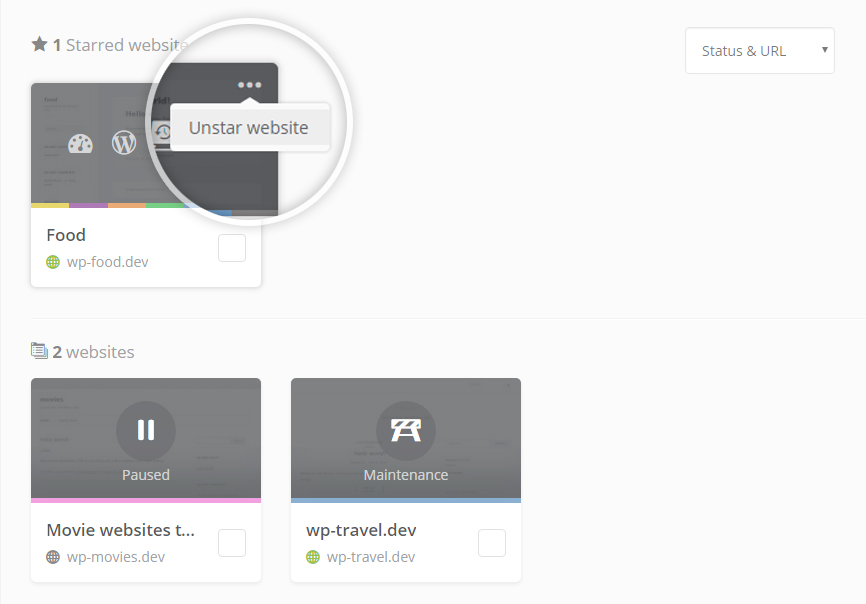
The tags and the website status were looking good, but after all this is a website management section, so we thought we should introduce another management option. We started by redesigning the favorites section. Rather than having a star in the top right corner of each website, now you will see three dots, by clicking on them you can see if that website is starred. This idea was brought on because we want to add more options, so stay tuned. Here is what it looks like for now.
List view improvements
The list and thumbnail view are meant for the same function, however some prefer one to the other. We are here to make sure our users get the most logical solution for website management, so we implemented changes on both options. The changes are very similar they just take slightly different forms. So, let me go over the news for the list view.
Better view on smaller resolutions. Ok so I like to have a big monitor when I am at the office, but often I log into my dashboard on my Macbook Air and at this point I want to be able to see everything at the same quality. This is something that we focused on, on our list view. First thing, the tags on a smaller resolution change to dots. You can hover over each to see the name of the tag.
The second improvement is the website options. Rather than being able to see all of the tools that are turned on, we introduced the three dots. By clicking on them, you can see all of the options for that website, including going to the single website dashboard.
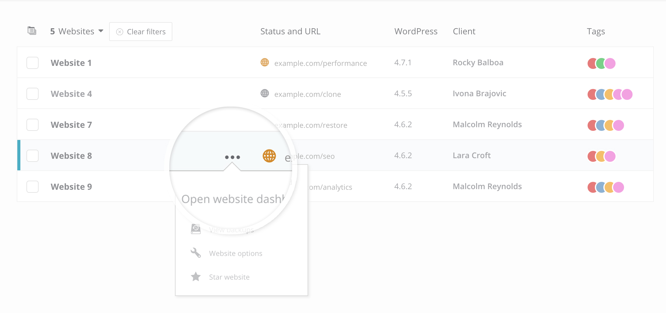
On a high resolution, you won’t see these options. So, if you want to test the new changes, take your resolution down to 1660px.
Top action bar improvements
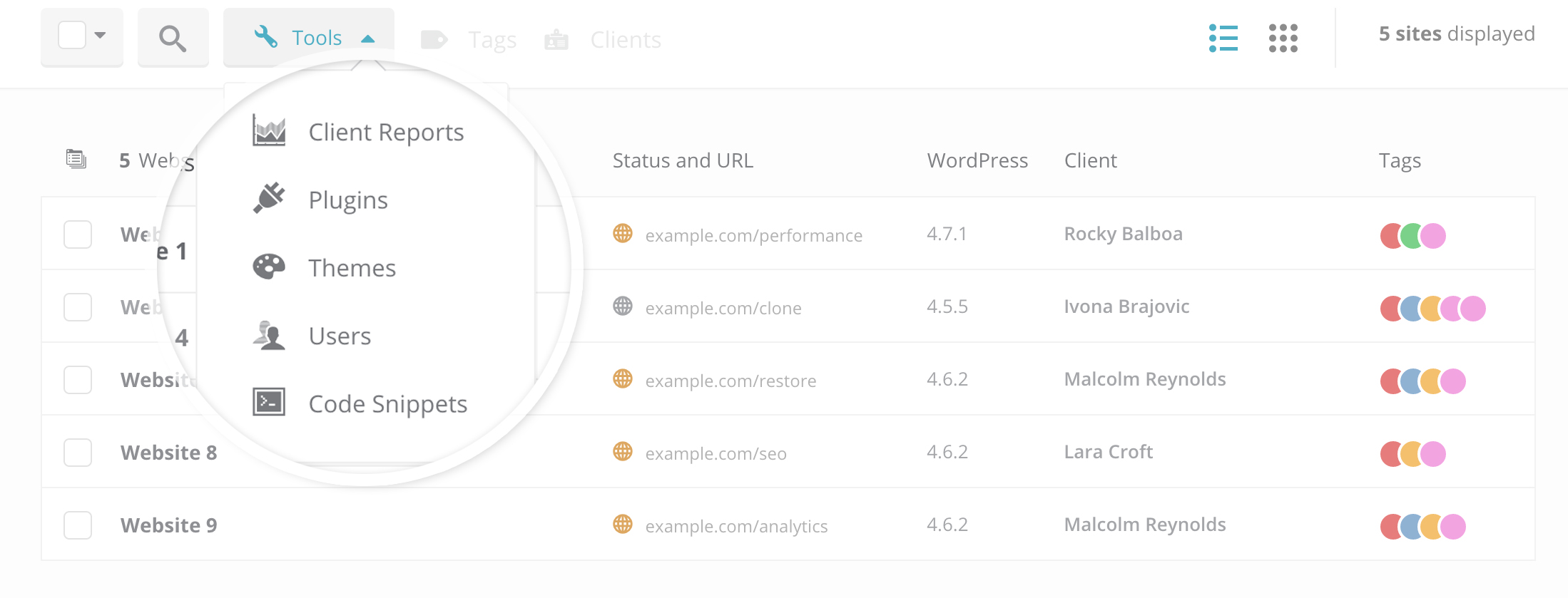
We adjusted the top action bar in a similar way, so that when the resolution is reduced, it becomes responsive. We kept the dropdown pattern and made it so that the tools are displayed in a dropdown.
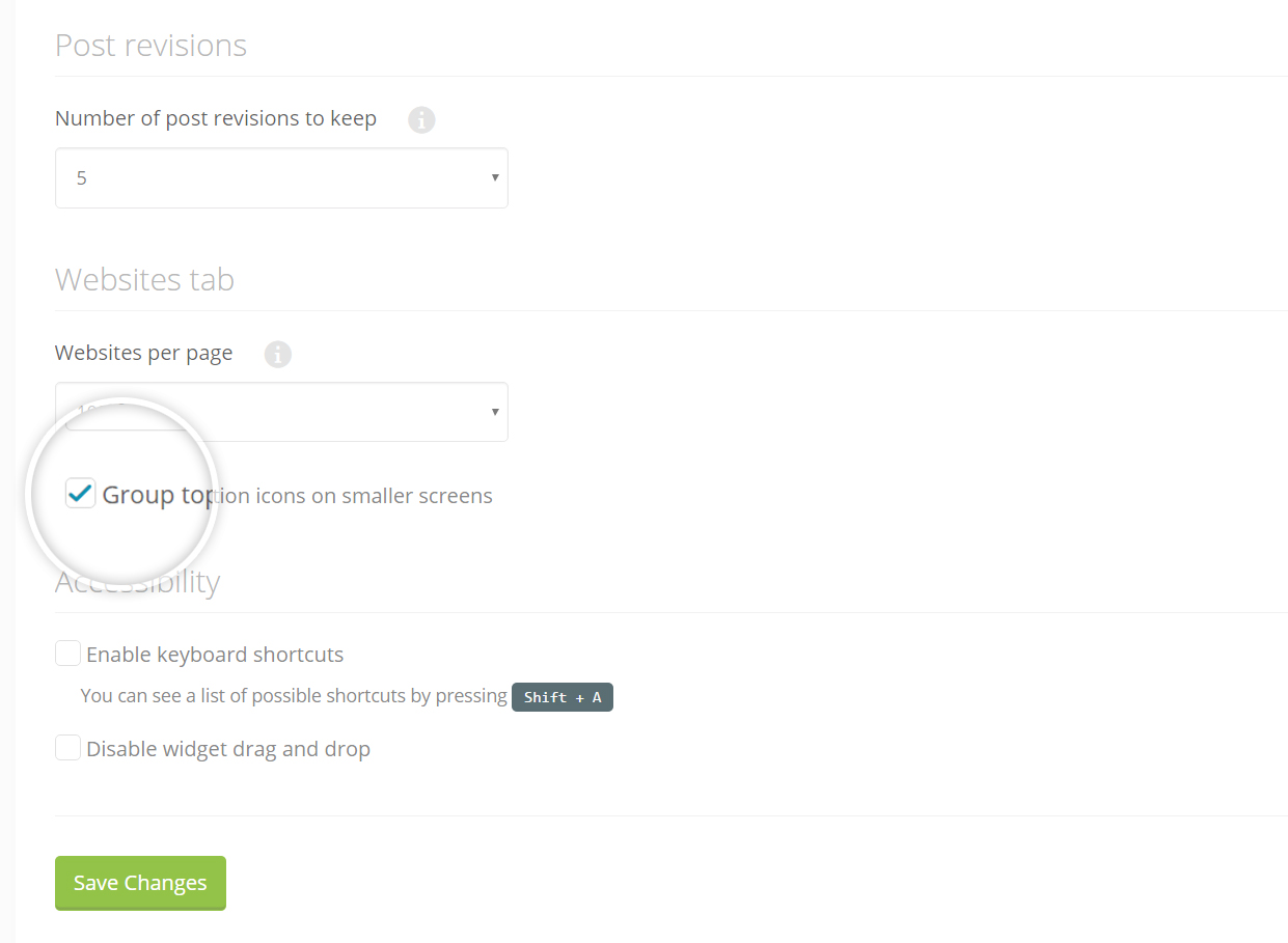
We did, however, also introduce the option to switch this on and off. If you don’t want to toggle the top action bar, you can switch it off by going to Settings and clicking on Advanced Settings. Under Website tab, you can tick the box.
Wrapping up
This is just the beginning of the dashboard optimization. Alongside our tools and features, we are highly focused on making our UI better. Our aim is to make our dashboard highly intuitive, powerful and elegant. Let us know what you think of the improvements, and a big thanks to our design and frontend team for the ideas and hard work.

Leave a Reply