
Last week we published a somewhat controversial post entitled 5 Reasons Why Responsive Design Is Not Worth It. But let’s face it – responsive design is going nowhere (and quite rightly, as most would argue).
Whilst I maintain that responsive design is often executed poorly (resulting in a worse user experience than if they had just stuck with the standard design for mobile platforms), and is often simply not needed, there is no doubting the quality of some responsively-designed websites.
So following on from last week’s article, I thought it would be pertinent to seek out five diverse examples of responsive design, and take a closer look at them. I want to explore how they attempt to enhance the user experience, and what sacrifices are required in order for that to happen.
Let’s take a look.
5. The Sweet Hat Club
Quite frankly, this site deserves inclusion on its name alone, but thankfully it also sports an excellent responsive design.
Here’s the desktop version:

As you can see, The Sweet Hat Club is a highly graphical design which lends itself to responsiveness. This becomes apparent when we switch to an iPad-style display:

There’s just a few subtle changes here – namely the navigation elements being vertically aligned, and the “Newest Members” section reducing to one column. This allows the images to remain at a good size without really affecting the user experience.
Now onto the iPhone-style display:

This is typically where so many responsive designs get it wrong, but The Sweet Hat Club does a pretty good job. The designer selectively reduced the elements available above the fold, presumably by assessing what he/she felt were the most popular features on the desktop design.
Whilst the user loses the ability to things that they could do on the desktop version (not good), the major elements are present, correct, and nicely laid out. However, one might argue that this site manages to have a successful responsive design primarily because there simply weren’t that many elements to start with in the first place.
4. Food Sense
I was immediately intrigued by Food Sense from a responsive design viewpoint due to its highly graphical nature. Check out the desktop version:
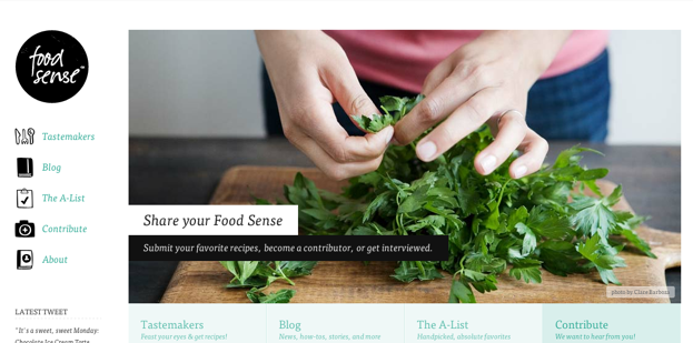
As you can see, the viewable space above the fold is dominated by a huge feature image, along with navigation elements that are (rather needlessly) repeated.
Let’s take a look at how well this indulgent design translates to an iPad-style display:

The left-hand navigation elements have been sensibly moved alongside the logo, but the screen is still dominated by the feature image. As with the desktop version, you either need to click on a navigation item or scroll down to see anything of substance.
How about the iPhone-style display?

You can say one thing about this design – it is consistent.
Whilst recipe sites are typically graphical in nature, this perhaps takes the concept a little too far, at the cost of the user experience. However, this is not the fault of the responsive design – more the overall design concept. The way in which the design “downsizes” is actually quite appropriate, given the desktop design.
3. Authentic Jobs
This is the kind of site where you might expect to see a standalone app. However, the designers of Authentic Jobs go perhaps one step further by designing a responsive site that manages to have an app feel to it.
Here’s the desktop display:
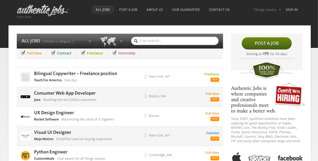
There are three main sections to the design – the top navigation, the job board, and the sidebar. The desktop display is perfectly suited to displaying all of this information without risk of overwhelming the user.
Here’s the iPad-style display:
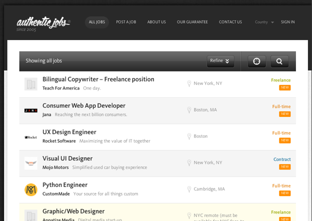
The designer has done an excellent job here of prioritizing the elements that were present on the desktop display. The sidebar has disappeared, giving the user a better view of the most important part of the site – the job listings. The user doesn’t lose too much from this, as the content in the sidebar is represented via the navigation elements.
Let’s take a look at the iPhone-style display:

You could argue that the designer went too far here. It seems that the ability to do anything apart from search for jobs has disappeared.
The opposing argument to this could be twofold:
- It is a worthwhile sacrifice, given that job searching is the primary concern
- People who are looking for other options (i.e. job placements) will be less likely to use a mobile device
One thing is for sure – the way in which they have presented the information they have chosen to retain is excellently executed.
2. The Boston Globe
I wanted to include one content-heavy example, and The Boston Globe is a worthwhile inclusion.
Here’s the desktop display:
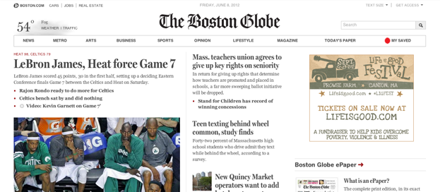
It is a greedy design – taking up all available space on your desktop. This is arguably a necessity, given the amount of information that the site is trying to display.
With that in mind, let’s see how well it adapts to a smaller iPad-style display:
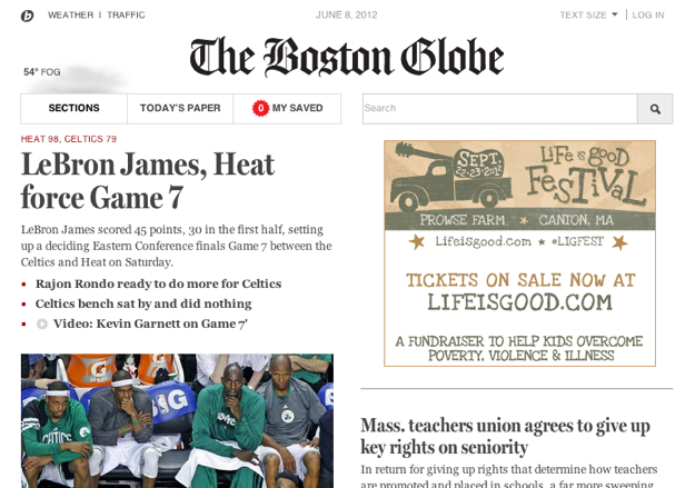
Rather well, it seems. The key headlines are prioritized and remain in place, whilst less important content elements fade out of site, below the fold. The content is still all there, but it may take a whole load scrolling to find it.
You might be able to guess how the design will adjust to an iPhone-style display:
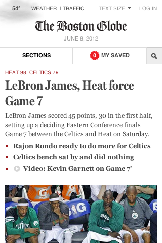
That’s right – just the top headline (with related articles) is available above the fold. If you want to see anything more, you will have to scroll. With such a complex and content-heavy site, this is likely to be a far preferable solution to most users than being presented with the desktop display on the iPhone.
1. St Paul’s School
We’ll finish with a design from a rather unassuming source – St Paul’s School in London, England. What caught my eye was the assortment of separate elements in the desktop display:
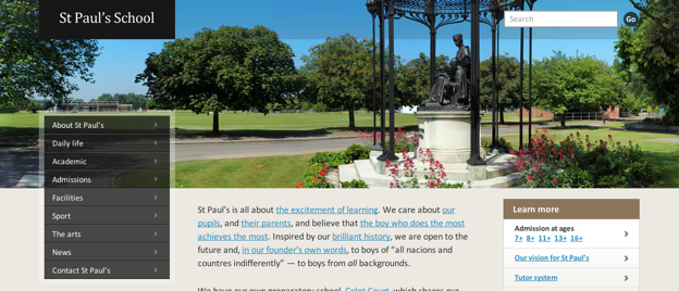
Just like The Boston Globe above, St Paul’s design stretches to fill up the entire desktop display, with a dominant feature image. There are various different elements to the design – a rather unique sidebar, some introductory blurb, and a “Learn more” sidebar. And that’s just above the fold.
Let’s take a look at the iPad-style display:
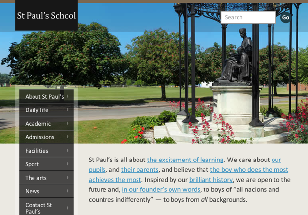
The designers have done a great job of prioritizing the available elements – retaining the navigation bar and introductory blurb. The “Learn more” element can be found just under the content. As a mobile user, you’re not really missing out on anything.
Finally, here’s the iPhone-style display:
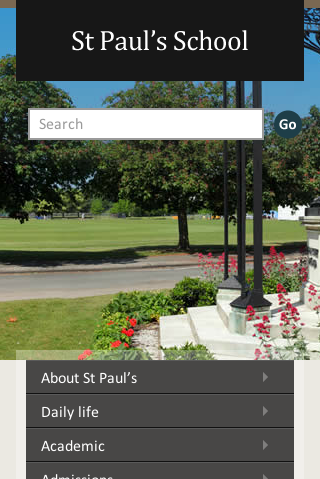
This is perhaps where I can be most critical of the design. Although it certainly looks good, there is a little too much imagery and not enough functionality. You can only see the top part of the navigation bar, and the content is lost well below the fold. This could easily be remedied by moving the navigation bar up nearer the search box.
Having said that, the end user can still access everything they might want to see, and with relative ease.
Key Takeaways
Having examined these five sites, I am left with the following thoughts:
- Responsive design always requires sacrifice and an alteration of the user experience – dangerous ground to tread upon.
- Many responsive designers seem to (perhaps subconsciously) prioritize aesthetic appeal over functionality.
- Responsive design can improve the user experience, but always at cost. The key is in whether or not the “net return” in terms of user experience is positive or negative.
- Many responsive designers are seemingly against giving users the option to switch to the desktop design.
What are your thoughts? Do you have other examples of responsive design that you would like to share with us? Let us know in the comments section!

0 Comments