There comes a point at which you can no longer say, “I had a bumper choice of themes to choose from this month.” There comes a point a which a huge number of candidates comes to be the norm. That seems to now be the case.
So instead I can say to you that I had an average number of themes to choose from this month. While that may not sound quite as exciting, the fact that awesome themes now seem to be the norm is pretty awesome in my opinion. Enjoy!
5. Quintus
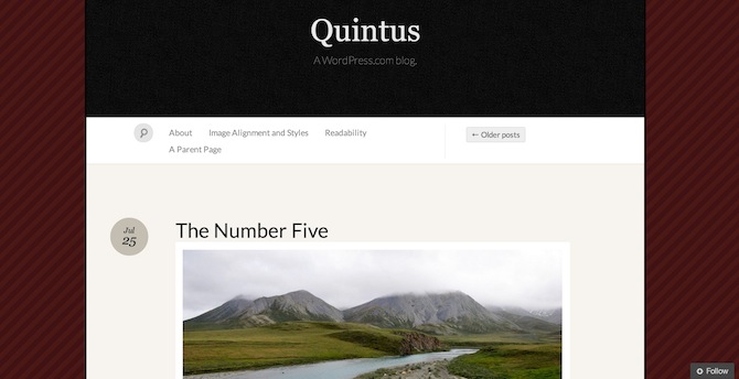
The folks over at Automattic have been busy — this is the first of two of their themes featured this month and I actually had no less than four to choose from.
Quintus offers a simple yet striking one-column design with “semi-academic graciousness and elegant typography” (at least, that’s what I read). It would be a great option for anyone with a personal blog, especially if you like to publish photos.
4. Delicacy
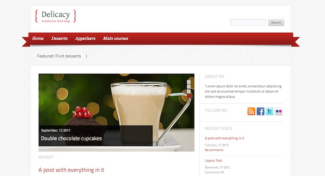
This is the highest-rated theme in this month’s list with an impressive 12 five star ratings at the time of writing. It’s clear to see why too — Delicacy is a clean and well-presented theme for food bloggers. Having said that, the developer claims that it can easily be adapted for other uses.
3. Chunk
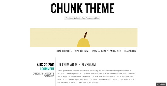
There’s something I really love about Automattic’s second featured theme this month but I can’t quite put my finger on it. It’s probably the extremely simple yet striking design with bold typography and ease of navigation. There’s a lot to like about keeping it simple and Chunk is an excellent example of that fact.
2. zeeNews
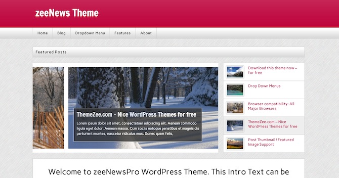
ThemeZee pop up on a pretty regular basis with good-looking themes and zeeNews is no exception. I’m sure that you can guess about the intended application for this theme and it doesn’t disappoint with extensive theme options, custom menus, custom widgets, custom page templates and more. That’s a whole lot of custom.
1. Infosource
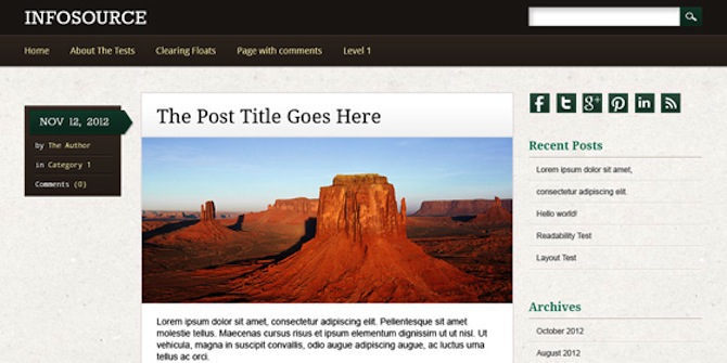
Finally we have this rather attractive theme which makes full use of your monitor’s available space. The three column layout allows for the traditional content + sidebar combo but you also get a natty post meta box to the left of the content. Infosource is clean and attractive and would be a fine option for any number of bloggers.

Matej
Are these Themes responsive? If they are not, they are not useful anymore.
Adele Kelly
Nice and clean designs. Like it. Have browsed several other sites and this one has by far the best suggestions.
Izdelava spletnih strani
I love that Chunk theme, I will probably buy it next time. Clean easy and fast. Best regards
Spletne Strani
Awesome themes, I wonder if all of them are responsive for Ipads and Cellphones. Best regards
sheet music
great selection of wp themes. will definately use some of your suggestions on my sites. grest job!
Prehrana
Thanks for sharing your post. I really enjoyed it. 😉
Izdelava Spletne
My favorite is delicasy. I may use it on one of my cooking/culinary sites where I show various recipes. However, I must say that all other templates look great as well. 2nd favorite is Quintus 😉
Spletne strani
Nice collection. My favourite is Swift Themes, because the free version does more than other themes…
Akhil
Excellent themes. Good choice.
Haisbur Rahman
Very nice WordPress Template Collection.Thanks!
Tom Ewer
No problem Haisbur 🙂
Wordpress Questions
Any programming issues related to this theme can be addressed here at itdost.com
Izdelava Strani
Nice collection. Infosource looks nice, maybe I’ll try it.
Allii Allee
awesome collection love zeeNews theme
Harshh Vardhan
Nice post. I personally like Swift Themes, the free version does a lot more than other premium themes out there 😉
Darnell Jackson
Good list
I’d say #3’s my fav.
PS
I don’t know why John is saying responsive design is not worth it.
Everyone is moving to mobile.
Charley Chris
Fantastic collection. Lemme pick the top three according to my taste:
1. Delicacy
2. Zee
3. Infosource
I’m gonna experiment with the top two on one of my niche sites :-).