Recently we rolled out mirror version of the current ManageWP Orion. While we still work on some core features – the feedback we received so far on the design process of Orion is overwhelming. Let’s talk how we’ve got to the point where are we now with the overall user experience and user interface.

You ask us from time to time about the various changes in the Orion interface: the reasons why we settled on this UI, how we made a number of UX decisions, where that cute little robot mascot came from, etc. That’s why we decided to talk a little about why things in ManageWP Orion are the way they are right now, how your feedback helped shape the interface (thank you Carrie for the mention), and what the future holds from the design perspective.
Reinventing ManageWP According to Your Needs
We wanted to design ManageWP Orion around your needs; more importantly, around your activities. Earlier in January we wrote what was, and still is, the baseline for our design decisions.
We tried various approaches and product processes, but we still didn’t hit the “perfect” one (if there’s such a thing) for our ManageWP development and design workflow. However, over time we made progress in the right direction.

The main reason why we needed Orion in the first place is that the current version of ManageWP cannot be adjusted to the new challenges and changes we wanted to introduce on the market.
A facelift wouldn’t do the job. We needed to rethink the flow. It’s flattering that other WordPress services on the market copied what we have in the Classic ManageWP version: it proved that what we built is valuable, but it also educated the users that WordPress website management can be less stressful.
“Reinventing the wheel is actually part of the gig. We need reinvention just as badly as we need conformity — arguably, even more.” — Cahill Puil
However, it’s a thin line between a copycat and an innovator. We consider ourselves as the latter – that’s why ManageWP Orion needs to push the WordPress website management market to the next level. With ten thousand WordPress professionals using our tool regularly, we have the perfect environment to experiment and come up with an ideal interface – we’re pretty sure we can do it right. Confused with the new user flow and not-so-typical interactions? You’re not alone, but bear with us.
Usability Analysis and Prototyping of Ideas
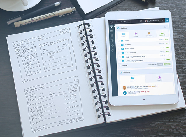
At first, we tried to turn everything upside down. By learning from the gaps in the workflow of our classic version, we tried our best to deliver the first batch of the tools and release Orion for the beta testers early in February 2015.
We brought several people aboard to boost product development and design teams. This resulted in a much better interface and flow altogether. Since then we worked on many concepts of the user interface and interactions. Those of you in the Orion beta certainly noticed how much we changed even a tiny UI details in the last couple of months (hint: scroll down to the video).
All those changes were not our whim. It’s something we built based on your feedback. Thank you.

And by feedback, we don’t mean just on “Can you please make X thing a bit more prominent?” or “Is there a chance to move Y to Z since that’s where “it is supposed” to be?” kind of things. Instead, we searched for underlying problems. In this case, neither of them were about making a button more prominent and moving main actions to the upper left corner.
The real problem was much deeper. We needed to redesign and rethink whole user flow to achieve better and effective workflow. While we do appreciate your loyalty, you are not really using our service to kill time. You want to achieve things easier, faster and with a smile on your face. With Orion, we are one step closer to achieve that.
Careful and Responsible Innovation
Our biggest problem were our predictions how users will interact and react on new interface changes. While there are common dark UI patterns to avoid while building web interfaces, we are picky and careful about “best UX practices”.
“You cannot design the user. Users are different. Some are able to easily use a website to perform their task. Other simply are not. The stimulation that a product provides depends on the individual user’s experience with similar products. UX depends not only on the product itself, but on the user and the situation in which they use the product.” — Helge Fredheim
The reason is that most of the studies fall apart when you do some usability tests with real users. That’s the time when you start creating your own “UX design baseline” for further design decisions. We’re guilty for some of those wrong predictions as well. We thought we knew how you would like to use it in some ideal scenario, but after involving you in discussion and evaluation – that was often far from the truth.
So, as soon as we moved from predictions to data, testing, feedback and analysis – we were capable of making better design decisions.
— Some of the user interface changes during the last few months of beta.
Anyone involved in the UX Design process is aware that personas are a great starting point. But they are just that – fictional users made to help us through the design process.
However, the more we speak with our audience, the better personas we can have. Many startups and companies are failing to define their target audience. Thanks to our beta testers, we evaded that pitfall.
Looking to the Future
As a user, you have a goal. The less you think about how to achieve it, the more likely is that you’ll do it. That’s why we are not trying to design for individual preferences. If we design for the individual today, that design would fail tomorrow. And with Orion, we are here to stay.
“The more something is tailored for the particular likes, dislikes, skills, and needs of a particular target population, the less likely it will be appropriate for others. — Don Norman“
We rather design for activities. Instead of analyzing specific small and disruptive tasks, we try to focus on activities of meaningful, goal-oriented actions. Those that will have the biggest impact on all users, and we’ll deal with pixel perfect things just a little bit later. By shifting our mindset to that approach, we are confident that we can make the best management tool out there. Together with you, who needs it the most.
As people, we don’t like changes, even if we would like them and encourage them to happen – once things change, we tend to not like it for a short period of time. Take any one of the big players out there (Facebook, Google, you name it) and how people tend to disagree with the tiniest UI change, until they get used to it and adapt to, most of the times – a better and improved interface.
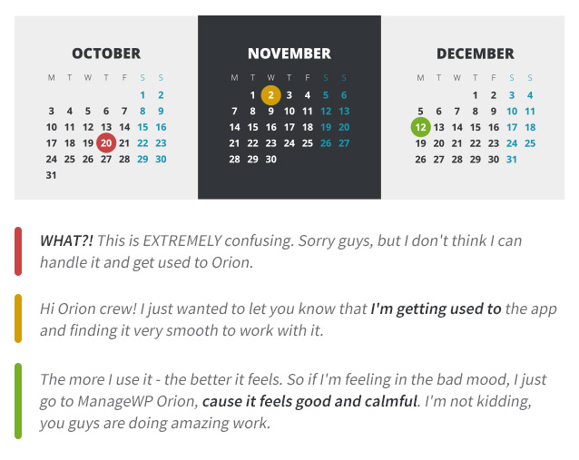
We noticed that pattern with the Orion UI changes and the feedback we’re receiving. For the people who were finding it confusing at first, the story usually went like this:

— Actual feedback from one of our beta testers.
To wrap it up – activities, robustness and integrity are our core design principles. Everything else falls into one of those categories. We encourage you to give yourself some time to get used to our new Orion UI. If after a couple of weeks you still don’t see the benefit and improvements over the current version of ManageWP – we would be happy to hear from you. Give us a shout and let us know your opinion, so we can figure out what bothers you and how we can fix that on a larger scale.
We believe that we’re truly on a mission to provide you with the tools you really need, and further evolve the website management concept. Want to join us on the ride? Sign up and let’s build something together.

0 Comments