While a personalized approach is essential in delivering engaging and positive customer experiences, it can be challenging to maintain that personal touch at scale. We understand just how important is to strike a perfect balance between personalization and automatization that inevitably arrives with scaling your business.
That is why we decided to further invest in improving our Client Reports and offer you more options that will help you deliver an even better customer experience to your clients. I am pleased to officially announce the Beta release of our new, redesigned Client Report experience.
Client reports redesigned
We did more than just give the new report simple facelift. It was rebuilt from scratch, improved significantly and what’s best about it – all of that was mostly driven by your requests and feedback. While we cannot grant every wish out there, we’re delighted that we will be finally fulfilling at least some of them.
In this post, I’ll walk you through some of the changes and show you how you can use the new options to further improve communication with your clients and reinforce your brand image.
What is new?
We added a couple of new features and customization options, all neatly packed up in that easy-to-use interface that you are already accustomed to.
New format & style
While the initial idea behind the landscape design of the existing client reports were the landscape-oriented screens we mostly use, an overwhelming number of users asked for the portrait version of the client report. The new report template was built in portrait mode, with a modern design and numerous customization options.
Let me dive into some of those and show you how you can use them to customize the report, reinforce your brand, and even further personalize communication with your clients.
New branding & customization options
Custom cover page
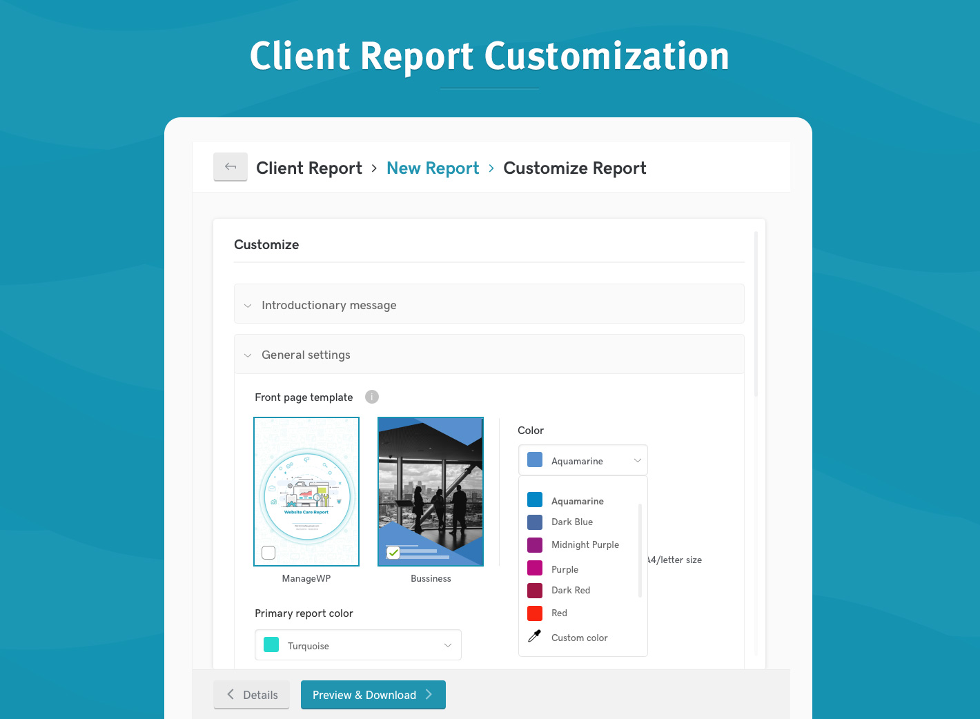
You now have multiple options for the front page of the client report. You can use the default design page or chose to upload your own image and color that matches your brand.
Yes, you read it right. You can now upload ANY design that you would like to be on the front page of the client report.
Improvements to introduction and closing messages
Introductory and closing messages now support not only the placeholders you can use to auto-insert the client’s name or the name of the website, but also the additional markdown options. This will allow you to better format the message, emphasize key elements and even add links or images.
We also added support for multiple logos (up to 3), enabling you to add your client’s logo in addition to your own.
Color and font options
The main report color is used for key elements such as headings and icons. It is important to mention that the front page color can be different from the main color of the report and that you are free to use any combination that you like.
There are 2 font options for the new report; regular & condensed. While we might expand that in the future, the condensed option now allows you to add 30% more information on the same view space.
Customizable header and footer
Header and footer can now be further customized by either using the default placeholders, adding new ones or simply typing in any text you would like to see there. Whether you would like this place to show the website name, company, clients name or something else entirely – it is totally up to you.
And you even have the option to customize the header background by either choosing a pattern, a solid color or no color at all.
Localization
New report beta release will support all the languages that the old design currently supports. You can get the exact list of supported languages by either testing the report or reading our blog post from last year.
While these options allow you to improve the look and feel of the report and align it more with your brand, we added some new functionalities as well.
New options
Select section order
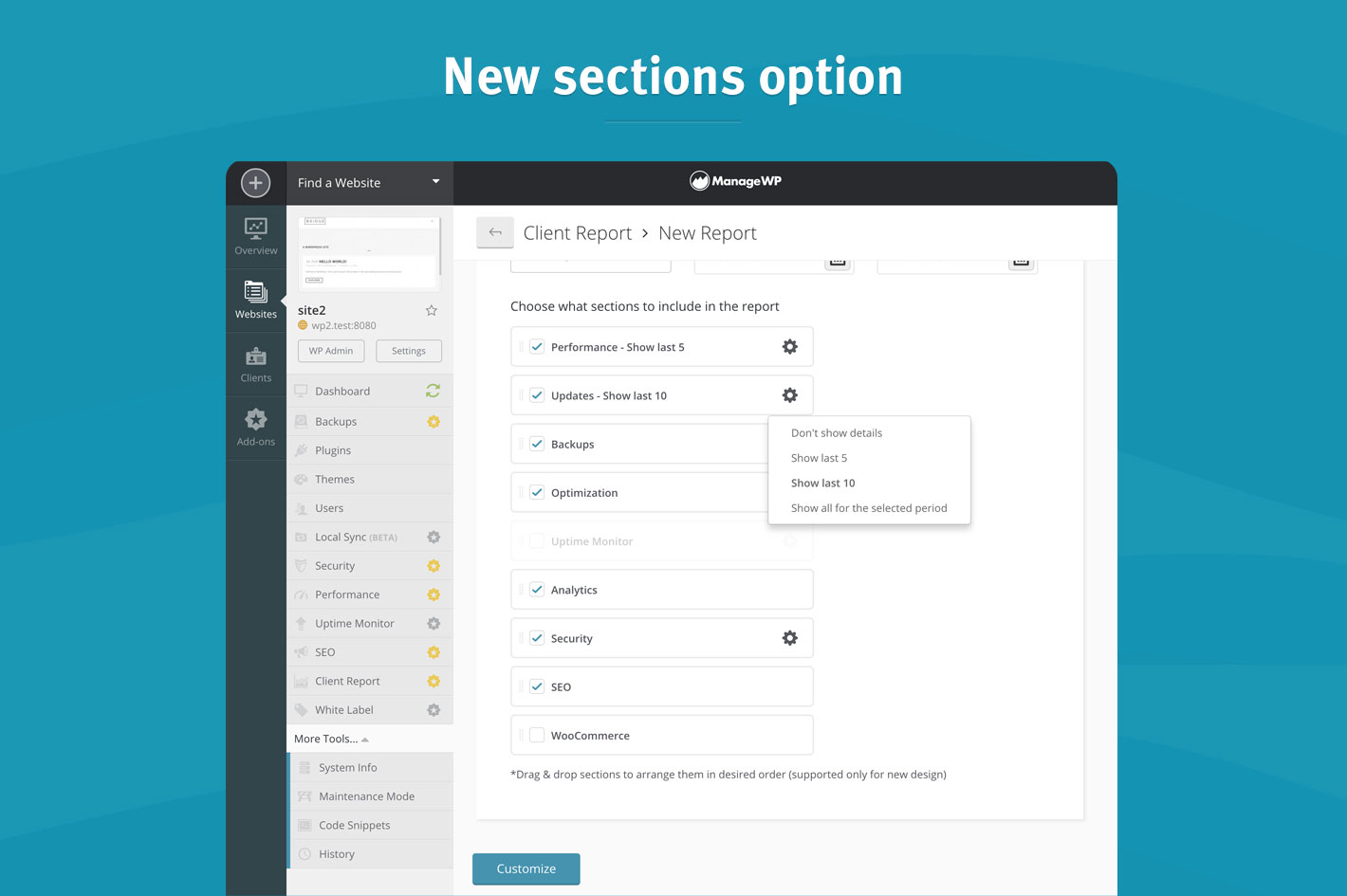
Gone are the recognizable blue section icons in favor of our new functionality – ability to change the section order. You can now reorder sections any way you like by simply dragging them to the positions of your choice.
Number of items per section
We added support for multiple options regarding this subject. You can choose to include/exclude all the events for the chosen data range or limit the number of items in the report to the last 5 or 10 items.

What’s coming?
That’s NOT all folks! We’re planning to continue improving this feature and already have a few ideas for the next release:
Based on your feedback and requests we’re planning to add support for the ‘custom text field‘ that you can use to showcase all your additional work for your clients that is currently not show through the client reports. Whether you are looking to include some plugin updates done outside of ManageWP or to show your development hours for some custom work, this will be a perfect place to list it all.
We’re still working on the final solution so there is plenty of time to suggest what would work best for you. A custom text field that will be added to manual reports? Nested table with fixed columns to show the work done, description, time spent and cost? A field that will be imported with automated report at the end of the month? Share what would work best with your current workflow.
And next on our radar is the compact mode. Version of the report specifically designed to show just the main highlights without going into too many details.
This is definitely not everything that we’ve planned for future releases, but we do not want to spoil the surprise.
How can I try it out?
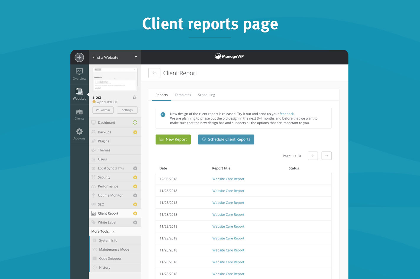
1. Log into your ManageWP account and head over to the Client Report section.
2. Choose to create a new report and the new design template will be selected by default.

From there, feel free to test the new options and experiment. In case you need more detailed information on any of the mentioned options, head over to our User Guide and dive into more in-depth explanations.
We hope that the new options will help you to better personalize the communication with your clients and further align the reports with your brand.
Wrapping up
New Client Report template will be available under the same conditions as the older version. We wanted to improve the value you are getting out of it while keeping the costs at the same level. Client Report will be remain at $1/month per website, with bundle options available as well.
We are planning to phase out the old design in the next 3-4 months (March 2019). After that period, it will be impossible to generate or send a report with the old layout.
Make sure to test out the new design and let us know what you think so we can make sure that the new design supports all the features that are important to you and you are adequately prepared for the switch.
We are looking forward to your feedback, ideas, or any suggestions you may have.


Jonathan Nicol
I like the changes, but the design is still too opinionated to show to our clients. Some changes that would allow templates to be more austere:
– An option for for a text-only cover page and/or an option to remove the cover page entirely.
– An option to remove the icons that appear at the top of each page. I imagine that for most people the icons are fine, but for our studio they are off brand: we would not use icons in this type of report.
– An option to remove the green ticks and/or change their colour.
– An option to choose the text colour.
– An option to choose the typeface.
– The coloured bar at the bottom of the template serves no practical purpose? I would like to see an option to hide it, or simply remove from the template design altogether.
What I’m shooting for is a black and white report, with a minimum of design flourishes. Minimal!
Thank you for considering my suggestions.
Melanie Richards
Your link to the user guide is broken: https://managewp.com/guide/clients/client-report/new-design
Marko Tanaskovic
Updated. Thank you so much for reporting this!
Marijn Achterkamp
Like the new front page customization options but for clients that have more then one site in the report I still get a quirky front page without any customization option…
Marko Tanaskovic
Hi Marijn, can I ask you to send us an example through our Send Feedback form? Screenshot with a bit more information?
It would really help us to fix whatever is not working properly.
Nathan Duvall
Hey guys, we’re liking the custom front page template, but is there not a way to remove the top and bottom triangles? It’s kinda jacking with the design we’re trying to implement. If those can be removed somehow, we’d be happy.
Debbie
Loving the new reports so far! Will it be possible to specify the URL shown on the cover page? For example for a site that has the url of example.com/wordpress instead of that url displaying have it be example.com? Or if I’m missing how to specify that please let me know, thanks much!
Ryan
I would love it if the future custom field option could be a list of items. Like, jobs completed during the month. Everytime I do a small job for the client, I could go into ManageWP and add the task and date completed to the list. Whenever the next scheduled report goes out, it grabs those list items and includes it in the report, then empties the custom field. So its sort of like a cumulative list we can load up over the week/fortnight/month and auto includes in the report. Hope that makes sense!
Marko Tanaskovic
Hi Ryan, that is exactly one of the options that we are considering. Feedback such as this allow us to deliver solutions that match what you need. So, thank you for sharing.
Mark
Nice work. This is definitely a step in the right direction. Well done 🙂
Steve
Love it guys! In many cases the report is one of the fe touch points that I have with clients so these are some fantastic improvements. Keep up the great work