5 Reasons Why Responsive Design Is Not Worth It

10 Reasons Why Responsive Design Is Not Worth It


UPDATE (April 2014): After the huge debate this original post created, we decided to refine and build upon the original article, bearing in mind the thoughts of some very insightful feedback left by some commenters. You can find the new article here.

UPDATE (March 2018): Some of the comments are not taking into consideration that the market has greatly changed since 2012, and responsive today is practically mandatory. Please keep that in mind before raging in the comment section.

“We’re just now starting to think about mobile first and desktop second for a lot of our products.” ~ Kate Aronowitz, Design Director, Facebook

“[The shift to mobile design] is even bigger than the PC revolution.” ~ Kevin Lynch, CTO, Adobe


In 2014, more people will be using mobile devices to access the internet than desktop PCs. Accessibility for mobile devices has become a huge priority for web developers.

Responsive design is seemingly universally accepted as the way forward, but I am far from convinced. Today I am going to explain why I believe that responsive design is not always the optimal solution for web design. Check out our web design case study.

What is Responsive Design?

Wikipedia describes responsive design as follows:

Responsive Web Design essentially indicates that a web site is crafted to use Cascading Style Sheets 3 media queries…with fluid proportion-based grids, to adapt the layout to the viewing environment, and probably also use flexible images. As a result, users across a broad range of devices and browsers will have access to a single source of content, laid out so as to be easy to read and navigate with a minimum of resizing, panning, and scrolling.

So from one platform to the next, the design of a site will adjust based upon the device’s particular resolution and/or screen size restraints. By the above definition, responsive design seems like a sensible move for web design.

A Caveat

I am about to explain why I think responsive design is not worth it under many circumstances. I am a fan of responsive (or alternative) design in certain situations — for example, when dealing with a web application whose desktop design could not practically be contained within a mobile device’s screen. Google Maps is an excellent example of this:
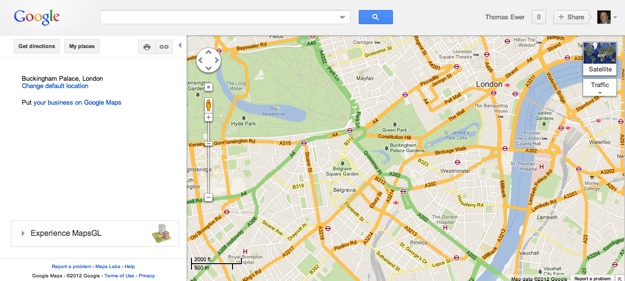

Google Maps (Desktop Display)
Desktop Display
Google Maps (Mobile Display)
Mobile display

Sites that rely heavily on images can also be good candidates for responsive design. But when it comes down to the vast majority of text-driven websites and blogs, I believe that responsive design is, quite frankly, a waste of time. Here’s why.

1. It Defeats User Expectation

The first rule in usability 101 is to give the end user what they expect. There is no worse cardinal sin in web design than confusing the end user. And yet that is exactly what responsive design can do.

Take blogs as an example. There is a widely accepted “standard” design for blogs — header up top, content to one side, sidebar to the other. That basic design is repeated across literally millions of blogs because it is easy to navigate, and it is what people expect.

Unfortunately, if you visit one such blog that has been developed with a responsive design, that sidebar will almost definitely disappear. It may be re-jigged and moved to the top or bottom of the page, but one thing is for sure — it will not be where you were expecting it.

Take Cats Who Code as an example. Here is the desktop display, complete with a top navigation menu and sidebar that includes the latest posts, snippets and a search box, amongst other things:
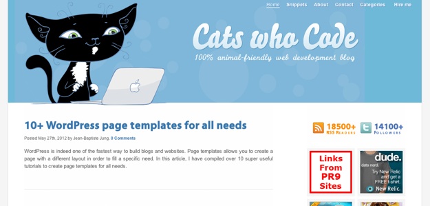
Cats Who Code (Desktop Display)

And now the responsive design on my iPhone:

Cats Who Code

Both the navigation menu and sidebar widgets have disappeared. After much scrolling I located the sidebar at the bottom of the page, but the navigation was nowhere to be seen.

Exponents of responsive design will argue that this is simply an example of poor responsive design (we’ll ignore the fact that this site was recently featured as having an “excellent” responsive web design). I would argue that this is an example of typical responsive web design. The most pertinent question is this — would I have preferred to see the desktop layout on my iPhone? The resounding answer is yes.

2. It Costs More and Takes Longer

Generally speaking, a responsive design is going to cost more than a non-responsive design. Resources are typically stretched as it is, so forking out an additional chunk of money for a responsive design is a painful experience.

One might argue that responsive design is a damn sight cheaper than building a separate mobile site from the ground up, and I would agree. But do you know what is even cheaper than responsive design? Non-responsive design.

And let’s not forget the extra time it will take to produce a responsive design, and the additional complications that will be involved.

It is easy to get carried away with the idea that not developing a responsive design is akin to sounding the death knell for your site. But ask yourself — how much of a return on your investment is a responsive design going to offer you? If you assume that a non-responsive design renders your website unusable for mobile users, it might seem like a no brainer, but that really isn’t the case. Which leads me onto my next point.

3. Non-Responsive Designs Usually Work

Let’s take a look at my own blog as viewed on my Mac:

Leaving Work Behind (Desktop Display)

So far, so good. My site is built upon the WooThemes Canvas theme, which at the time of writing is not responsive (it will be shortly however — eek).

Now let’s take a look at the site on my iPhone (to scale):
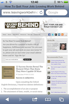
Leaving Work Behind

On my iPhone 4’s retina display this is perfectly readable and as the visitor would expect — and this is in portrait view. Remember that the above screenshot is a relatively low-quality JPG, and you are probably looking it at from 2-4 times the distance that you would if you had the phone in your hand.

But if the text is a little too small for your liking, just flip your device to landscape. Here’s another to scale screenshot of a post in landscape view:

Leaving Work Behind

Is anyone struggling to read that? Probably not, but if so, go ahead and double tap on the text — the iPhone will zoom in on the text content.

Leaving Work Behind

Here’s the thing folks — modern mobile devices are developed to display non-responsive website designs effectively, and for the most part, they do an excellent job. There will of course be exceptions that prove the rule, but such sites usually look terrible on a desktop PC too.

More often than not, a well designed desktop site will be perfectly readable on a mobile device, without you having to lift a finger to accommodate it.

4. There is Often No Load Time Benefit

One of the loudest arguments behind responsive design is that mobile devices are often operating on sub-broadband speed internet connections, so sites should be stripped down to ensure optimal load times.

It sounds like a sensible suggestion. There’s just one problem — many responsive designs don’t actually decrease the load time over their desktop counterparts. It is a habit of many designers to hide elements, but unfortunately this does not prevent them from being loaded. Whilst one can argue that this is simply bad practice, it is also common practice.

An optimal (and non-responsive) solution is to use lazy loading, which is essentially a trick in which you choose to load the most resource-intensive elements last. Here’s a snippet that enables you to lazy-load selected images on your site.

5. It’s a Compromise

That’s right folks — responsive design is a compromise. It is a subjective decision by the designer that the desktop display will not be optimal on mobile devices, followed up by a subjective decision as to what will be.

Briefly touching again on my first point, many mobile users will be left frustrated that it has been decided for them that they should be presented with a different design. Second rule in usability 101 — don’t make the user feel like they are not in control.

My point is this — is a compromise really any better than the perceived detrimental effect of loading a non-responsive design on a mobile platform? Especially when that compromise costs money and takes time to produce?

Wrapping Up

I wrote this article for two main reasons:

  1. I believe that responsive design is completely unnecessary in many circumstances
  2. There is a remarkable lack of arguments against responsive design on the internet

Nothing is perfect, and yet responsive design seems to get a free pass on constructive criticism for the most part.

I am not against the theory of responsive design. But I do see it used in so many situations where it is simply not necessary. A lot of people seem to be jumping on the responsive bandwagon just because it is the done thing. Perhaps you should take a moment to consider whether you really need a responsive design — whether it is truly in the best interests of your visitors.

Creative Commons photo courtesy of adactio

We compiled a list of free responsive themes for those who like responsive design, you can check it out here.

Tom Ewer

Tom Ewer is the founder of WordCandy.co. He has been a huge fan of WordPress since he first laid eyes on it, and has been writing educational and informative content for WordPress users since 2011. When he's not working, you're likely to find him outdoors somewhere – as far away from a screen as possible!

371 Comments

  1. MLA Web Design

    Responsive Design often means unnecessarily long load times for mobile users. There’s no “Desktop View.” You have a perfectly good website. You’re not getting a lot of mobile traffic. But still a wonderful tool.

  2. Tony

    I was making responsive and usable sites when this was originally written. The excuses used now and in retrospect, are just as ridiculous as the original article. I didn’t do things like make text columns stretch too wide then and people still make that mistake now. Responsive tools like grid systems have improved but this guy was clearly doing everything wrong and wrote this out of ignorance. The rules of usability and good design have not changed. The problems he had were amateur problems that he didn’t have the skills to resolve. Others certainly did.

    1. Marko Tanaskovic

      We do not disagree. Which is why we’ve added updates at the top of the article.

      UPDATE (March 2018): Some of the comments are not taking into consideration that the market has greatly changed since 2012, and responsive today is practically mandatory. Please keep that in mind before raging in the comment section.

  3. Hussain

    Well, I don’t mean to say you are wrong but I personally prefer responsive web design. It is proven to boost SEO without which maintaining traffic on a website is difficult. Also, mobile traffic is increasing day by day and if the design of the website is not user-friendly, the users will surely head to another website.

  4. Fred

    Well this guy got it wrong. And so why is it still on his site you ask? Because people like me see the title, disagree completely, click the link and realise its out of date. This page drives traffic because it is wrong. Cynical.

    1. Boogey

      Exactly! Perhaps now this discussion should evolve into how to deal with stale, old content like this. In other websites, responsible authors post updates to their past articles (usually with links to newer articles on the same topic), and they also lock comments.

  5. frank

    this website is currently responsive, whats your point

    1. Olli

      At least there’s still a comment section. Unlike all the news sites in my home country whereas it’s still available on the desktop version – which became completely unavailable on mobile despite explicitly requesting it on the browser, changing the user agent or resizing the pixels to make the site think I’m watching it on a giant screen.
      Responsive design isn’t a problem on itself, botching features is.

  6. Rod

    My wife’s site (900px wide) was built ten years ago with Xsite pro and resizes perfectly on iPads. Readable. Text too small on a mobile. I am assuming that the latest iPads are rendering non-responsive website automatically???

  7. Nick da Costa

    Responsive is waste of time since it forces compromise and requires designers to struggle with one size fits all. I use an earlier version of Adobe Muse that allows you to design separately for desktop, tablet and phone, so you can design what’s best for each. It’s actually quite quick since – once you’ve done one (I start with phone) you just copy and paste elements to the others and quickly resize. My website is no great model but you will see that each design is optimised for the platform. So I have resisted the Adobe upgrades to responsive

  8. Po

    Hi, I agree to some point, but if you have a well designed Mobile Ready Website, it doesn’t necessarily have to follow the Desktop layout for people to know how to navigate through entire website, like collapsible Nav that sticks to the top after a certain point. Does it take longer to develop? Yes, but only initially, since features like that don’t usually change.
    As though you’re talking about how it’s outside of users’ expectations. As far as that’s concern, people already got use to having less information shown at a time on a phone, and People sometimes writes a separate copy for Mobile, just so everything is nice and condensed, but the information will still be delivered on point. It just depends on how you make of it.
    Smaller Copies are usually better, since users’ attention span aren’t all that great. Just give them what they want quickly, and less about spamming your keywords by expanding your copy.
    If you’re going to say that making changes to the website like copies and stuff takes more time too, I would argue that a well developed Responsive design will take no more time than a non-responsive one. Everything just takes a little longer in the first initial stage of the website building.

  9. results.nic.in

    Well i respect your opinion but when i do open your website in mobile or tablet it looks like crap. sorry but its the truth. On some points i do agree with you but most of them i don’t.

  10. Mike

    You’re totally wrong on this. Your website looks awful on a mobile. You mention usability, however novices struggle using a smartphone to display a non-responsive site that’s cramped. Firstly the text is too small, and also the user experience of zooming in and messing around to find what you want is difficult. Scrolling up and down is much easier, when the website has responsively re-sized.

    Your argument against responsive websites it to show BAD responsive websites. I could argue against anything by pointing out only the bad.

    Your other argument is cost. Well the amount of money lost, if you’re a business, more than the cost of designing a responsive site. The problem is that most graphic designers know nothing about designing a website for different screen sizes (or browser widths). If someone resizes a browser on a desktop, it’s also useful if it’s responsive.

    The top websites in the world use responsive layouts, or design for mobile first. These people have billions of dollars flying round… they can therefore hire the best people in the world. So no offence, but they are better than you, and they are better than me. Let’s not get arrogant and assume we know better than the best in the field!

    1. Nevena Tomovic

      Mike,

      This article was written 5 years ago, which in tech is a decade 🙂 A lot has changed.

      1. Krzysztof

        I still think, even after a “tech decade”, that responsive design is sth stupid

  11. Marc H.

    Wow!
    I stumbled upon this article and actually spend a lot of time reading comments and the other article.
    5 years after this statement, it is really interesting to see how quickly things changed and perceptions of the customer alters.
    Best regards,
    Marc

  12. Scott

    I’m surprised this old article is still online 😀 Responsive design gets an automatic push up in mobile searches above your competition not opting for mobile friendliness, and if you work in web everyday and produce websites every month, you can do it fast and efficiently and is easily inserted into your workflow as you go from PSD to code. The thing to remember is a mobile experience is a mobile experience and a desktop experience is a desktop experience – neither expect the experience of the other, at least anyone who’s younger than 50 maybe?

  13. Website Design Coimbatore

    In responsive designs, some of the designs are not worth because It Defeats User Expectation, Non-Responsive Designs Usually Work, It Costs More and Takes Longer etc….

  14. Nathan

    Part of the problem here is something that I’ve encountered in the past. Many people think you can improve the experience simply by making it responsive, shoving content into containers, and using a few default tricks built into a framework like bootstrap. This misses the point. These frameworks came as a product of trying making the experience better. Tools were developed as a result of a design and experience need. However, now that the tools are available, many people think they can just shove things into containers, call it responsive, and state to their client that they’ve created a top-tier experience without doing any research. This is wrong. Responsive tools are the way to make executing a design easier, not the design itself.

    Design is, or should be, human-centered. There can be a difference between a business wants the client to see and what the user needs to see. A 2/3, 1/3 layout like you have above is a design where the information on left is more important than the information on the right. Therefore, you can shift the info on the left below so it is the 1) the second thing they see, or 2) they last thing they see when scrolling. Your bio information is not the reason they came to the site. The content is. If this information is something critical to consuming the content, there are other responsive design tactics available to make sure the user has access to this information at any time. The importance here is the information hierarchy. There’s a difference between what you “want” a visitor to see and what they came to your site to see.

    On the point of designing for your user, mobile first is a development strategy in responsive websites. It makes you life easier and reduces the necessary number media queries greatly. It can be but does not have to be a design strategy. If 90% of your traffic is going to come from a mobile device, the best strategy is to design mobile first. However, if your visitors are largely going to be on their computer, which is the case with many enterprise apps and internal sites, then you can design the desktop first. This is far more challenging and the code is much heavier, but the idea is to optimize the experience for the end-user.

    Finally, there’s one big reason to design and develop for mobile outside of the end-user experience. Search engines are slowly optimizing search to penalize sites that are not optimized. If you ever want a hope in getting more visitors you need mobile optimization built in to your site.

  15. Terri

    Great post! I’m now going to turn off the responsive design view on my blog. I needed some convincing and you’ve done this topic justice. I personally like the desktop view much better, especially considering my blog’s content and set up.

  16. MaxHongChen

    Please be advised that:
    1. Your website is also responsive.
    2. In mobile view i cant find the comment section properly
    3. The whole comments are loaded that is unnecessary for me coz using mobile data and takes time to load in slow connection
    4. First please make your website better before suggesting others.

    Please reply

  17. Jules

    Are there any Responsive Design sites that allow re-sizing WITHOUT re-positioning?

    Often I want to reduce the size of a Window to show one element of the page (an article, maybe some FX rates or something).
    The last thing I need is for my selected content to shuffle up, down, sideways – anywhere out of view.
    Yet that is what RWD seems to do.

    I would much prefer a mobile site to be similar in appearance AND layout to the desktop site – so that I can find stuff quickly. By changing layout, RWD makes navigation around a site inconsistent so slower.

    “Mobile FIrst” design approach has dumbed-down sites that are best used on desktops (e.g. comparison shopping, financial products – in fact anything “serious”)
    Typically a mobile-first site has HUGE monotone slabs, over-sized text (often combined with much smaller text, making re-focussing harder).

    Perhaps the worst aspect is that mobile-first sites make the User “work” – by forcing scrolling – often through a load of unwanted stuff.
    By contrast, Menu and Contents driven navigation means LESS work – clicking ONLY on relevant stuff.

    Also, visual clues to aid navigation have been stripped away (e.g. borders, shading, colour etc)
    Menu Bars have fewer items (often in plain, passive-looking text). Contents lists removed – yet these are the very elements that provide context and invite exploration.

    The sooner that design-led” Mobile-First” is dropped in favour of User-driven content and navigation, the better.

  18. mobibob

    The haters in the comment section missed a lot of his message — chill. First, you cleaver detectives who found out that his website is responsive, he stated that is was not, “at the time of the writing” (2014) and he expected it to become responsive in the future. Nobody is arguing that RWD and mobile first aren’t increasing in demand, but it should be considered in light of an overall mobile strategy. Imagine this from 2014, It is now 2016 and there is a lot of talk that the website is going to be irrelevant when the Physical Web is fully adopted and +90% of traffic is a personalized mobile experience. Websites will be relegated to being web services to the mobile experience. Desktop browsers and laptops will be the new relics, commanding a niche, multi-billion industry but consolidated to a few players from Asia. I was never a fan of RWD hysteria, but I do accept its place in society.

  19. Responsive Guest

    Please delete this post. The amount of ignorance is to damn high!

    1. Another Responsive Guess

      Haha I was thinking the exact same thung. I believe only number 4 is still applicable to today. This article seems to have been written in a time when responsive sites were just coming out (just look at that old version of iOS!)

    2. Hill

      Not only do you disagree, but you want it removed so that nobody ELSE can disagree with you. Might I point out how annoying it is that I’m typing the comment in 25-POINT FONT????????????

  20. Mobile First Responsive

    Hi Tom,

    I know this article was written a few years ago, just wondering what your thoughts are now on this topic as responsive design has definitely become a mainstay. I am not trying to combat anything you have said in this article because it is always good to question things. I will however point out that (as I put in my name field) Mobile First Web Design is now becoming a huge movement. It is ever so important for mobile users to feel comfortable with a site and be able to navigate and consume the content effortlessly.

    Anyways, looking forward to hearing your thoughts on this topic at the present time!

  21. Major Critic

    That’s an excuse. You’re rather trying to attract attention, not making points.

  22. Major Critic

    This feels like you wrote the article just to attract attention rather than throwing facts. This blog, for example, is using responsive design (I’m commenting from a small smartphone and it fits perfectly) and I’m just wondering why you couldn’t use non-responsive design on it if you really thought it’s what users want.

  23. Mike Boardley

    Your points are terrible and they seem more like an excuses.

    Here is the #1 argument against your article. Using a site built for desktops on a mobile phone is a HORRIBLE experience for the user.
    How many times have you had to pinch to zoom in to read text or click a link? Have you ever used a site that uses a jQuery Lightbox on a mobile phone and the modal window is too wide for the browser window and as you try and scroll the modal is working against you trying to center itself?

    The bar is being raised on website design and development. The learning curve is much higher. Good Front End Development requires modern tools like SASS / LESS and a build system like GULP or GRUNT. Even in 2016 many people aren’t doing responsive design properly. I come across sites on a regular basis that are not done well and poorly put together.

    I love responsive design because it allows us greater control over the layouts and experiences across devices. The challenge is to create new conventions that are more user friendly and innovative.

    1. Jules

      Pinch & Zoom ?
      What’s wrong with that ?
      Websites that disable P & Z are really annoying – dictating how the Visitor shoudl view the site.

      I would much rather visit a familiar desktop version – and navigate around easily rather than scrolling endlessly, having to guess where an item is in a looooong page.

      But worse – RWD is the tail wagging the dog.
      I hate it when re-sizig my browser window, the site then decides I am viewing via mobile – so removes the Menu bar and shuffles content into a single loooong column.
      That is HORRIBLE and DISRESPECTFUL

  24. Simon

    Though I use responsive design, a lot of the points raised here are valid ones. I can only speak from my own experience, some sites are so heavy with their media queries that the pages are simply too slow to render, making me cose the site and move on – which kinda defeats the whole point.

    Working in web design, one of the most common complaints from clients is their site looks different when viewing on a tablet to their laptop/desktop. One client wanted a consistent look across all devices, so we had to remove all media queries. This brings me to my point, I’m no responsive design hater, I use it, but I’ve discovered over time it’s often used because the designer wants it there, not the client. As developers / designers, we have to work to spec, it is not for us to dictate how it’s done. I always present the website in the same way when mocking up, three designs, laptop, tablet, mobile. I have yet to come across a client who doesn’t ask why there are three designs to their site. When I explain why they always look displeased, then ask the same question “Why can’t the design be consistent over everything”. To which I reply, “It will be, it will just display different on each device” – which is a complete contradiction to what they want!

    Tablets and mobiles do an excellent job with displaying sites, people are comfortable zooming in and out, the very nature of a tablet or mobile – which leads to my question – why bother? Client doesn’t want it. Just who are we designing for here? I still use RD, but have eased off a lot, just a few changes here and there. It won’t stick around. Once someone comes up with an idea to display effectively across all devices, the RD will be straight out the window.

  25. Nishant

    Great article, I agreed with you definitely non-responsive website cost lesser than responsive. Making our non-responsive website as a mobile friendly is great approach it will save money and time both. I hope whatever the pit falls in responsive design will get better solution in future because most of the designers working on responsive sites.
    Thanks

  26. Marcus

    While my response is somewhat late, I agree with many points in this article. As someone who is currently building a portfolio, I have plans on designing my sites with two or three breaking points. I have no intention of making my sites fully responsive. If you are a ‘true’ graphic designer, you can design page content that doesn’t require resizing. Designers should focus on maybe two to three breaking points; however, the breaking points do not have to change size for each device. Plus, many responsive site designers forget about leaving room for finger navigation.

    Desktop and tablets can carry the same design layout. As you mentioned in the article, the ability to turn a device sideways is always overlooked. I am going to be a big prediction. Within the very near future, cellphones will restrict ‘web browsing’ to the landscape view. Its all about practicality.

    Finally, responsive design is not the final destination. Prior to the rise of responsive design, we jumped from table based sites to div based sites. Even though responsive sites are currently trending, the reality is that someone is already thinking of a better solution. No one should be married to one idea. People need to keep experimenting.

  27. Alex Radcliffe

    This article was written in 2012 and it is now 2016. I can’t be critical of the author because there were some poor approaches to responsive design in its infancy, but the best approach to responsive design is now quite refined and for the most part universal now and if this article was written in 2016, I would disagree with everything he said.

    His first point was that the navigation disappears with responsive design. One of the primary reasons for responsive design is so that navigation is front and center on all screen sizes. If built for a desktop when small screen devices are used, you usually won’t even see all the navigation unless you either zoom out and make the navigation often to tiny to read or you pan around to find it. With responsive design, navigation always fits the device and much easier for the user.

    His second point that it takes longer and cost more to develop. In 2016, the opposite is true. It would take longer and cost more to try to develop a website that is not responsive but still functions well and maintains its aesthetic qualities across the over 100 commonly used screen sizes; an engineering nightmare. Responsive web development is not difficult now days thanks to libraries or frameworks such as bootstrap 3 among others.

    His third point is that non responsive websites usually work. That depends on what your standards are. If you believe “work” means that they can find and see your website, true, non responsive usually does work. But if you define “work” as your website being equally beautiful, functional, and readable regardless of the device or screen size being used, then most of the time a non responsive website is not going to work.

    His fourth point is that responsive design has no load time benefit. Load time concerns should be addressed but responsive web design is meant to solve other issues. However, anyone developing with responsive design has mobile devices in mind and therefore will be concerned with load time as well. He is not saying this, but a lot of people who are not technical will misconstrue his statements to mean that their website that was built before mobile devices became mainstream is fine with load times because responsive design is not going to make it any better. Considering what I just said, that is far from true.

    His fifth point is that there is a compromise. I suppose he is talking about the old days when developers had to guess at the likely screen sizes so the website is never going to look perfect on every device or screen size anyway. The grid system used today changes that. The point of responsive design is to assure that the website is equally beautiful, functional, and readable on all devices and screen sizes and anything less than that is not ok so I don’t see any compromise.

    Alex Radcliffe, Software Engineer
    designdevelopwebsites.com

    1. Jules

      “With responsive design, navigation always fits the device and much easier for the user.”

      Really ?
      In my experience, RWD removes (or redcues) visible navigation. How is that “easier for the user”?

      But worse RWD doesn’t respond to the device – it responds to window size.
      i.e. if a Desktop User resizes a webpage to do work alongside – RWD shuffles content around (mainly down) and hides Menu items.
      How is THAT easier for the User ????

  28. Biondo Creative

    This article is totally wrong, now responsive design is a must.

  29. nikki

    LOLOLOLOLOL IS THIS GUY SERIOUS?! YOUR ENTIRE SITE IS RESPONSIVE!!!!!!!!!!!!!

    1. Tj

      haha, this article is from 2012. I think the dude has come around to responsive design since then. It was always going to happen. his arguments are completely outdated.

      1. Liz

        His website is responsive. I just checked it out.

        1. Jules

          Try reading the whole article …..
          The author said:
          >>
          My site is built upon the WooThemes Canvas theme, which at the time of writing is not responsive (it will be shortly however — eek).
          <<
          i.e. This site wasn't Responsive when he wrote the article … and "eek" suggests he wasn't lookign forward to the imposition.

  30. AVDev

    This article is so inane and ignorant that reading it literally made me angry. That’s all I’m going to say, otherwise I may get myself in trouble.

  31. Corey

    Your post is a joke considering:
    A) Your site is responsive
    B) Your site uses media queries
    C) Your site is responsive
    D) Your site uses media queries

  32. Alexander Melvin Kao

    I agree with the author. Most people don’t realize that media queries are not needed. To make a website html and css mobile and desktop friendly just wrap the whole site in a div tag with a style that contains min-width 100% , position:absolute, and white-space:nowrap. Also make sure your elements within the page are all fixed width. Javascript compatibility is much more complex.

    1. Ralph

      FAIL!!!

  33. FredSandord

    It drives me nuts that pinch and zoom is now looked down upon. It is powerful and more responsive than any responsive design can be.
    We have a full layout where more content can fit. We can move around the page and zoom in and out…. OR we can have some piece of crap design where everything is hidden behind endless slide outs, tabs and stacking making the user scroll forever to get anywhere or find anything. It is a joke and google should be ashamed for pushing people to dumb down their layouts. They are only reducing rank when somebody search from mobile but still. With the advent of 1080p+ mobile screens there is no need for this responsive garbage. How many times have you wished you could just view the full desktop site and couldn’t?

    1. Paul Allen

      Hahaha when you’re ready to step into 2015 it’s waiting right here buddy.

      (I do hope you are joking though)

      1. Michael Walls

        FREDSANFORD – you’re spot on. There will never be a shortage of newbies who follow the leader, but one size fits all has never worked. “Flex design” was similar and came and went about 15 years ago. There were no data phones then so there was no reason to scale down. You absolutely cannot fit any volume of meaningful content on a clamshell phone, and Google appears to demand you be compatible with the lowest common denominator.

        If you are rebuilding an existing site, read usage stats from the server to decide what screens to target as primary. The majority of my clients are business, and their usage averages 9 to 1 desktop. If my clients were pizza shops, etc I would focus more on mobile. But for now, “responsive design” is WAY too slow and limited. I have been in this business for 21 years.

  34. Steven Lutz

    The arguments sound like someone defending his inability to design responsively. I can see no reason once you have a good grasp and are willing to take the time not to use it.

    Also, as of July 21st 2015, Google has announced that non-mobile friendly sites will decrease in the sites search engine rankings as now more than 40% of their requests are coming from mobile devices. They do not want to return results to users that are going to be a frustrating experience once they click the link.

    I am just now adding another media query point to my own site to enhance it’s mobile and responsive ability. Is it worth it? It is if I ever want to design for another person that appreciates acre on good design.

    Steven Lutz

    1. Bonnie Jean

      I love this article. And to Steven Lutz – frankly you are so wrong. Your site is plain, boring and slow.

  35. Vern

    Very confused by the need to to warn anyone about “overuse” of the responsive design process. Those who use it effectively and correctly know it’s strengths and weaknesses. You don’t have to explain those issues.

    Much of the complaints are based on fixable problems. They can be changed to create the desired behavior. The disappearing sidebar? Bugged me as well. If it’s a problem I just put the dang thing wherever you want it. Change the ordering and flow of stacked elements using flex or other options. There are ways to easily move blocks around outside of the document flow with responsive layouts for mobile. The “vanishing sidebar” incorrect stacking order is NOT a failure of the responsive design. If it’s not right change it.

    Another bizarre complaint is concern over user “confusion” when the UI changes.
    Are viewers using both a phone and desktop simultaneously? Do they click and then suddenly change the device or screen size?
    It’s not very likely users will be switching back and forth between desktop and mobile during the same session. Most of the time they will be viewing the site on one device at a time and can associate the changes to the UI with that device. Each device has a different “mindset”. Desktop implies a longer “committed” viewing process. Mobile implies a “casual” shorter access to specific content needed while “on the run” or in a situation that needs big bold buttons with clear identification for information. The two devices often have different inputs. Desktop has mouse with hover behaviors and clicks, mobile is touch input, no hover. You instantly tap and activate without moving a cursor. A finger is much quicker and logical for clicking a hamburger menu icon than a mouse on a desktop system. Try it sometime. On mobile clicking and interacting with buttons and offscreen menus feels logical, on desktop not so much. Drop down sub menus activated by hovers are not as effective on a mobile device.

    Consider as well that almost all applications with different desktop and mobile versions have different UI’s because of screen space and device interface. Without changes to the UI it is difficult to have the same functionality on such extremely different devices. UI and content presentation simply works better when designed to target that device.

    Long before responsive frameworks became mainstream and readily available, I was creating duplicate versions of websites for mobile and desktop. Separate content, separate database, different menus, etc. At that time there weren’t other options. Designing and maintaining two websites was way more inefficient than repurposing content using responsive design for different devices. Many clients in those days were asking specifically for mobile support and there was no clear, widely accepted solution for mobile.

    I think the main issue I have with this article is an “all or nothing” approach. You don’t have to use ALL responsive, and you don’t have to throw out the whole thing because of a few imperfections. Use responsive in a very limited basic bold stroke manner if you don’t want to spend more time to customize it.

    Time for development? I have his argument regarding time spent implement grep/regex to process text files. The regex takes some time up front, but when done many files can be modified in a split second exactly the same way. 10 files or 10,000 all done with one click. Editing by hand one at a time might take same amount of time or less for 10 files, but with more than that it introduces mistakes and user error performing repetitive steps. This automated processing is why most sites use a server scripting language like PHP or similar for dynamic processing.

    For me, responsive website design fits into the same methodology as using PHP or grep for text. You are processing the same content based on variables for different uses. The initial development for responsive may take more time, it may be more work, but IT ONLY HAS TO BE DONE ONCE and also can be reused if you develop a “template” along the way for future projects.

    When responsive came along and started to become the standard, I did a happy dance. I was THRILLED at the simplicity and unlimited design options. No longer had to design for one device or another. Could keep the same core design and tweak it as required. Could hide content, menus, etc for mobile because it wasn’t applicable on that device. A site with a file download page specific to desktop usage? Turn it off on mobile to reduce the options for mobile users, fewer choices quicker access to content. Desktop sites usually are using cheaper, faster connections as well. Mobile is usually slower and limited bandwidth. Why limit one or the other when you can create the best experience for both? And once again, same content different skin.

    A phone is not a desktop computer, a desktop computer is not a phone. You can have amazing resolution on a small device but it’s still crammed into a teeny tiny screen. It’s a completely different viewing experience and by it’s nature requires a different design and layout. A desktop website on a phone is just not going to work that well. A mobile design isn’t going to work as well on desktop.

  36. Not Disclosed

    hahahahahahahahahahahahahahahahahahahahahahahahahaha
    This is the dumbest thing I have ever read.

    1. Bonnie Jean

      It’s because it serves your pockets well to promote the ‘truth’ of responsive sites. It’s Google’s biggest all time debacle – you just don’t know it yet – just listen to ONE of your real life clients and you will get the real truth.

      1. Ralph

        Bonnie Jean, you definitely picked the wrong job… go farming or something!

    2. Liz

      I know right.

  37. zeeshan

    hallo frind i need help,,i create my website in php etx, in coding,, i not create my website in wordpress,, its good look in laptop ,but win i open my website in phone it structure are demage , so change , what can i do for it,,

  38. Stewart

    Your 5 Reasons are valid but I suggest a 6th which is the main one.
    The real reason for Google’s promotion of RWD is to protect its ad revenue stream. Common code – mobile to desktop keeps the ad requirement. Specifically designed mobile sites aren’t interested in Adwords due to lack of real estate (and a performance hit)…. and mobile usage is growing (so growing danger to Google).
    SEO’s are the disciples of Google (‘beware the de-ranking if not RWD’ – a convenient misquotation message) and of course they also want to protect their revenue regardless of the negative impact RWD might have on their customer’s sites (for the 5 reasons that you state).
    Do you also notice that the RWD mobile sites are geometrically repetitive (Apple, Microsoft, Apple, Ford etc) the only area of interest left appears to be in the imagery – please try with 3G (but I suggest you sit first)?
    There are certain places where RWD is appropriate but not universally – we should not be RWD lemmings.

    1. Steve

      First, holy crap. A responsive design conspiracy theorist? I didn’t even think there was such a thing. Kudos, sir. You’re a whole new breed of nutjob to keep an eye out for.
      Second, are you stoned, or just stupid? I can’t mash together the logic for a single argument you’re trying to make. Essentially, you’re saying that Google is promoting responsive design because it’s bad for Google…because responsive sites don’t have room for ads. That doesn’t strike me as a sound business decision. And no matter how many times I read your sentence about disciples, I just can’t make any sense out of it. 🙂
      And finally, you just put a cherry on the sundae with the geometric repetition in popular sites. Yes, I am sitting down. No, it isn’t fascinating. You’ve taken note of the fact that well-made responsive websites have rectangles of content that fit comfortably on small screens. Mind-blowing, it isn’t. You would prefer that they be less geometric?
      I am proud to be a responsive lemming. I will continue to design websites that scale and transform for the best user experience I can achieve on every device. And when a new media platform comes along that beams a helix-shaped blog post into your frontal lobe, I’ll design for that too; because I am not conceited enough to believe that I should decide how the internet is used. Users dictate the need, and 40% mobile users necessitates responsiveness.

      1. Bonnie Jean

        It’s because it serves your pockets well to promote the ‘truth’ of responsive sites. It’s Google’s biggest all time debacle – you just don’t know it yet – just listen to ONE of your real life clients and you will get the real truth.

        Big ecommerce sites with money have two sites – desktop and a mobile version. They are not so dumb as to fall into this rhetoric trap.

      2. Jules

        “design websites that scale and transform for the best user experience I can achieve on every device”

        Two things
        1) RWD doesn’t limit its scaling to the “device”.
        RWD sites respond to a Desktop User re-sizing the browser window by removing / hiding the Menu bar, shuffling the content – mainly down into a looooong page. Hardly helpful !

        2) Why assume what a “best user experience ” is based on device ?
        Plenty of Users (here and elsewhere) have said they would rather use a familiar desktop layout – with full navigation – and rather pinch and zoom to suit – on a mobile.
        When I use my wife’s tablet I ALWAYS choose “desktop mode” – but increasingly there is no difference because (arrogant ?, lazy ?) designers have dictated the UX.

  39. Santhosh Samban

    Then why are you using responsive design to build this blog??

    1. Sujit

      Question of the day

  40. Aaron

    BWAHAHAHAHAHAH!!! If I was the dude who wrote this, I would take this article down…oh boy.

    1. John

      An article about the pitfalls of responsive design written on a blog that is designed to be responsive. That’s funny…

  41. Michael Walls

    Google’s dictatorial mandate to “Responsive design” is quite literally the death of professional layout. All sites now are trending to bulky, boxy horrible design – for the purpose of “being all things to all men”.

    Now since 60% of online access is mobile, all sites must cater to the tiny screen or be punished in search results. Many people have cell phones but no computer at all – and what is the business demographic of those people? In backwards third world countries, there are no phone lines, only cell phones. 70% of all traffic on mobiles is just fooling around on social nets.

    Yes, mobiles have captured 60% of online access – but 70% of that group is just mucking around, and many others are third world backwaters. If I were Marie Antoinette, I’d say ‘Let them scroll !’.

    We are dealing with raw stats, and no interpretation toward usable models.

    1. Michael Walls

      PS & RE: “There is a remarkable lack of arguments against responsive design on the internet”

      A big amen on that one, Tom

    2. Tim Ware

      Aren’t you aware that responsive allows for different layouts/designs for desktops, tablets, and phones? You’re free to have your “profession layout” for display on larger screens; the Google requirement just says that if you don’t reformat that for smartphones and (possibly) tablets, you’ll get lower rankings on those devices. This makes sense because, face it, a site design for a big screen isn’t going to provide a great experience on smaller devices.

      You make it sound very all or nothing. Responsive is a great solution to the mobile “problem” created when 60% of users access sites on their mobile devices.

      1. Michael Walls

        RE:” face it, a site design for a big screen isn’t going to provide a great experience on smaller devices.”

        My point entirely. Engaging content that fills the average flat screen monitor WILL NOT FIT on a small phone without scrolling. To look professional, you will need a second, pared down version. One size never “fits all”.

        All this as laptops are shipping now with huge resolution, and phones are getting larger. At the same time, smartphone sales and Facebook use are trending downward. When the smartphone obsession levels out, that 60% share of traffic will go down with it. 70% of that 60% mobile internet traffic is social media – not websites.

  42. chống xuất tinh sớm

    thanks you so much about this article

  43. Michael Kennedy

    Time to remove this article, or buy Google so you can change their new policies. lol!

    1. JW

      Funny – this is the first article I found when I searched “Responsive Conversion Sucks.” Our fixed dimension website conversion project is about to get scuttled b/c it’s wayyyy easier to just build a new responsive site as opposed to convert an existing one.

    2. Thuong Nguyen

      Dear you, mobile doesn’t mean you have to make your website responsive.

  44. drew

    i didn’t even read anything you’re a fucking idiot.

    1. Brandon

      Lol, I read it and regret every moment of it.

  45. Charlie

    This guys a tool

  46. Well B.

    So… let me guess… this is satire, right?

  47. Annette Gustafson

    i would like to know what you think about responsive design now that Google has made its announcement. Would love to hear your thoughts!

    1. Dave

      Responsive design is geared towards the chronically brain dead so that they may mindlessly thumb through their gallery of stupid images over and over and text the never ending 13 year old-isms like lol…lmfao…omfg…

      And so the pussification of America continues…

  48. Rose

    PS clearly are most of the commentors unaware of visual beauty, putting all in 1 column, navigation benefits, don’t make me laugh. Before I said I wanted a 3 column but I mean a 3 column + sidebar. I do have it. Some smart theme designers give you the option to turn the ugly css off. Big type and one column, hahaha.

  49. Rose

    I TOTALLY AGREE. Visual content, content that needs ‘overview’ needs a ‘desktop like’ window, also on mobile. YES preferably a 3 column, and STILL those themes are hard to find! Because YES you can luckily turn OFF the damn mobile css, but then when you might be using popups by let’s say Megaphone you’re screwed after all. So yes responsive css off, beautiful layout (yes fast) but signup boxes are unfillable on mobile. Where are the designers that BRING US better and MORE UNRESPONSIVE themes that still support responsive scripts etc. THANKS!

  50. Rob

    never read so much incompetent rubbish.

    Not worth discussing with the author and show him how the market works.

    Useless

    1. tubesnake

      Hmm, Rob here seems to know everything… Like every typical corporate asshole.

  51. Miguel

    Just read this in a responsive designed website. 🙂

  52. Scott Frangos

    If you read Eugene’s post below mine, and some of the other comments by “echo-gurus” who parrot back to us that pure responsive is the only way to go, then you’re dreaming just like Eugene is.

    There are at least 5 reasons to use a mobile app solution (separate mobile styling) OVER a responsive solution, including faster loading for slow phone connections and better SEO; better navigation and UI options; less expensive to develop; more control over conversion elements; and less time to develop. Plus on WordPress, using the solution we advocate, you can choose which plugins to use for mobile versus desktop — quickly, with no coding.

    To be clear, I am talking not about a separate site, with separate content; but rather a mobile optimized styling for your existing site — an entire separate, lighter weight theme. And sometimes, for true A/B testing on mobile, you will need to occasionally test different mobile sized elements that what you are using on your desktop version.

    See: http://webdirexion.com/news/tactech-talk-responsive-schmonsive-authentic-smm

  53. Eugene Kerner

    If you read this article and believed it you are dreaming.
    In eCommerce sites sales triple when the site is updated to be responsive.
    The real fact is that people hit the back button if they cant read or navigate your site.
    Even when there were 2 screen sizes (like 15″ and 17″) we catered for both,
    now there are many screen sizes and we must cater for them all.
    This article is like a tire manufacturer saying “I don’t care how many rim sizes they make I’m going produce 14″ tires only”.
    It did give me a laugh though.
    Eugene.

    1. Simon Green

      Bit confused by your and most of the latest comments on here. This article is clearly old, and so things have changed, back in may of 2012 a good chunk of this article would have been correct – or at least up for discussion as we were on the verge of a change in the way we use mobiles. (i still hate having my sidebars pushed to the bottom of my photography mobile page!). It would be no different than reading a ‘best practices’ article for SEO back in 2011/2012.

      Granted, some of it might have been written to be a bit link baity, and a bit of forward thinking might have suggested that people would likely start to get more confident in their mobiles for doing things like buying stuff online.

      As always things have moved on, and can do quite fast in the online world, and in some cases in the flick of a switch (anyone out there spend any time sorting their Google Authorship out?) not least Google now telling us responsive design is factored into its index/ranking algo’s: Responsive themes/designs are not as much of an extra hindrance these days and in many cases are more controllable).

    2. Michael Walls

      If you want professional looking layout/design for your computer users, the answer is obviously two versions of the site – one with full content, and the other cut down to fit the small screen.

      There is no way to jumble the contents of a large screen around to fit a tiny screen (w/o scrolling) and look professional. I have done this for 21 years and saw “flex design” peter out. It was the percentage-based predecessor to “responsive design”.

      It is obvious what Google demands now – that is not disputed. What is being largely ignored is the sad fact of the death of quality presentations. It is like demanding that ALL food be designed and packaged for the microwave.

    3. Jules

      “people hit the back button if they cant read or navigate your site.”
      Yes …
      i) So why do RWD sites remove / hide menu links ?

      ii) Why do RWD sites shuffle content down into a long , hard-to-find content, single column ???

      iii) Why does this behaviour occur when viewing on a Desktop?

      So…. See RWD behaviour ?? Hit the back button !

  54. Joomla Perfect

    Responsive is needed in all websites except for website that offers downloadable Templates because no one will download templates in their mobile.

  55. Sean

    Notice – the Authors website is now responsive in 2014. I wonder how relevant that makes this article now.

    1. Emmanuel

      Exactly what I was thinking..
      I do not remember a time when people looked at responsive web design being a bad thing, in fact, I’m betting back in 2012 that it was a web design trend along with flat colour design and others.

  56. Margarethe

    I#m just about to grasp what the www. quality freedom I am loosing to responsive webdesign- Thank u apple

  57. Jason King

    Bear in mind this article is a couple of years old. Things change rapidly in this industry. In 2012 I would have read this article and agreed with it. Many of the points were valid then. Tom posted an update to this post but it was only five months afterwards. I would have agreed with that one too! I’d love to see an update for 2014.

    1. Responsive design has had time to mature and develop standard practices. I don’t see many sites putting their navigation at the bottom of the screen these days, most responsive sites put it at the top, where users expect to find it. Also, expectations have changed – many if not most users have smart phones and know what to expect.

    2. I’m building responsive websites faster than I used to build non-responsive sites because the tools have improved. If we build our own themes, these days we have tools like Bootstrap and Zurb Foundation that handle a lot of the underlying framework for us and take the slog out of coding rows and columns.

    3. I often see non-responsive sites that don’t work on mobile devices unless the user is prepared to zoom in and out a lot to read the text. One site I run has 66% mobile users, and that figure’s shot up over the last few years – I’d be crazy not to make it responsive.

    4. We now have techniques for improving load time benefits on mobile devices.

    5. Many of our decisions when building websites – or doing anything else in life – involve compromise. Maybe we show fewer graphics to mobile users: that’s a sensible compromise.

    I have a different complaint these days: designers making sites that only work properly on mobiles. They’ve gone overboard and forgotten that responsiveness means serving everybody: including desktop/laptop users.

    It’s now common to find WordPress themes that only have mobile style navigation, complete with hamburger icon, that’s displayed to desktop users. That’s hugely problematic for people who aren’t familiar with smart phones. They must be wondering why there’s no nav menu! I was surprised to see so many of these themes in WordPress.com.

  58. Responsiveisthefuture

    Responsive works when done correctly. Just check out Iheartthenight.com as an example on all your devices.

    And like many have said when creating a responsive site/ web application you must think mobile first and scale up adding features that complement each device/screen size accordingly, Without lost of content and usability.

    The amazing thing is this blog Makes a lot of crucial mistakes that are mentioned in this article.

    But regardless it’s a great debate.

  59. Billy

    just two things..
    1, iPhone to use as an example ? please
    2, 90% of people that look at a website don`t have a clue about good or bad they just click on and click off.
    It`s only web designers that care.

  60. Juanita

    I need some-one to tell me how to get 15 categories and 50 sub categories, into a responsive design, it looks ridiculous and stupid, and extremely hard to navigate. My website even though you have to pinch and pull, allows far easier navigation. If anyone can’t navigate they leave.

    I will redo responsive, as soon as some-one comes up with a workable plan for large niche sites

  61. Milos Milosavljevic

    The best way forward is to build mobile versions of websites. Here is another SEO related post that explains why dedicated mobile web sites trump responsive design: http://marketingland.com/why-matt-cutts-is-wrong-about-responsive-web-design-64715

    And ManageWP is a cool tool to manage the desktop and mobile version from one dashboard 🙂

  62. Sean

    Most designers choose templates that already have the responsiveness built in but the job that a template does is sloppy and gets worse if the programmer or designer fiddles with it. I totally feel that custom mobile sites are the way to go. Mobile is about simplicity and to expect a full blown desktop website to function the same on a small screen is unrealistic and useless.

  63. binario

    Hi,

    You are making many dangerous assumptions/guesses…

    1) “Defeats user expectation” – the # of bad desktop designs is not much different from the # of bad mobile designs
    How many websites with good desktop design are there? Its just a minor percentage (ex: charitywater.com)
    ——Note: Sidebar can be hidden on the left of the page and accessed via swipe from left to right (it’s becoming popular)

    2) “Costs more & takes longer” – For public facing site, mobile access is ALMOST A MUST; if you develop separate apps for iOS/Android/BB/Win – it will COST AT LEAST 2.5x MORE

    3) “non-responsive design usually works” – true; but well thought mobile UX/UI works MUCH BETTER on mobile

    4) “there is often no load time benefit” – true, because majority of developers use generic templates that cost around $30… trying to fit every business content into those templates.
    —–Note 1: if needed, wise developer can avoid loading the content that will not be displayed on mobile UI
    —–Note 2: LTE/4G + recent mobile GPU improvements = little to no concern for rendering & loading extra data

    5) “it’s a compromise” – of course… point #5 is a statement without purpose.

    I think the author spoke on behalf of the development community that “develops” sites/applications by using $30 templates…
    The 5 points don’t apply to the small % of people who actually develop custom UI/UX… just check some of the work from leading digital agencies and you may change your mind about non-responsive design.

    Best of luck!

  64. Joshua Blevins

    The way I see it, it’s not really a matter of responsive design not being worth it as a result of the flaws you have identified, but rather a matter of the need for smarter responsive design for the flaws you have identified are in human error rather than theoretical error. It is within a designer’s realm of responsibility to make decisions which allow their designs to be most effective.

  65. delia

    Thanks for the reality check. Responsive design is more a fad than a roadmap and Google is driving the responsive design trend. The truth is that bad responsive design hurts a website. The still acceptable option of a separated mobile website is the only way to go – design for mobile or design for desktop – that’s the best way to get good results.

  66. Andrew

    I think it’s a good debate to have and that the author brings up a lot of good points.

    One thought of mine on the subject is this: Just because it’s responsive doesn’t mean it was designed. Let’s always remember that design is form+function. Just making a site responsive does not mean it was actually designed. End of the day it’s about serving the needs of the user, and hiding the navigation is a great example of how the design aspect of RWD is often not fully baked.

  67. BillyBob

    There’s some hefty confirmation bias going on in this piece.
    Yes, that happens the on other side of the argument, but that doesn’t make this a good one.

    Make it more credible by:
    1) Comparing/contrasting the CatsWhoCode with another site that doesn’t lose content/functionality (which is more prevalent in adaptive than responsive design)

    2) At least mentioning that responsive is generally trying to bring in a new design language in terms of standardising collapsed section icons etc. – still finding its feet, but WIMP’s & to some extent touch-screen apps converged on a shared design language so responsive should/could do likewise.

    3) Show the top of your blog in landscape mode on the iPhone!
    It’s pretty clear you scrolled down a long way to get past the desktop GUI there – that’s one of the key arguments for displaying to the form-factor/viewport’s strengths through responsive design.

    4) It sounds like your argument is more – just use desktop for everything. I tend to agree for the myriad poor adaptive site systems where a site detects Android/iOS via user-agent sniff, then dishes you up a crippled version of the original site.
    Responsive is aiming to step clear of that by detecting capability, which includes (but isn’t limited to) viewport size.
    The idea is the web apps respond to their environment and take advantage of the features provided, be that more pixels or different sensors/storage/APIs/permissions etc.
    It really starts making sense with “mobile first” where you make your app to work on a mobile screen the best way possible, then scale in new features/layouts appropriate to larger form-factors, rather than taking a perfectly good web app, crippling it, shrinking it and calling it mobile!

  68. Sergio

    Seriously, it wasn’t April fools when you wrote this?

  69. Keith

    Well there will always be arguments for and against, whit is right, what is wrong…

    Responsive Design is necessary to enable ease of view on smaller devices. I have seen sites where the text content is so small even a person with 20/20 vision would not be able to read it.

    Zooming?? really?? – Pinch/Spread to Zoom in and out… No not a great idea.

    Endless scrolling?? Not a great Idea.. This is a Bad design technique.

    A compromise is to have the responsive site working efficiently where there is no need for zooming, and where scrolling is minimal.

    Consider having less page “content” and a couple more pages. A good design with minimal “code” doesn’t take a lot of space.

    A good design with minimal content change will load faster – keep page “Design” the same where ever possible just change the content (Basic Design 101).

    To dismiss Responsive design is ludicrous especially in this day and age where web access via smart phone is increasing, however to use Mobile First techniques is more time consuming and less cost efficient. – It is almost like building 2 separate sites.

    If the latter is your choice, good on you, that’s up to you but don’t bag others by saying “I wouldn’t hire you if you create using Responsive Techniques”

    My vote is for Responsive, simple, clean, neat, efficient, cost effective, less time consuming – IF you know what you are doing.

  70. Brian

    I love that the article about why responsive design is a waste of time is posted on a responsive design page. I can’t figure out it this is ironic, hypocritical, or sarcastic.

    1. Anna

      Haha very true. Although to be fair this was written two years ago! Must have realised he was incorrect and got with the times,

      1. Jesus Spiritus

        As he has mentioned it in the text, the WP theme at that time was not responsive, now it is. Bitter irony 😉

        1. trhrth

          His blog is also responsive.

  71. Mike Robinson

    Great argument! I couldn’t agree more!

    1. Rene Pilon

      I fully agree with the author. I do use responsive when I can – but … there are certain places responsive does throw everything off and is more of a hinderance than anything else.

      When on a tablet – the first thing I look for is the “View as desktop” …. for example – check out linked in on mobile – it sucks compared to desktop view.

  72. Shane

    Responsive design is awesome. It does not matter what you do in web dev if you do a bad job then its is going to be terrible. This is supposed to explain why it is bad. Yet all it does is explain it is bad when not done properly and then at the end goes to say it is a compromise. Hardly explaining why it is not worth it.

    If you are building website as a service then it is very different. Also to cost of building multiple apps for multiple screen sizes is tremendous. When 1 site built correctly can solve all issues. That to me is a no brainer esp is your income depends on the ease of use of the site. Making a more tedious job for users to use on a mobile device is going to cost you money in the long run.

    People should do their job properly. If you want website built correctly stop looking for the cheapest option cause you will end up with crap. Then articles like this start popping up.

    1. Doug

      I would just like to add to your well spoken points Shane.

      My company only creates responsive designs. When it comes to SEO many professionals know that creating separate mobile css an print css documents can increase your rankings.

      Sites without mobile css or mobile redirects are effectively punished for not doing so.

      I would also like to point out that a good coder will add a link at the bottom of the page that utilizes cookies or sessions to allow the visitor to use the desktop or mobile versions by setting a min-width. This can also be created as a popup when someone accesses your site with a screen resolution under your max-width resolution.

      1. John

        Neither of you are addressing some of the key points that he has made in this article. You’re sweeping them under the rug like they don’t exist. Good for you and your company. I would never hire you guys to create a site for me. You probably only like responsive design because you can use the same template over and over again and charge the client a lot’ acting like you really did something special for them. But I have an idea what your site would look like on my phone. Real dumb.

      2. John Amato

        Doug (probably inadvertently) highlights the misunderstanding of the current and growing (so-called) “mobile” problem: you can’t use screen resolution to determine if a visitor is on a “small” screen. So CSS media queries are useless. My Galaxy S3 has 1280 pixels in the vertical, the S4 now has 1080 x 1920. That’s higher resolution than my 27″ desktop monitor.
        Interesting things are about to happen to display tech: go search on what Samsung, Google, Apple are doing in this space. I predict that in a few years, all of this will be moot.

  73. Puffy Don't Need Combs

    This web page itself is responsive but its title is Responsive Design Is Not Worth It.

  74. Leon Hidderley

    From my own experience I completely agree with the original poster. We were considering using a responsive website design when we overhauled our website last year, however after a lot of consideration we decide to scrap it.

    One of the main reasons for this was that most devices in 2013/14 have much larger screens and I have yet to find a device that displays the new site incorrectly.

    The only people who seem convinced that responsive website design is a good choice and makes a difference is the sales people trying to convince you it’s the way forward. As yet we have not had one single customer give negative feedback about usage on mobile devices (quite the opposite!)

    Until a customer comes up to me and says otherwise I remain unconvinced and I am thankful of the time/cost saved from going down the route of responsive website design.

  75. Steve

    What a load of rubbish! A site that adapts to screen size is obviously the best way to go. With a tiny phone screen double tap is not an option unless you have a magnifying glass! I’m fed up of having to zoom in and out of major sites. As for user expectation if we all designed for that then it would be a boring world indeed.

    1. John

      I’m fed up with responsive sites because I have to scroll a lot more, and a lot further to find anything on the page, when all I have to do to zoom in on something is spread my fingers apart.

    2. Juanita

      I need to rebuild my site, but your statement “as for user expectation if we all designed for it would be a boring world indeed”
      Your obviously not trying to sell anything, if they can’t navigate your site easily, they leave…end of story then your website is obsolete.
      In my case its worse, I deal with a lot of over 50’s who are sewers, the fact they use the website at all is a bonus, let alone something that does not have clear precise and easy to find navigation.

  76. benny

    1 year later, this is all I could find on the disadvantages of responsive design.

    THIS TEMPLATE IS RESPONSIVE!!!
    …. hypocrite!

  77. Greg

    Why did you use The Cats Who Code as an example? It is a very poorly designed responsive site. The fact that it hides the navigation menu speaks a lot about its design. You link to an article that praises its design but the link is broken. Makes sense, because there’s nothing good about it. It’s responsive for the sake of being responsive. It leave a lot of white space on smaller browser widths as well. If you want properly developed responsive sites try The Boston Globe or ABC Family.

    Responsive design is an alternative to having an additional mobile-optimized site. If your site works well with a single layout, you don’t need it. But if you’re maintaining a separate mobile site, it actually saves you a lot of time because you don’t have to maintain two sites.

  78. Kristoffer

    I don’t like responsive designs either. It’s annoying to build or modify, it is annoying to read on your phone or tablet.

    Especially as a user with bad eyesight (I have an astigmatism), I often come across responsive designs, where you can not zoom in on the text. So you have to see whateverr size the designer decided. Which for me makes the site unreadable.

    1. Gavin Curtis

      What a stupid reply. We’re talking RESPONSIVE site here, not a re-scaled website! The font size does not get smaller when the container’s “respond”.

      If they do, you’re doing it wrong.. OMG.. the posts on here are ridiculous, as is this article 🙂 You shouldn’t need to zoom on anything, as it’s not a small version of your site, just a “re-arranged” version.

      Gavin Curtis
      UI & Usability Expert – Concero IT

      1. Emm

        Gavin, what an ignorant and arrogant comment. A font-size, type and color that’s perfectly legible to YOU may not be legible to someone with a vision disability. Some people need to zoom in on something in order to see it better, and, unfortunately, many designers and developers fail to include accessibility into their websites. I’ve seen responsive sites on my phone that don’t allow zooming of text, which is a key component of accessibility.

        Try being more polite in your posts so that when you’re wrong, you don’t sound like such an ass 🙂

        1. Gavin Curtis

          My apologies mate. My sites rearrange content and I always ensure that text is very legible on mobile devices. There must simply be a whole lot of really bad responsive designers out there that most of the comments are being judged on.

          Arrogance was not my intention. And one could build some nice @media queries in conjunction with some fancy JQuery footwork to enhance viewing for visually impaired people.

          Personally I get very frustrated if I have to keep zooming to see something. That kind of web development renders me in fact visually impaired. Sure, I could zoom in, but that takes away from my user experience…

          A site with mini-writing that you can zoom in on is most certainly not the way forward.

  79. applesapples

    Only thing is that the author’s site is now responsive. So I guess this article is no longer relevant.

  80. Zlatin Zlatev

    Although there are some fair points – showing some caveats and antipatterns when making adaptive and responsive web pages, the article as a whole is quite far from the reality.

    I would suggest watching these resources:
    http://vimeo.com/55076713
    http://www.slideshare.net/bradfrostweb/beyond-squishy-the-principles-of-adaptive-design-17070713
    to understand why responsive and adaptive design through progressive enhancements is a must in the today’s web
    (not the future, but today’s web!)

  81. casey

    You failed to mention the recent algorithm change within google. It happened in July 13. Part of this is the fact that sites without mobile capabilities will be pushed down in the Google search if they don’t have a mobile site, or responsive site available. This is HUGE.

    My pageviews plummeted by nearly 1000 per month on mobile devices. The next month I implemented a responsive site. The next month my hits went back up to normal.

    So in my opinion you missed one of the most important aspects: the fact that google awards you with a higher place in their search index for having a mobile ready/responsive site.

    1. Sofia

      Casey, do you have any evidence of that? From Google themselves would be ideal. A subjective experience isn’t much to back the claim – But I, and I’m sure others, would like a link or something to further investigate your claim. Thanks.

  82. Xclamation: Website Design + Development

    I get the feeling that you just don’t like responsive web design…?

    The examples you provided (especially the Cats Who Code site) were not good ones and the Cats Who Code site was clearly poorly designed in the first place if no navigation/menu was visible on mobiles! This is not a problem with responsive design, but with your designer…

    The cost of designing/building a responsive site is not much different to a standard site if done from scratch as there’s not really that much extra work involved. However, the cost does increase if making a non-responsive site responsive.

    I do understand what you are saying, in that some sites will not need it, however, I strongly think it will benefit others.

    Also, not everyone has an iPhone with retina display and the examples would simply not look the same on other devices and would result in the user having to zoom.

    Just like most iPhone users, I would suggest you take your head out of the iCloud and get back to the ‘real world’ where real ‘users’ are…

  83. Leyden

    In that case, lets design all native apps like regular desktop websites. So when you try to read the content, the font is super small and you have to double tap to make it bigger. You you have to scroll to get to the navigation button all the way on the right side.

    Simply stated, responsive design IS taking the user into account by changing the structure so you can interact with a website the way native apps are being designed. To ignore this would be to ignore the usage trends of mobile devices and how they bypassing PCs.

    I think the problem is bad responsive design. When it’s done right, it reflects the native experience users already know and understand.

    1. Gavin Curtis

      Well said, couldn’t agree more. Terrible, uneducated, personal opinion in this article.

      Gavin Curtis
      UI & Usability Expert – Concero IT

      1. Lee

        90% of all comments on this article are personal opinion. Not too long ago we were allowed to have one, and a choice. Now Google has decided we shouldn’t have either without forfeit, and many on here think they’re right and everyone else is wrong. I build desktop and mobile-viewable websites if the client wants both, and have no problem with that. I’m a businessman and service provider, and if i felt the need to spit bile and venom at them for choosing not to have a single column “responsive” site — as some users on this very thread seem all too happy to do — then I’d pack it in and look for a job i took less personally.

  84. JohnSitka

    Yeah, voice of reason. I just upgraded to a Note 3, Three years ago everyone was saying there is an app for that. So I went to find out what an App was. A highly paid option in ITunes to let you use a skinned Web interface. I was lucky enough to have HTC phones which have always supported text reflow until recently. Now on full 1080p phone only rare mobile browsers support that feature. So no hit to the folks at Zerb because their Foundation product is amazing but I always thought that Responsive design was an artists concept, not a practicality. It has gotten to the point where Microsoft won’t even let you view the full site on mobile. Firefox emulation plugin I guess.

  85. Bob

    Thank you for a very helpful post! Before reading I did not understand what responsive meant and lost days of work trying to make my site show “normally” while using a response theme. Thank you for such a clear and precise post while I still have some hair left.

    1. Gavin Curtis

      Jeez Bob, let me correct you quick.

      This was an incredibly “unhelpful” post. You’ve been completely bamboozled into the wrong thought processes by some poor writing on a topic the author has no authority on.

      If I were you, i would revisit Responsive design asap.

      Gavin Curtis
      UI & Usability Expert – Concero IT

  86. Jarsh

    Funny enough, if it wasn’t for responsive design, I wouldn’t have been able to read this article so easily on my mobile phone. This website is responsive.

    I guess it was worth it after all…

    1. john

      Why would you have not been able to read this so easily? Do you have a really old phone and cannot pinch and zoom? I’m really trying to understand who responsive design is targeting with modern android and iphone users out there having full desktop browser support. I tend to agree with the author here and i’m assuming the responsive design is targeted more at older phones?? I run Chrome on my LG phone and i really prefer the nytimes website view (non-responsive) over the bostenglobe.com view (fully responsive). The Globe’s responsive view on my phone drops to single column and i feel like i see less content.

  87. Nate

    Fully agree. I’ve lost count at the amount of times I’ve scrolled to the bottom on a “mobile site” to find the desktop version because the mobile is annoying and lacks user friendliness. What makes it worse now is that many responsive designs I’ve seen don’t provide the option to display as a desktop version.

    1. Gavin Curtis

      Those are “mobi” sites, not responsive sites…

      Gavin Curtis
      UI & Usability Expert – Concero IT

  88. Nick Adams

    While I feel you raise a few good points and responsive may in fact not be ideal for all websites. Responsive allows a user to interact with a website when otherwise they couldn’t. If the developer writes code with a user perspective in mind then menus should stay in generally their same location just revert to a dropdown menus which aid in navigation, not detract.

    It does cost more and take more time. That’s a fact. If your a restaurant and know people who are searching from a mobile device are only looking for either location, phone number or menu then responsive may be overkill when a mobile site would due just fine.

    I find as responsive is adopted more and more I’ll leave a site that sizes everything down to fit and stay when I can clearly read, navigate and interact with a site.

  89. Muneeb Ahsan

    Well, i learn a lot from this post and i personally think the responsive layout ruins the design layout totally and accor to me it creates more problem for mobile users than to offer ease. Thanks

  90. AndyG

    Yes – i am absolutly agree!

    Responsive design is the biggest hype since a long time – completely ignoring that all new mobiles and tables have a HIGH RESOLUTION screen ! And those which still buy a 320pix mobile – wont use it for internet!

    What i recommend is:

    Use a 960 pIxel (floating or fix) layout !
    Use large fonts! (16pix up )…

    Way more important then “responsive” is that your visitors feel comfortable, seeing always the same layout !

    And what abut convertion? Splittesting and your mobile visitors will see something complete else? .. responsive is in most cases AGAINST every know marketing and design rule (we usally have a target and dont post content just because we like it!).

    Youtube in the mobile version is a PAIN – just to give you a example .. on my netbook with 1080 great.. on my mobile with 960 – drives me crazy!

    1. John

      Great points, and of course through CSS one can simply make the type display larger on mobile devices.

  91. Christiano

    Thank you for this explosive account. I recently did a web design job and went without a responsive design so that I could achieve the design look that I wanted, and the preferred desktop experience. I am glad, you agree that responsive design is good, but not a must.

  92. Garrett

    What an eye opener to anyone obsessing over responsive design for content-driven sites lately (i.e. me). You have some great arguments, Tom; especially your explanation on how mobile devices aren’t necessarily built for responsive designs and how it can be quite easy to get just as much out of a “non-responsive” website with a simple flip or a double-tap, which most users are used to doing anyways. Good read.

  93. Linda

    According to Ethan Marcotte “Fluid grids, flexible images, and media queries are the three technical ingredients for responsive web design” Ref: alistapart.com/article/responsive-web-design .

    The focus in using Responsive Design techniques are the same as Accessibility and Usability techniques. That focus being the End User. The goal is to make your website or application accessible and end user friendly on any device effectively.

    I believe Responsive Web Design techniques can help insure our website or applications are accessible and end user friendly when designed properly.

  94. Kuroneko

    And yet you are using one…

  95. John

    Wow I can’t believe what I just read. This reminds me of the time I read an article against CSS, that HTML tables are just as good and CSS is a waste of time. I would go on about how wrong you are but I think most have already said what I would say except no one brought up SEO, if you don’t know the SEO benefits of having a responsive site, which are only going to get greater in time then you don’t know anything about SEO and you will get left behind.

  96. Jess

    I disagree, I think you’ll get passed over for other web sites if yours is not responsive.

  97. Steve

    After months of frustrating work I’ve come to the same conclusions, and it’s good to see there are professionals who agree.

    I’d say about 90% of the responsive websites I visit on my phone have some sort of goofy error. Buggy navigation, overflow issues, poor switching from portrait to landscape, slow loading. The idea of responsive designs seems to be to eliminate horizontal scrolling, yet there always seems to be some weird margin bugs that allow me to scroll a few invisible pixels to the right.

    I constantly find myself searching for the “view desktop site” link and get very annoyed when there is none.

  98. marmots

    The conclusion of this article is that if you make things wrong responsive design is not a good solution, but it’s the same for conventional design. Making things correctly, responsive design is much better than what you say about using same interface for mobile devices.

  99. sadiq sarumi

    Also btw i realised that THIS WEBSITE is responsive. and i think that is completely unnecessary.

  100. sadiq sarumi

    This was an excellent post and backs up many of my thoughts.

    Nice one 🙂

  101. The Usability People (@UsabilityPeople)

    RWD is just another of the “Gangnan Style” trends in user experience design that, like PSY, will soon be a fond — or not so fond memory.

    What the typical “Responsive” designed web/mobile web site lacks is a theoretical framework or design paradigm that guides/leads the design. We recommend that one follows the 7 principles of universal design — a well documented and well researched approach to making all things accessible to the largest number of people. See http://theusabilitypeople.com/responsive-and-seven-principles-universal-design for more on that.

    What’s the next UX trend that will soon fade away? “Flat Design” While it may look cool, creating a tablet style interface and forcing your users to swipe across, and down in order to locate content is no more useful than the Flash intros of the 2000s — but at least those gave way to a ubiquitous “skip” button.

  102. Sarah Ingram

    These 5 reasons mentioned in the article makes it clear that the responsive web design is the necessity and it is the future of web design.It is needful if your are into the business and it takes it price.

  103. Mark Smith

    Responsive design is a relatively new term in web design. It was only coined three years ago in May of 2010. Now its a renowned term in designing field.

  104. Bob

    I tend to agree with you and I think there is another reason responsive design is not a must: mobile navigation speed. With 3G and 4G now and wi-fi connection there is decent speed to show up your website on a mobile device.
    If you use a responsive design with WordPress at least make the most out of it and use resizeable images (Hammy plugin) not 1200×800 images that will mess up with your responsive layout; use responsive video and Ads.
    The difference with responsive vs. mobile version is in that with the responsive design you won’t be able to see how the desktop site looks like.

  105. Paul

    The comments don’t look so good on a mobile. Just saying.

  106. Reuben Chovuchovu

    Can I suggest that you write another article title “WHEN TO USE OR NOT USE RESPONSIVE WEB DESIGN”. In this article, you can explain situations where you think RWD is the appropriate solution and where you think its not. That way you won’t seem bitter or biased for or against RWD.

    1. Tom Ewer

      Author

      Hey Reuben,

      I did follow up on this post here: https://managewp.com/is-responsive-design-still-not-worth-it/ and we’ve also got another pro-responsive post coming up from another blogger in our team, so I’d like to think responsive design will be getting well-rounded treatment here at ManageWP! 🙂

      Cheers,

      Tom

  107. ScoDal

    I can’t wait til it is cost effective for everyone to have a mobile device with decent screen resolution. Then everyone will quit using mobile websites and responsive websites completely and designers can just go back to making normal websites.

    I’m going to future proof all my websites now by no longer doing responsive layouts and mobile pages. My android user agent is always set to desktop. It’s annoying to think you’re gonna see what you saw on the computer, then nope. I prefer consistency myself. Even if that means I might have to zoom a little. Oooh noo, I have to not move my body at all and be really lazy and pinch my fingers! Maybe double tap? End my life. Sarcasm 🙂

  108. Just.a.surffer

    i use duckduckgo not google :D. And i hate when i´m forcet to use sites “mobile version”, i want to use my mobile the way i want, not the way designer want 😀

  109. I Agree

    I belong to a web design and marketing company. I have to address this in more detail.

    Mobile devices – why they need a responsive site: What happens when pictures are very small, words are very small, check boxes and entry fields are very small, and menus have cool features but they get lost because of a poorly designed and implemented theme?

    The end user cannot easily navigate the site, enter information, or purchase a product. The conversion / sale is lost.

    The reason responsive themes are popular out of the box? The client shouldn’t have to manage two separate sites. The workflow for both visitors and site managers needs to be planned from the beginning.

    Google predicts that mobile searching will surpass desktop and laptop searching. Any designer / marketer worth their salt will incorporate responsiveness into their products from the start. We are no longer in a world where it’s acceptable to build an html site from scratch and have a client pay us for every minute change.

    People rely on technology more and more. They want to be informed, be able to easily access information, and have all of this easily accessible. To make this happen, you must reach their mobile devices. It’s not about us or how we feel about the level of work required. You must take care of the client. If you are afraid of the work that needs to go into the site, you should educate yourself on new techniques, or find a position that doesn’t require expanding your repertoire.

  110. Karen Walters

    Responsive Web Design also means that it is not only a technique, but a way of thinking and prioritizing content. And this is one of the most important points towards good design, I believe. It’s perfectly future of web design.

  111. Nigel Joy

    lol, this is one of the most idiotic article EVER! Just like in the rest of the world, there will be someone with negative bland opinions about something that is meant for good and does only good. ( in this case, responsive design )

    get some common sense.

    1. none

      lol true.
      this blog is useless.

    2. I Agree

      Nigel, I completely agree. This person is so uninformed that I feel silly reading it. I usually never take the time to respond, but this person is ridiculous.

  112. Paul

    5 Reasons Why Responsive Design May Not Be Worth It.

    1. Your company has no internet strategy and doing the latest trendy thing on the web “Responsive Design” (or iphone app) is not going to stop profits from going down again this year.

    2. If your budget is tight and your site satisfying your users needs, you may get better returns on your dollar by improving your marketing, customer care, etc…

    3. A sister mobile site may satisfying all the needs of your mobile users needs.
    Google and others proved free mobile platforms. Eg:
    http://www.google.com/sites/help/mobile-landing-pages/mlpb.html

    4. Your IT department may not be responsive or breathing.

    5. It might be a better idea to pay the rent than a know-it-all geek that just wants to play around with you web site because he/she is bored.

    Make sure to basics are being taken care of – your business and web site are running well – before you think about spending time and money on go fast stripes!

  113. Rob

    I’m in the “No responsive” camp. Recently I was asked to build a site responsively with fallbacks for IE7. A desktop design was supplied, and I was asked to make sure it collapsed down. I got it to collapse in a way that worked well. The resulting desktop and tablet versions were very similar. Mobile was quite different.

    I then ended up in a game of email and basecamp football as infinite changes were requested for every single break point…

    “At 830px and 736px I don’t like the way the text breaks…can you force a new line in paragraph 2. At 332px can you adjust the letter spacing… etc ”

    I don’t know of any mobile screen that’s 332px wide…. The designer and client insisted I should cater for this scenario.

    I had to educate the designer in the problems of forcing line breaks at set widths… and how the content may change (as its a cms based system etc etc…). I had no contact with the client – so goodness know’s what got lost in translation.

    Responsive did not give the designer the level of control that she desired…. she expected pixel perfection, despite being advised that this cannot happen (indeed, pixel perfect is hard enough on desktop with the variety of font rendering engines and very slight variations in how each browser engine handle shadows and border-radius etc)

    A ton of further changes were requested (none of which they had any desire to pay for). Ultimately, they only had their iphone and ipad as reference. What they ended up with was not ‘responsive’ but more or less hardwired to the iphone. The reality is: clients typically want iphone only…. ipad only… they don’t get it. Designers are jumping on the band wagon without understanding the tech… making promises to their clients without any consultation, and then expecting developers to deliver.

    Responsive does have its place – however, its far from a panacea or magic bullet. For future projects I have advised her to provide separate designs for desktop / tablet and mobile…. She’ll then have greater control over the experience, and I’ll have less hassle at build as I’ll know exactly what she wants.

    …. and to also think about the features afforded by such devices: geolocation, the camera.. and so on. So its more work – but I think in the end it will be easier to maintain, and will force the designer to think…

    For those who say you can mitigate the above by buying a ready made theme. Using a ready made theme is not an option: I don’t use WordPress or wordpress templates… I tend to roll my own stuff in Express or Rails. Too many people doing WordPress – so I aim for a different market where bespoke functionality is the norm. I stumbled across the article while googling to see if anyone shared my thoughts… glad I’m not alone.

  114. LIndsey Ewer

    This is BY FAR the worst article I’ve ever read. Truly terrible and full of misinformation.

  115. Andrew Gee

    Is this supposed to be ironic considering how shit this page looks on a phone?!!!

  116. henk

    i guess all the reactions on this article are people who are developers or have to do something with webdevelopment.but we are not the target! the end user is!

    i am still not fully on the bandwagon regarding responsive webdesign but i see a lot of clients are. we get so much request for HTML5 or responsive websites it is insane. and that is all because our friends(not mine) of the marketing department. it is a marketing buzz word.

    just like HTML5 is an umbrella for so much techniques, responsive is too. fluid grids, adaptive css, device sniffing and so on.
    if we make a “responsive” website we go for the adaptive approach. media queries but pixel based.

    fluid percentage based websites are just plain old bull. and they are the same, maybe even more work than adaptive websites. do you check your code in every single resolution there is?

    i can’t look in the future so i just have to make sure my code works in certain resolutions. if you are over a certain resolution well enjoy the white space left and right. still using percentages? is that paragraph easy to read spanning just 1 sentence? you WILL end up with more css if you are using percentages.

    and for the people going on about this blog being responsive. it is a wordpress theme. read the source code! so no control on that subject. but you need your themes, plugins up to date.

  117. LaurenElysia

    I don’t think you are doing it right, if this is how you feel about responsive design. I cannot argue with you about page load time, so far that is the only down side I’ve found with responsive.

  118. Eoin

    You’re crazy! The issue with non-responsive design is not that you can’t see it whatsoever, it’s that often it’s hard to click on things, readability is worse, and if you have poor eye sight you’re doomed. Overall, responsive web design solves these problems. I’ve never thought of it as saving load times.

  119. g

    The ManageWP website is Responsive, no?

  120. CG

    How about: Recommended By Google

    With 67 percent search market share, when Google speaks, search marketers listen. Google states that responsive web design is its recommended mobile configuration, and even goes so far as to refer to responsive web design as the industry best practice.

    1. tken

      People are putting multiple things into the term ‘responsive web design’ and they all mean different things. Fluid grid layouts are the worst type of responsive layout. They force users into having one type of layout only. The only ‘responsive’ thing worth doing is having media queries which have been around for years.

  121. Evan R

    “modern mobile devices are developed to display non-responsive website designs effectively, and for the most part, they do an excellent job.”

    Amen. The devices already do the job, and the resolutions of some devices are already exceeding normal desktop/laptop resultions.

  122. Shawn

    Did you know 80% of people in any job field are incompetent?

    1. Why would anyone want a side bar on a mobile device where screen space in limited? That argument makes no sense at all. Maybe you want it there for advertising, but the user doesn’t care. Put a small ad in your header or above the main content. If you have a well developed system you can overcome 99% of the issues in this article that makes you hate responsive.

    2. (Just have to zoom) sorry if I have to zoom at all on a mobile. I’m not wasting my time reading anything. The site is useless in my eyes. Just because people are “used to doing this” doesn’t make it better.

    3. Laziness of developers that don’t want to learn more coding, and adapting with technology is not an excuse to why they dis-like responsive. It’s pretty obvious to me this is mostly the reason some people don’t like it. I still see developers designing websites in tables for example. Why? cause it’s much less technical and they can’t be bothered to continue to learn. The end customer gets as a result a site from 1999.

    4. Face the facts. Building websites are only going to get more complicated and technical, and the people that don’t adapt to changing technology probably will be in a different field in 5 or so years.

    Sure they’re may be some cases where having a complete mobile version is better option depending on the layout. But to think that a desktop version of the site is what people want. I don’t know where you get your data from… it’s kind of funny actually.

  123. AWD

    Responsive Web Design as a whole makes sense but not using percentages for fluid grid layout. The ‘responsive’ part of a fluid grid using percentages is only responding until you hit a resolution breakpoint e.g. 480px(w) and you offer a different layout to the user. The end result is that the person viewing a mobile device is stuck with the layout that you think is best for them and they have no way of viewing the ‘full/desktop’ version because if you serve them the desktop version it will just look a mess.

    I do not recommend using fluid grid layouts at all. They are the devil and will soon be scrapped.

  124. Ian Ray

    There is some irony considering how this page loads on a mobile device.

  125. Milo Bozovich

    Great post but I have to disagree for the most part.. I think in the next 5 years every major website will become responsive, and everyone else will follow. Why not get ahead of the pack and get on it before then?

    1. Shan

      IMO, those websites which folks access regularly, say daily basis [like banking sites, social websites], shouldn’t have two different [or multiple] user experiences across devices. This will add more difficulty to the user that he needs to remember it now and adjust himself based on the device that he is using for viewing.

  126. Adam

    I will be running with responsive designs this year for all new clients. I really like what GMoneyMobile says in that it should be ACTION orientated… Noted… Is it the wrong direction? Ill find out in 2014 but for now its a POD in my market.

  127. Tken

    Following on from my previous comment I have done some testing with tablet devices, especially the BB Playbook. The results are more favourable for responsive fluid layouts than fixed-width. Basically, using fixed-width does not display correctly at all on the browser and it gets even worse when you switch to portrait mode. The most common resolution at the moment is 1366 x 768, so you think you can safely create a wrapper with a width of 1000px right?… Wrong! This does not display correctly on the BB Playbook and god knows how many other devices. Anything outside of the device’s resolution requires horizontal scrolling.

    So now I think there needs to be a percentage-based CSS layout solution that looks the same no matter what device you’re using. When I mean look the same, I mean LOOK THE SAME. No weird removal or replacement of key elements such as sidebars. Whoever solves this is onto something.

  128. Ericjt

    I found a thread on another forum where a webmaster found that using a responsive theme drastically cut down on sales conversions and email opt-ins from mobile devices, phones especially, and the site owners complained that images could not be zoomed, some buttons were too small. When he switched to a non-responsive theme his results went back up to good levels immediately.

    In a responsive theme you also don’t get to use opt-in popups that can dramatically increase subscriptions, or use sidebars for advertising, affiliate links or other ways to get the reader’s attention on what you want him/her to see, buy and do.

    I think responsive design is another poorly thought out novelty/fad like fluid design, which I promptly rejected when it appeared because it always messed up the layout of my page and the relationship between text and images. Clever doesn’t always equal wise.

  129. Tken

    I totally agree with everything said. In fact a website designed with media queries is as far as responsive design needs to go. There is no need for percentage-based fluid grids. Waste of time and resources.

  130. Jack

    Author mentions his blog looks fine on phone
    Only mentions iPhone
    Most of the world runs Android on less capable hardware

    You sir, fail

    1. Alessandro

      Most of people use Android, but not for web browsing.

      Most web mobile traffic comes from iOS

      You sir, EPIC FAIL

      1. I Agree

        So people running on Android phones put them down and use an Iphone for searching? If only I had the luxury of two phones…

        The moment you have one person using another system, that produces a need to cater to that system.

  131. John

    Makes a lot of sense, and as each minute passes, mobile is getting faster CPUs, faster cell connections, better screens.

    RWD is all hype, formulated by a panic knee-jerk reaction.

  132. opensource

    Well, it’s not worth if you are not marketing a product.
    I think if you unto a business, you might need a responsive
    layout. Yes it cost but i believe it’s worth.

  133. GMoneyMobile

    Spoken like TRUE coders/devs – the market will dictate what comes out on top, Responsive, Adaptive or True Mobile. (mdot)

    Not prissy code-boffins.

    Sure, Responsive sites work for e-commerce or B2B – but are a lazy approach to the grand marketing opportunity of other business models. Why would a customer want the entire contents of a site available when they are clearly in ACTION mode on a mobile phone?

    More work? Oh tisk risk, a TRUE mobile experience is only about a 25% of content from the desktop site – and it has one purpose, drive RESPONSE. Fat finger buttons, tap-to-call, tap-to-map, simple social media integration.

    Lean forward vs. Lean Back – the web isn’t one size fits all folks, no matter what your hear in the forum echo chambers.

    1. I Agree

      THANK you.

  134. Tim Wiklund

    I think a responsive design will give you benefits to the fact that maybe your design can’t be used at all on a mobile device, if you havent thinked avout it when ypu develop. Thinking responsive makes you think in the right track!

  135. Ryan Oelke

    Before I agree with you – your site is broke on mobile:P I see that you have some responsiveness going on with your site as the sidebar drops under the content on mobile. However, your content overflows off to the right of the phone and your navigation is only partly viewable. You can only scroll right/left and cannot zoom. I was sharing your article on Facebook and my geek friend pointed out he couldn’t read it, so partly defeats the purpose of the article:P

    Now, I absolutely agree with you on all 5 points. I think people are looking at a real problem/challenge with multiple devices, but they’ve jumped blindly on a bandwagon for responsive design, similar to SEO. Glad to see somehow else challenging the default stance!

  136. Guillaume

    Non-responsive design cost more, but also brings in alot more benefits. The major problems with responsive designs is that they do not consider accesibility. You show an exemple of a site that hide navigation in the footer… but fails to provide a link to it in the header. You’re also try to make a point with your own website “beeing perfectly readable”… after turning it in landscape and zooming, wow! Between a website giving me easy access to content without zooming and paning, and you’re site, I would leave yours within seconds. I would have called your article as “I don’t know anything about responsive but I’m telling you it’s shit”.

  137. Matthew Shuey

    I agree. Most modern non responsive websites look great on phones and tablets. It is a ton of additional work. Adaptive design is much better.

  138. Devx

    I definately agree that a lot of compromises are needed for a responsive site. I wouldn’t do it just for that. I visit a website and I want a rich experience. I pay to have a big bandwidth. Yes, please create full content websites.

    A lot of mobiles are being sold, and the number is increasing but its just a trend. Seriously, I wouldn’t surf more than 15 minutes on a mobile. I want a big screen. 21 inches and more. And that is not something a mobile can have. Running a facebook app or having your favorite chat messenger may count as internet use, but its a specific use.

    If I have more money to spend, I would probably spend them on google/facebook campaigns, improving SEO, new design/concept, sms credits, etc.

  139. lokin

    I agree and feel that responsive design is merely responsive to the device. How about responsive to content or the user? is it really responsive if you are forcing iphone users to have one column? is that not the same usability arguement about old mobile sites being forced upon iphone users??

    and even more so to the point, look a the apple.com website from an iphone!! It would seem apple, the kings of brillian design and usability would agree.

  140. Arris

    Having my website responsive has lowered my bounce rate in regards to mobile visitors. A huge improvement since changing from a fixed layout. On the other hand, I have another site that I am just going to keep with a fixed layout since I don’t get a huge amount of mobile visitors and also because it just looks pretty good on mobile devices as is.

    I get what you mean about the dramatic changes from the desktop version and mobile versions of some RWD sites, but believe me implement the best practices and your mobile site using RWD layout will be very very user-friendly.

  141. Iulian Grigorescu

    If you want to show us that ur website is the best example for responsive, then you are a huge joke.

    1. Sam

      I too think that responsive design is not worth because 1st media queries does not supported by Internet explorer. 2ndly it’s almost impossible to make a large site responsive (for example who’s css file runs over 5000 lines). if possible then it will take lots of time. How many css class will you adjust…mainly where inner divs may be calculated in px. responsive design is best for small site like blog where it will be a max of 5 pages. Can any one make yahoo.com responsive with a single css file? I wonder….

  142. Researching responsive design

    This is very interesting – you’re probably one of the only anti-responsive opinions out there! Of course, that doesn’t mean you have a case, but again and again – it’s all about what helps the user the most.

    Is it in everyone’s budget to do responsive? No.
    Does everyone need responsive? No.
    Therefore would it make sense for people who answered no above to have a responsive website? No.

    However…

    Are there sites that could benefit from responsive design? Yes.
    Are there people who can afford responsive? Yes.
    Therefore responsive is useful to some people and sites.

    So it’s not really so black and white.

    Also, looks like you’ve implemented responsive design. Why was it a good choice for you?

    1. Ino-pass

      You nailed with this 🙂
      “Also, looks like you’ve implemented responsive design. Why was it a good choice for you?”

  143. Jim lofton

    It’s like the tables vs css layout argument from years ago. It just shows you really do not understand responsive web design. Certainly your critique of the shortcomings of what everyone says is a great example of RWD is as valid as any critique of any design. Very few designs, desktop or mobile, achieve actual perfection. That does not take away from the fact that it is a great design. There are many RWD that suck, just as there are many desktop designs that suck.

    The cost and time of RWD is definitely better then developing separate experiences and maintaining separate code for mobile and desktop. Ignoring the fact that users will use your site from any potential device and the terrible experience that forcing a desktop view into a variety of view ports will cost you one way or the other sooner than later. Responsive web design is a technique that when leveraged well, gains you significant benefits to meet user’s needs across multiple devices with much less effort than any other combination of techniques. The only case for not using RWD is if you do not care about users on other devices or you are already invested in one of the other approaches of providing separate experiences.

    1. Shane

      I agree, responsive design is an asset that we should be pleased to have at our disposal. Even just the smallest bit of changes based on screen size can make the user experience a million times better.

    2. Al Brown

      Developing separate experiences for desktop and mobile is all your left with for web these days. HTML CSS have crossed the line into bloated architectures that are poorly suited to mobile browsers in anyway. Every time JQuery is downloaded its a huge performance hit for mobile. Heck new calls to separate CSS files is not the way to build mobile sites. So I fond the whole idea of RWD as going down the wrong path. It is a buzz word but is actually not worth the time to even bother with just make a super simple version of your website for mobile.

      Really should just build a app Web is fading on mobile as a good option.

  144. Sylvain

    Hi, responsive design Is so important. Look at your conversion rations go down with regular website on a mobile device. Twitter bootstrap makes it easy too.

  145. Razor

    Disparaging… I can tell a lot of the comments on here come from inexperienced designer/developers. Responsive design works fine IF the site is a simple site that is highly minimalistic in design. With responsive design content compression you also get into forever scrolling unless you figure out a conditional point to cut off the content. The Boston Globe is a perfect example of a responsive design that forever scrolls and takes forever to load on a smartphone.

    What some web devs are trying to achieve is a “one size fits all” approach, and there’s nothing wrong with having a flex mentality, although Flash was always far superior with its vector flexibility. The problem is that mobile frameworks like jQuery Mobile, Sencha, and Kendo UI work “awesomely well” on a phone. The underlying code for what works great on a phone vs. what works great on a desktop is becoming more defined and separated daily. The other issue is content updating and trying to avoid updating two separate web sites… well, have you ever heard of dynamic pages? I think web designers have the loudest voice here as they are often more focused on saving their world with design and less about using dynamic code to solve problems in content updating.

    It is going to be several more years before desktop usage declines. It also looks like phone screens are going to be stuck in the 4″ to 5″ space for a long time. So the question is, do you develop a highly simple web site that sacrifices real estate on a desktop to accommodate a more simple phone experience… or do you develop a highly functional desktop and a highly functional mobile site both managed by one intelligent and efficient CMS..?

  146. ManageWP

    Tom gathers for a round two on the topic: http://managewp.com/is-responsive-design-still-not-worth-it

  147. Joseph Putnam

    Here’s an argument I would make for this article, although I don’t agree with every point. I personally have been seeing too many websites that are designed “mobile first” which means that the mobile experience, yes you called it, is prioritized first. In too many instances, this leads to a desktop design that is compromised because mobile receives priority number one and desktop gets priority three. This is a problem because on most of the sites I manage, 85% of the traffic is desktop and 15% is mobile. Since that’s the case, why would 15% of the people get the top experience? Shouldn’t the largest group be prioritized first, even if you want to argue that these numbers will change over the next three years (although they haven’t tipped yet…)?

    So my argument is against poor responsive design AND the cost of it. If I was designing a site today and my designer wanted to make it responsive, I would consider two things: 1) Is my desktop design going to suffer in any way? If yes, then that needs to be fixed. 2) How much is it going to cost? If it’s double, I have to decide whether or not it’s worth the money for 15% of my audience when those 15% can still view my website whether or not it’s mobile optimized or responsive.

    Now, if the design firm does all of these things incredibly well, meaning the desktop design is awesome and flawless and the site is responsive making the mobile design useful and gorgeous, then I have no problem going responsive, as long as I can afford it at the time. But if mobile has to come first and desktop is going to have glitches and not be as perfect as the mobile version, then I’d say no way.

    So how about this argument? Any responses?

    1. I.K.

      The question is not if your desktop design is going to suffer. The question is… Are your users going to suffer?

      If I was to design a new website I would first check how my current site is actually doing in terms of usability.

      The technology should not be the center of attention but the users should be.

      If you have a website that works just fine on an Ipad and mobile phone, why the hell change to a new look?

      In the IT world a new technology mostly means more features and possibilities adding in complexity instead of improving current situations. That is exactly what I’m seeing today checking some responsive websites on my Ipad. My brains were trying hard to find consistency and flow in the overwhelming responsiveness of some designs.

      1. tdu

        The problem is some people assume the site’s look fine, or are functional enough. EG as a user, I don’t think this site is friendly to navigate through on a iPhone or Android device. The author of the article obviously considers it to be fine. So what is ‘what works’?

    2. tdu

      My only comment is that there are a bunch of existing responsive WP frameworks that look great on desktop and mobile. This article only shows a few examples hand-picked to show what bad responsive design can look like. There are plenty of options for people on a budget who want a good looking responsive site.

  148. Isaac

    I’m not the biggest fan of the comparisons you used to complete your arguments. They revolve around blogs, which are consumed in high quantities on mobile devices. However, it doesn’t take a look at other, for lack of better term, genres on the web. Example: what about news sites, ecommerce sites, etc.?

    How does this affect the actual business world where companies need to make sure that their information is readily available to the general public on a number of different mediums/devices? Your argument starts and stops with blogs only, which doesn’t necessarily affect too many people doing web design and development. Looking at it from a larger perspective, a perspective with much larger audiences, I find your arguments a bit lacking.

    I would love to see you expand your arguments and relate it a larger business sense. I’m not saying you don’t have valid points, but that they aren’t being supported enough by relevant examples. Blogs are one thing and only part of the overall discussion when it comes to the web.

  149. Simon Pedersen

    Do you think this website works well on a mobile phone?.

  150. I.K.

    As a Usability Expert I couldn’t agree more with you and reading some of the above comments made me laugh.

    It’s the “inmates running the asylum”.

    Your article and criticism on Responsive Design is very genuine and agree with you on many of these points. Simply surf the internet and check out some responsive websites. They can make you go crazy.

    I’m not saying we should all abandon Responsive Design and I understand your Title is meant to catch some traffic (We are all here so you did good!). Your main point however stands and in the middle of a go-no-go on our new website/shop going responsive I wondered why the hell we should change a website that was already very easy to use on all platforms.

    It’s the end user that counts not the platform. It doesn’t matter what the hell you call it, if it’s easy to use it works and I see a lot of Responsive Designs have totally forgotten this rule.

  151. Simon Pedersen

    Hey Tom – The title attracts readers, but I think you wrote it thus to provoke discussion. I don’t agree in most of what you say though 🙂

    1. It Defeats User Expectation

    This has nothing to do with responsiveness. It has to do with UX-design. Bad design is bad design no matter if responsive or not.

    2. It Costs More and Takes Longer

    It costs more than not having any mobile adaptiveness at all. But is that a viable solution to most of the sites we make? Read header 3.

    3. Non-Responsive Designs Usually Work

    Totally disagree. Most sites don’t work well on a tiny screen. And the issue you don’t touch at all is the fact that the world is turning mobile, and more traffic will go through smaller screens – which means we need to focus on what’s important (not maintaining our right sidebar).

    Maybe my country is not the standard, but the biggest mobile network provider estimates that they will have 70 % smartphones on the grid within the end of this year. If you check out rapp.tns-gallup.no – you’ll see that mobile phones actually stood for 45 % of the traffic on the most visited site this week (that site has however a dedicated mobile site).

    Maintaining a dedicated mobile phone site is however more work than a responsive site, as you’ll have at least two code bases. Most sites don’t need a separate mobile site.

    4. There is Often No Load Time Benefit

    True – and here we developers need to do a good job to make sure there actually is a load benefit – which the author also agrees on. Responsive images via srcset are under development, and soon we’ll have a standard. In the meanwhile we’ll have to use good polyfills.

    5. It’s a Compromise

    Of course it’s a compromise. A mobile screen is not an ipad’s screen which is not a full blown 17″ or 40″ for that sake. Adaptiveness is not about mobile phones but about device screen independence.

    🙂

  152. Wakkos

    Have you notice that all these points can be applied to a “web” vs “print” article too?

    That’s not objetive. You saw 3 sites, you didn’t like them nor think WHY they hide what they hide and then POOM! Responsive sucks.

    you’re not expecting same navigation in a mobile than in a desktop man. A sidebar in mobile? would you expect that in Foursquare App? but the desktop web does it!! what a losers, huh?

    Think about it: Objectivity.

  153. Joaquin

    I agree with 2 of the 5 points, though I don’t see big disadvantages on them. I try to argue:

    1) Good responsive design will prioritize what a mobile user expect on a web. If the sidebar should be more important or not, or the navigation should be at the top of the web are design issues, not responsive technique issues. It’s a common practice, for example, hiding some elements and providing a link to expand or show them. Since responsive gives you tools to solve problems it’s the designer work to use them.

    2) Of course it costs more and takes longer. Welcome to a multidispositive environment. Would be cheaper and more comfortable to have users with just one browser on one device but it’s science fiction.

    3) In the example you can’t read clearly the navigation, the title, the content, the sidebar… because you’re showing 990 real pixels in a very small screen. I don’t think that’s better than a good responsive version.

    4) Not true. The main weight of a web are the images. Since you can change the design images with css media queries, even the content images with some new techniques, you can reduce the load time. You don’t need to use lazy loading, since it’s just a “load later” technique… About text content shouldn’t be a big problem to hide 1 or 2kb of code and text, but if it is, developer could inject by Javascript some parts of the web.

    5) Yes, it’s a compromise. It’s impossible to be designer, developer, agency or even a client, opening a web to the public and try to avoid compromises.

  154. Hybris

    I don’t like how this site looks on my Nexus7

  155. Dickum

    The funny thing about responsive design (while I totally agree it’s absolutely the perfect choice for some projects) is that the designers that first jumped on the bandwagon and praise it’s gospel are really not the most talented visually. They don’t tend to care that much about typography, grids or white space.

    For those designers that take these things seriously responsive design means that you literally have to do several variations on your original design. Which is ok, but very few clients are willing to pay for this largely because of the design hacks are fixated on how the design responds to different devices and screensize and not how it looks and feels on each of them.

  156. Ty Cahill

    I’m guessing the author and many of those leaving comments are within the web design community, so I tend to dismiss all your personal biases against or in favor of responsive design. Look to your users for the answer. If you have a blog about web design your users probably know how to double-tap to zoom, and to rotate their devices for landscape, etc.

    Most of my usability testing with real end-users has shown that for many sites targeted at non-designers/developers, users don’t always know how to manipulate their devices to zoom and pan a desktop-oriented site. And a lot of them just don’t care if the sidebar has moved around, as long as they’re able to find the content they need. And they aren’t comparing a desktop and mobile version side-by-side, like many designers do.

    The argument regarding load time is valid for improperly designs sites, but I think any good designer/developer will be using progressive enhancement and pulling in additional content for desktop-oriented sites, instead of loading everything and then hiding pieces of the page.

    In the end, I’ll always let my target audience drive the decision to make a site responsive or not.

  157. Jeffrey Nolte

    There is no one solution for any site / client imho. Every clients need and the needs of their users should be taken into account before moving in any one direction. Taking this step to think about what is important to the client and the user is more important than “mobile first” thinking in my opinion. I also must disagree with user expectation, the web is an ever evolving environment with so many devices popping up that it is near impossible for developers to consider and test for them respectively. Considering the way a site should display optimally now is great thinking for the unkown future devices and technologies that will power them.

    As an agency we will continue to push for responsive as I personally believe after a good amount of thought this is the way to go.

  158. Naoko

    I checked this site on iOS4 and looks broken too…
    We use bootstrap and works pretty good on all devices we test so far with no pain!

  159. Rachel

    Have you seen how broken this very article looks on an Android phone? It’s a crappy, huge-font mess that completely succeeds in breaking my browser’s ability to view fully-functional websites. You even disable Zoom, which is kind of defeats my user expectation that I should be able to perform that mobile-specific action. You don’t even have a “For God’s sake, just show me the normal bloody site” link hidden at the bottom of the page, which means you think your choices about how I should view your site are more important than my choices about how I should view your site, which makes you an idiot.

    Maybe you should sort out your own crappy mobile site before you presume to comment on anyone else’s? Just a suggestion.

  160. Joseph Putnam

    Just in case anyone else needs more food for thought, iOS doesn’t allow you to zoom in on paragraphs but Android does. It’s super easy for me to zoom in the my Galaxy but iPhone users have no way to do this same thing. If Apple wasn’t behind in this part of the game, more people could zoom in and see what the post’s author is saying.

  161. pixeltarian

    1. People aren’t brain dead. I think it’s honestly refreshing to go to a site that doesn’t have the same layout as every other site. As long as the design is very UX conscious, I think the visitor will be more than happy to interact with something new. If this philosophy about expectation was true I wouldn’t ever go anywhere or do anything I haven’t already done. Yet I love seeing new places and having new experiences. If it’s beautiful and all the functionality is well-communicated I think it is even better to have a new way to interact with the page. The only time I see it being a problem is when the design is made to “work” on different screen sizes but only feel well crafted and refined for one size.

    2. Meh. This is situational. A site that really pushes a user experience catered to my mobile device I will surely visit it. This could easily lead to more revenue in the right situation. Besides that, I don’t think it takes a ton longer. Not nearly as long as building 3 separate versions.

    3. Non responsive designs “work” – nuff said (think air quotes around the word work).

    4. I don’t know where you learned about usability, but this is not my experience. Users are glad to give you complete control as long as you do an amazing job. Every change you make in a responsive design should make the visitor think “wow that’s really cool.” and not “where the hell is the navigation?!” It is your job to break their expectations by exceeding them, not by doing aggravating things like putting menus at the bottom of the page. You say “defeats user expectation” I say “fails to design a proper responsive site.” If I expect to come home and watch TV, and open the door to a surprise party with all of my friends wearing funny hats – I’m happier than I would’ve been. This is how a responsive design should be.

    5. Why are we not starting with the mobile site first? That is the only issue I see here.

  162. Zaid Zawaideh

    Always start with mobile first when doing responsive design. The constraints of mobile design lead to a better user experience.

    It is easier to add functionality than strip out functionality when scaling down.

    I think responsive design a lot of time is abused as a shortcut to doing good design.

    1. Josh

      True, This article should be titled, Why responsive design is not worth it when you don’t start mobile first.

  163. Sam

    This blog post is more about causing a reaction (which you’ll get) and free traffic than anything else. Linkbait.

    This is quite possibly the most ignorant post I’ve ever read on responsive web design, ever.

    As if YOUR phone and blog is the benchmark for all phones and blogs?

    Haha, wow, ridiculous, really.

    You’re on the wrong side of history.

    Happy to return to coding responsive websites that everyone loves.

  164. Josh

    I love the critical thinking of this article. I feel like reason #2 is all you needed. That said you gloss over the importance of mobile first thought and good development practices.

    Sure people will say that its a bad responsive design even though it was touted as one of the best. Not the best argument in this discussion. To me that says, its too hard to do it well so most of the time its just going to be crap and people will think its good enough so why bother? There is compromise in all design responsive or no responsive.

    From my experience having to design a responsive site does not have inherent compromise in fact its the opposite. Just like the concept behind mobile first it makes you design a better more user centric site but of course we could argue the validity of this and I would be happy to have that discussion.

    Same for the argument

    ” It is a habit of many designers to hide elements, but unfortunately this does not prevent them from being loaded. Whilst one can argue that this is simply bad practice, it is also common practice.”

    Now you are saying the developers suck at developing so why go for responsive? Again, if done properly this would force developers to think more about what they are developing and how it affects performance which also becomes clear when following the mobile first thought.

    Also you talk about ‘expected users behavior’ You look at something copied all over the web and say, see look this is how we do it. I look at that and say, is this the right way to do it? or is there a better way? Just because something is copied does not make it the best. This reminds me of the skeuomorphic argument. People are more ‘use’ to that but is it best to design that way? Is there no room for innovation? Should you not even bother?

    http://medialoot.com/blog/skeuomorphic-design/

    Now for your final argument. If the site is designed well for desktop it’ll be ‘good enough’ for other devices. That may be true for iphones but what about kindle fire? have you checked out your blog on that device? What about future devices we have not seen yet? Do we force the hardware and software manufactures to ensure a great user experience? Do we have no responsibility in this? Is ‘good enough’ really good enough?

  165. wazz

    yes, good points, esp. #3. i hope people/companies are checking out their sites in various devices before going responsive to see if it’s really necessary.

  166. Pete

    I agree that the Cats Who Code responsive design is not good. Responsive design should never remove an element from the UI, especially navigation. Responsive design should only affect how an element is shown. If the navigation would become list below the logo, that would have solved the problem. So the real problem here is not the fact that they are using responsive design, but they are using it wrong.

    It costs more and takes longer? True, but in order to be able to do responsive design in the first place, the code must be clean and standardized. In short, thinking responsive from the start promotes good code.

    Non-Responsive Designs Usually Work? True that, but it usually isn’t optimized for mobile use. If you know I’m on a mobile device, I’d prefer you just format it for me optimally. The cost should be weighed versus the benefit. I agree that in many cases it’s just not worth it, but mobile will soon outnumber desktops (http://www.domainsatcost.com/mobile/whymobile.html).

    There is Often No Load Time Benefit? That’s true. It will load slower on a mobile versus a dedicated mobile site. The downside is that you end up creating 2 separate sites instead of one with responsive design. Instead of maintaining 1 set of HTML and 2 CSS files (one for each media query), you trade it for 2 sets of HTML and 2 CSS files to reap the benefit of increased load time. This nullifies the cost more and takes longer argument.

    Nice article though. It’s good to hear stuff from the other side of the aisle on this topic. It was fun trying to refute most of it.

  167. John

    I’m interested in learning more about the trade-offs between the two approaches: responsive design vs. native app. It seems like the responsive design approach not only adds cost to initially develop, but would also require more care in making changes over time, and possibly imposes constraints on the design for desktop browsing…maybe not. How much more expensive is it to go responsive design vs. developing a native app? I know, it depends. But what is the long term total cost of ownership between these two approaches. Does a responsive design win an an obvious way, or does it depend on the design?

  168. Perry

    I’d like to point out that responsive design also has benefits for larger screens. For example, if I full-screen his (the author’s) blog “Leaving Work Behind” on my widescreen monitor (1920×1200), the website only takes up half of my browser’s width and while centered, there are huge white margins on both sides that just look like wasted space. True, some people don’t really mind but that’s honestly because they aren’t being offered anything better. This website, also from a “top responsive designs” list, does it better and looks wonderful on my widescreen: http://www.anderssonwise.com/

    The author is right about what is currently considered “typical” responsive design. I do agree, we haven’t reached a level of quality where I could recommend “any typical” responsive design to someone; the benefit probably isn’t there.

    1. John

      Do you really like to read a paragraph that stretches the full width of your big screen. I end up having to minimize and resize my browser window so the paragraph looks more like a paragraph. I suppose that’s why newspapers and magazines have been formatting large blocks of text into columns for decades. For many of us, shorter lines are easier to read. The author is only suggesting that designers and site owners consider some cost/benefit issues before jumping on the bandwagon–I found his ideas interesting.

      1. Perry

        Are people that stuck in their tunnel vision (literally and metaphorically speaking)? We are not accustomed (yet) to large screens that are capable of displaying content outside our immediate field of view. Best get used to it though. I predict a future of people with their tiny personal computers (smartphones and Google glasses) paired with massive digital billboards, projectors and surfaces throughout society, with some nifty interaction between the two (projecting your mobile device to a larger screen wirelessly). A new Facebook webcam on the market uses facial recognition to match your Facebook profile, and assuming you’ve set your privacy accordingly and perhaps “liked” Chili’s Baby-Back Ribs on Facebook, your profile could instantly popup on a Chili’s billboard somewhere, or perhaps an ad for Baby-Back Ribs appears on the nearest billboard. Long story short, screens are everywhere, and they are all different sizes.

        It’s not so much about the paragraphs being wide; they don’t have to be, that’s lazy design. Smashing Magazine has a ton of content yet they don’t suffer from wide paragraphs when viewed at 1920×1200. We’ll see even larger screens in the future (entire surfaces), higher resolution, and the ability to share one screen’s worth of information with several people (perhaps split-screen to show several videos or even a game of Mario Kart). They’re already doing this for digital fast food menus. Sure this stuff doesn’t have much to do with web design just yet, but I’d make a bold statement here and suggest that the web will become the new “virtual operating system” of choice, and every screen in the world will have access to it. The idea of displaying my websites (and webapps) across these displays is very enticing.

        Just about every client I have worked with has asked about a mobile version of their website, other than their existing (static, non-responsive) design. Even from project conception, responsive design (or a design that permits adding responsiveness later) is my technique of choice 100% of the time. Keeps it all in one code-base, all on one platform, easy and cheap to manage. With a CMS, you just publish content and don’t really have to worry about messing up the design.

        This is not to say the article was wrong. It’s opinion just like mine, and the author does bring up some important points, and they are solid points.

  169. Kid

    Did you see that Zuckerberg claimed his biggest mistake was taking the mobile version of Facebook to HTML 5. With that said, all of you are wrong! Don’t use HTML at all, use a native app!

    Seriously though, I tend to agree with the author. I don’t think he has covered every case out there but I don’t think he was trying to either. I think he was just making a point about how so many mobile designs really do not have any benefit over the desktop design. This could be more of a BUYER BEWARE thing too. Everyone is criticizing the article from the perspective of a web dev consultant, but what about the customer who is paying more for such poor designs? I think this article could be beneficial to both sides to push things further and create solutions that really do work well and provide good value for the price that was paid.

  170. Ariel

    Responsive design proposes an absolutely unnecessary new level of complexity. “We need a solution, not two problems, right?”

  171. Andy Boyle

    This blog post looks like shit on my phone.

    1. Dave

      Agreed. Though, to explain why, I like to double-tap paragraphs because the browser will zoom in on the text in a nice, readable fashion. The Google maps image, because it is *NOT* fluid, ruins that.

  172. Andy Cohen

    Very good points!

  173. Arno Nyhm

    I hate websites which redirects my automatic to his poor “optimized” mobile site and dont let me choose by myself which version i like. If i remove the “m.” or mobile.” prefix to get the normal website then it points me back to the mobile site.

    Horrible if the website has only 10% of the functions of the normal website

  174. Virgil Spruit

    What an attention pulling blog post. It saved me a lot of time doing responsive websites that being designed by a good interaction designer. Convince us that making a mobile, tablet and desktop site cost less time. As for load times, there a bunch load of solutions that people are still refining.

    But if you like zooming, pinching and swiping around instead of having a tailored solution for your device. Then you might want to give this post a thumbs up.

  175. PeterWooster

    I offer clients the choice of responsive or static design. The choice must be made based on the requirements for the site. If the site is for a local retailer, responsive is almost always warranted. I’ve experienced several instances where a static site has hurt my ability to use a retailer’s site to the point where a less persistent customer might have just walked away. Here are a couple of the worst:

    – on my way to get my photo taken, I couldn’t find the photographer’s studio. So I pulled out my iPhone, went to the site and the splash page was Flash, so all I got was a black screen. Lack of concern for mobile use almost cost that photographer my business. I had to call my wife who looked up the location at home on a PC.

    – we were on our way back into town after a long drive. About 10 minutes from town we decided to order a pizza. My wife brought up the pizzeria’s website on her Samsung Android phone. the site is beautiful, with lots of pictures of delicious looking pizzas and tons of text describing them. Try this on your smart phone http://www.feedyourdragon.com/Mickeys/Signature_Pizzas.html, the pizza is great, but the usability is not. As it was she found the phone number (almost invisible in the header) and called them and made our choices over the phone. We were almost to their door by the time we had ordered.

    Both of these retailers could benefit from either a mobile first or a responsive design. In their case the process of making their site work well on mobile would also improve their desktop site. The pizzeria site would be simpler and easier to use the photographer would get rid of the Flash splash page (actually after my comments he did exactly that).

    On the other side of the coin, I built a site recently for an insurance broker who really had no need for a responsive design. The only thing we did to cater to mobile was to ensure that their phone number was easy to find near in the top navigation so people with new cars or claims could get it in a hurry on mobile.

    About the sidebars on blogs, most of what is in those sidebars is worthless most of the time. It’s ads, follow me on Facebook, etc. The widgets for archives and categories are of lesser value than the content and can easily be moved out of the way.

  176. Phillip Haydon

    Great post! I can’t stand responsive designs. I just visited a website today which had REAL TIME updating on the mobile version of their responsive site, including updating you to say the # of comments posted. But gives you no way of seeing the comments.

    Most responsive designs fail. Designers think they are giving users a better experience… 95% of the time they are making the experience worse.

    1. Bronson

      Hang on, what the hell has real time updates got to do with responsive design? I get realtime updates on my phone from the BBC news and sports sites but it’s not a responsive site.

      Responsive is about the movement of content to suit the browser that the end user is utilising.

      And I have to agree with the commenter that said this is just the same as when designers threw their toys out of their pram when the industry moved away from tables. I also agree with the comment that this would’ve been better as ‘5 Ways Responsive Design Can/Needs To Improve.’

      The point about the text being legible on a retina phone is moot as the vast majority of phones don’t have resolution as powerful as the iPhone 4s/5 yet. I’ve got a very standard HTC running android and text is a ballache to pinch in to read. How you can say you’d prefer the desktop version is beyond me. Certainly, the dropped the ball over the navigation shifting too far away from the spot it needed to be in, but that’s it as far as I’m concerned.

      1. Phillip Haydon

        Because the responsive design was hiding the comments, the real time updating of the site was showing me new comments were coming in but gave me no way to view them.

        That’s a failure of responsive design hiding the comments to begin with. Responsive design sucks.

  177. A good laugh

    So what you’re basically saying is that no-one should do it because you find it difficult and time consuming and because a lot of people who do it don’t think about the design or usability expectations? Ha!

    The “it’s good enough, why make it better” mentality is what sets apart good designers and programmers from bad designers and programmers.

  178. Peter

    Reminds me of the debate when table layouts became obsolete because of more semantic HTML.

    Out-cries everywhere because web designers had to leave their comfort zone and learn something new. It is much easier to wave the “costs“ and “nobody needs this“ arguments around.

    Next up: Retina web graphics.

  179. Howard

    Firstly, your ‘watermark’ boxes didn’t work in IE9, so you kind of shot yourself in the foot as a “web expert”?

    1) Wrong. A traditional layout *does not work* on a mobile screen. So users don’t expect to see the same thing on a mobile and a desktop. The example shows a poorly thought out responsive design, but that does not invalidate it.

    2) Costs more and takes longer – than what? Than a pure desktop-only web? Yes, but not a huge amount. Developing a pure mobile-only version costs WAY more.

    3) Defeat your own argument here: the “scaled” version isn’t readable. Compare your scaled site to the text in the cats who code site: that is readable. Yours at best is “barely” and only for the main text.

    4) Never heard this as a reason for responsive design before. Most mobile operators cache and resize images anyway.

    5) Was this vague point added to make it add up to five perhaps? It smells like it was. All design is a compromise between various competing demands (business requirements, speed, size, complexity, layout, aesthetics etc.)

    So, no sale here.

    PS. My business website is not responsive either, but it will be one day.

  180. Andy

    Good article and I agree. I personally don’t like mobile sites and always make sure my phone’s browser is configured to request the “desktop” version. It’s only a 3.7″ screen but I can double-tap to zoom (which is fairly intelligent – it zooms in to the div/column being tapped).

  181. Alex

    So why is every major website desperately trying to rebuild their website making it usable on small screens then?

    And the cost debate is the same thing as with the move away from HTML tables for layout.

    The cost is to learn something new and practice it.

  182. Trav

    Totally disagree. Let me put it this way: I read your post in reader on iOS, because your site was illegible otherwise. If you’re really concerned about cost, then just create your content in straight markup, no CSS, and be done.

    That approach is not design at all. It’s writing.

  183. Joseph Putnam

    Here are the points I’d like to make:

    1) Responsive design is expensive to build from the ground up.
    2) Responsive design causes the desktop design to suffer.
    3) Responsive design fails to consider that 85% of traffic is desktop.

    To summarize: Why would you make your site responsive, if it’s going to cost a lot of money, when it’s going to cause desktop design to suffer and 85% of traffic comes through desktop.

    Just wondering.

    1. Dallas

      Hey Joseph,

      In response to your questions:

      1) You are correct, responsive design is expensive. The thing is, you must ask if there is a benefit that comes with the price. If you are selling a product online and your site is not responsive, chances are, users will not stay on your site long enough to purchase your product. Responsive design might be expensive at first but it has the ability to pay for itself.
      2) I am not sure how responsive design causes desktop design to suffer. For a lot of websites, It’s very possible to incorporate needed functionality into a responsive design.
      3) Although 85% of traffic comes from desktop browsers, mobile traffic has grown 162% worldwide in the last two years alone. Stating the current desktop traffic statistics is only considering the here and now, not the future.

      1. Joseph Putnam

        Here’s my take: I’ve seen too many websites where the desktop version suffered in a responsive design because too much emphasis was placed on mobile. This means that 15% of visitors were prioritized above the majority 85%. In my book, this is unacceptable. However, if you (or someone else) is able to design a site that a) Is responsive and b) Has an impeccable desktop design with zero flaws, then I’m all for it. I just wouldn’t sacrifice experience for the majority of my visitors in order to take care of a much smaller 15%, no matter how cool and exciting responsive design is. Your thoughts?

    2. Virgil Spruit

      Valid points, if you have bad development and poor design.

  184. bobx

    Its an interesting point to make, and as with most web development topics like this expose the core underlying truth which is that browsers, HTML and CSS make for awful end results. Given the hoops folks have to jump through just to get a basic page to look the same crossbrowser, and all the garbage JS they have to write, piling on another requirement like this seems foolish.

    God invented copy and paste for a reason.

  185. berto

    How do you define responsive design? using media queries and breakpoints to restyle portions of your site right. So by that, it’s up to you to decide what styles to add at particular breakpoints. I personally would not hide a sidebar (unless it’s really unnecessary to the user). As well, I think collapsing the navigation is fine, however this will probably use some getting used to; BUT if you don’t want to collapse it, you don’t have to. Your site could still be responsive…probably you can decrease the font size to and increase line-height to make it a bit more readable. Responsive design might be a bit of a run around, but that’s because it requires a little more thinking on the designers’ part.

  186. Luc

    Talking about access from mobile devices, this is one of the worst sites to read from my E75… I stopped reading after the first reason. Oh right, it’s WordPress. Nevermind then, your server is suffering as much as my phone. (What I mean is that wordpress is very heavy, both server- and client-size.)

    1. foljs

      Talking about access from mobile devices, this is one of the worst sites to read from my E75…

      Maybe get a better phone then? It’s 2012.

      I stopped reading after the first reason. Oh right, it’s WordPress. Nevermind then, your server is suffering as much as my phone. (What I mean is that wordpress is very heavy, both server- and client-size.)

      Actually it’s a blog, so WordPress with a caching plugin or a cache proxy on top is 0% on the server load. It doesn’t even have to touch the WordPress engine in fact, it can be loaded directly from the server memory.

      As for the client-size, your argument doesn’t make any more sense. WordPress is a blog engine. How heavy it is on the client depends on the template. It can be less heavy than Google.com if you design the template that way (and many templates ARE designed that way).

  187. Chris Ames

    This does not lend credibility to your argument –> http://chrisa.co/Jii6

    1. John Saddington

      ouch!

    2. Virgil Spruit

      Ha!

  188. WordBiLLY

    We at WordBiLLY.com found this interesting. Our side does have many pictures so we suppose the Responsice design advice is a good suggestions. Thanks. Hope you like WordBiLLY.com – BTW, we are always looking for feedback, ideas and suggestions. Drop us a note.

    1. WordBiLLY

      Site*

  189. Nick

    What’s with the ‘responsive’ designs that wind up restricting my ability to zoom?

    Nothing more frustrating than reading some long article where they refer to graph images that are completely unreadable on a phone without zooming yet I am prevented from zooming. Same goes for text I’d like to make bigger…

    I never have these problems on sites until they switch me to some ‘optimized’ mobile layout. I bought my first iPhone because I was able to effectively browse the web BEFORE any sites were optimized for anything but text mode blackberry browsing.

    1. PeterWooster

      The restriction on you ability to zoom comes from sloppy attempts to fix an annoying iOS bug that has been fixed by Apple in iOS 6. Developers set the minimum and maximum scale to1.00 to prevent the bug that appears when you switch orientation.

      There is a javascript fix that uses the accelerometer to make this work properly without restricting zooming. Developers can find the fix at http://forrst.com/posts/Fixes_for_Mobile_Safari_Zoom_Orientation_bug-2S0

  190. Christoph Zillgens

    I want to read this piece in five years from now. Then it’ll be even better.

    Regarding …

    … 1.: Can you prove it? User feedback? Statistics?
    … 2.: Good point, you’re right. But clients are willing to pay for it.
    … 3.: The ugly two-color-animated-gif-frameset-website I did 11 years ago usually works.
    … 4.: If done right, there IS a load time benefit – and lady loading is by far not the most important factor
    … 5.: Everything in web design is a compromise. And no, design decisions are not (only) subjective, they are based on solid foundations and reasons

  191. Barend

    Your post should not have been about “5 Reasons Why Responsive Design Is Not Worth It” but rather “5 Ways to improve Responsive Design” that is something worth writing about.

    Tom you’re completely missing the point, you demonstrated one blog on one phone, real world problems stretches a bit further than that.

    1. Huwaat?

      Totally agree! Author mentioned that by 2014 more people will be using mobile devices, well, Responsive design is a solution. Do you think creating a responsive design takes much time? How about developing a non-responsive, and creating a platform for mobile devices, do you think the costs will be low? As Barend says, your post shouldn’t be “5 Reasons Why Responsive Design Is Not Worth It” and turn it to “5 Ways to improve Responsive Design”. You are citing examples that

      1. Huwaat?

        **You are citing examples that features a non-user friendly responsive design

  192. sandijs

    Responsive design isn’t the solution if it is done wrongly! It isn’t just about the layouts and the looks. Obviously at the moment we lack some tools to do it properly and that’s why we are making one – http://www.froont.com. Responsive layouts, responsive images, using vectors — all that allows to make resolution independent websites. That’s the future I believe in : )

  193. Charley

    Reading all these baseless comments posted by insensible critics has done nothing by annoy me. Y’all don’t get the point. I hate responsive design with passion and I support I agree all what Tom has affirmed. Responsive design is just unnecessary, regardless of anyone’s view of it. I browse the web frequently on my smartphone and I’ve never been dissatisfied with the readability and navigability of any non-responsive website I’ve ever visited.

    Y’all are talking as though you’ve never used a modern browser before, and I can only assume the same considering your comments. There has never been a need for responsive designs in ordinary situations, and there never will be. The “perceived necessity” of responsive designs which has undoubtedly misled lots of webmasters is purely a misconception.

    1. Zoop

      Not sure if serious, but ironically this managewp site itself is an unmitigated usability disaster on my iphone.

  194. Murat

    You know there are more/better designed responsive sites than the ones you picked right.

    Congratulations on a great piece (of clickbait)

  195. Jay

    What an idiotic perspective, I disagree with ALL of your points. Responsive can certainly be done right so that nav & functionality are not lost. It’s a completely enriching experience on multiple form factors. Dumb perspective that should not have gotten to the top of HN. It’s articles like this that set the clock back on web development, my fear is that coders starting out are reading this crap and think it’s a good idea to ignore progress.

  196. Jonathan

    Using a site that completely hides is navigation for narrow viewports, and then stating that this is a flaw of responsive design is an argument against bad design, not against responsive design. I’ve never seen that done before.

    Also, this site (managewp.com) is a horrendous experience on a mobile browser.

    1. Jonathan

      Whoops: “its* navigation”

  197. Vlad

    A good title with weak points…

    1) It Defeats User Expectation
    so you like annoyingly zooming in on mobile apps? It doesn’t matter what your example was featured as, people all make mistakes. The main intent for a blog is to be read and scrolling down isn’t that hard to do…I don’t know about you, but when I’ve landed on a blog with my cellphone. Overall this was a mediocre point at best…saying “it defeats user expectation” is as much of an overstatement as the title of your blog.

    2)It Costs More and Takes Longer
    If it costs more then shouldn’t it take longer? You might as well have put “its harder to do” in there as well…anyways if a client wants to have it they can have it, same thing with a developer. If you really want to argue that point then do a cost-benefit analysis.

    3)Non-Responsive Designs Usually Work
    Yea…well when kids go riding on a bike they don’t usually get hurt…and when people don’t wear seat belts they don’t usually crash…I usually don’t respond to poorly written blogs, but look what’s happening to you 😉

    4)There is often no load benefit
    yea…usually didn’t get you anywhere, now we’re moving on to often? lol

    5)Its a compromise
    …so your saying its a compromise, I thought this was supposed to be a reason responsive design isn’t worth it?

    To summarize you actually had 4 flabby reasons responsive design isn’t worth it and said its a compromise as your last reason…Overall I like the contrarian point of view, but felt the title of the blog post was much better then the material…#troll

  198. Andy Ford

    Is it April 1st already?! My how time flies!

  199. Joshua Sortino

    Interesting read. It’s fun to hear the other side of the argument. I don’t really agree. Some of these arguments could be applied to all mobile sites, not just responsive sites. If that’s the case, we’ve debated the value of mobile sites for years and mobile sites have clearly won.

    1. It Defeats User Expectation — This is not a fault of responsive design, but rather the designer. We need more, skilled responsive designers. A responsive site should act and feel like a regular mobile site.

    2. It Costs More and Takes Longer — A mobile site usually requires two separate code bases. With a responsive site, you can maintain both the desktop and mobile experiences from the same place. Also, a good responsive designer is cheaper than a desktop and mobile designer. If it’s costing more, you’re doing it wrong.

    3. Non-Responsive Designs Usually Work — This isn’t specifically targeted at responsive design, but rather all mobile websites. By your logic, any mobile site is subpar. While I think you should always include a link to the desktop version (which can be easily achieved by switching out the stylesheet), I don’t think desktop sites are superior. A desktop view might be appealing to a small percentage of power users, but the majority of users will appreciate a tailored experience. Just don’t hide functionality. You should be able to accomplish the same tasks on mobile that can be achieved on the desktop.

    4. There is Often No Load Time Benefit — You’re doing it wrong. A good responsive design will have a much lighter weight than a desktop version. There is no reason a responsive site can’t function in the same manner and achieve the same performance as a mobile website.

    5. It’s a Compromise — Again, this is a power user issue. Always offer the option to view the desktop version.

    It is silly to argue against mobile design. Screen real-estate is more valuable on a mobile device and our designs should reflect that. If your argument is responsive design doesn’t offer performance benefits, than you probably need to reconsider your workflow and RWD structure.

  200. Nick Pyett

    Interesting perspective (and I’m sure even better link-bait), but I disagree.

    1. A user landing on the page demoed would expect to read an article, which is exactly what they can do. I would suggest a simple nav or toggle show/hide nav, but the site still works perfectly – the logo is a link to the homepage which is a list of links to the articles – perfect.

    2. In the long run, a well planned responsive site will probably not cost much more than a standard site if a decent scaffolding system is used (something like Twitter bootstrap’s scaffolding) – much of the work can be “fire and forget”.

    3. Your site doesn’t work. The font is probably near unreadable for anyone with poorer than average vision, your share buttons and most of the links are probably hard to use, and anyone trying to use your site with a mobile with one hand won’t bother turning their phone.

    4. This is more of an argument to have a separate, stripped down mobile site (a bit like mobile.twitter.com), but well written, minified CSS won’t add much to your page load – there are plenty other things to do – compress images, reduce HTTP request, Async scripts.

    5. Responsive design is not a choice between the mobile, tablet and desktop – it’s a way of maintaining a suitable design whatever the screen size – anything else is a compromise.

    Wrapping up…

    1. Responsive design is necessary because you may not know the circumstance.
    2. There is a remarkable lack of arguments against responsive design on the internet… this I agree with.

    Cheers,
    Nick

    1. Joshua Sortino

      Very nicely put, Nick!

  201. hayk saakian

    Any website that is meant to be interactive: many buttons, nonstandard UI, more content types than text.

  202. Jesse

    You’re trying to prove a philosophy wrong but arguing a couple implementations you don’t agree with. Having a mobile first design that scales up to tablet and desktop is extremely beneficial to the user. The fact that mobile dev and responsive technologies are relatively new doesn’t make them useless.

    We’re trying to push the web forward not keep it in the same state for the next decade.

    Point 1: I expect more of the Cats Code site than your site from a UI perspective.

    Point 2: Agreed but if someone can’t read your site they hit the back button and go elsewhere. How much did your site cost to make because outside of media queries it looks pretty responsive.

    Point 3: Responsive = 3 elements. Liquid (flex) Layout, Liquid Media, and Media Queries. Your site seems to have 2/3 of the elements. So the reason your site looks okay on smaller devices is because you are using many of the elements you are opposing. Perhaps you just downloaded a theme and didn’t realize this. If someone understands responsive they can make a pretty responsive site without much overhead. Higher cost comes when you’re making a web app or something that radically changes from mobile to desktop. You can make small responsive changes to make sure the user gets the most real estate as your site has done.

    Point 4: Agreed. As of current responsive media is something the community is working on and there are hackish ways to load smaller images and update to larger when on desktop. Using media queries the user might still be downloading a full css file but you try to cope with this with gzip, compression, minification, or other techniques. This is why some are using JS templating to dynamically load views as they are needed instead of loading a whole app like jquery mobile does.

    Point 5: Agreed. Don’t make decisions based on bad design or bad experience (unless you’re just trying to get a large amount of traffic)

  203. Pete Peterson

    I think this article is an argument for argument’s sake. The argument is loose.

    Basically do the bare minimum (do nothing) to help the user experience. This view on the user expectation is flawed. Sure, user’s expectations may be hard to change, but nobody who drives a Hummer, then drives a Prius expects the Prius to have the same characteristics as the Hummer.

  204. Jono

    I have a multitude of problems with this post, the first one being that no viable solution other than “just load the desktop site” is presented. Secondly, you’ve shown a lack of understanding usability by using yourself as the core use case – the fact that you like to read tiny fonts on desktop websites has nothing to do with the direction of the future of good web design. The point you bring up about the lack of load time increase has everything to do with how a website is built – mobile first means you *show* elements on a desktop website, not *hide* elements on a mobile site, so these responsive sites you are referring to are being built backwards. The argument I understand the least in this entire article – that you believe people should double tap to zoom into a desktop website instead of the website refactor itself to optimize the experience for the reader, including larger fonts and improved touch targets for navigation. SMH. The most important things that our devices should be doing for us is removing the need for hidden interaction and doing the heavy lifting for us. If you as a web designer or developer assume most people will double tap something to zoom, then you aren’t seeking to remove friction for your users, which should always be the top priority of a good design.

  205. Rack

    Horrible case against RD. Your site is imposible to navigate on an iPhone because it lacks RD. didn’t even bother reading half of it because of it.

  206. Meera

    The Responsive Design isn’t worth is a bad statement. RD hasn’t any fault because a legion of webdesigners sucks at doing one properly RD. Most of the websites you showcase are crap examples of what can you achieve with RD.

  207. Roman

    There is another thing to consider – the “tapability”. If we do not change the size of tapable area for links, buttons and such the navigation becomes very hard to use. And it actually makes it even worse than broken expectations. People adapt and there is already a notion that mobile devices have drawbacks or “other way” for browsing. But there still should be a way to navigate or browse.

    And for simple article/blog/page layouts the responsive design may not be as necessary as for more complex layouts (for websites which are close to apps). Consider Mint.com – will it work if the screen simply smaller? No way. The app design (iPhone app) is another approach for layout/design that is responsive. And this design is way different, which requires a separate website or an app.

    Spoken by a developer, and web-designer just partially 🙂

  208. Irv Briscoe

    Is this a joke? Seriously!

  209. Billy

    This is a good case against responsive design.

    Ultimately, I think RD is still applicable for certain kinds of content — such as enhancing readability, or mapping (as pointed out), but is worth throwing out the window in many situations for the reasons explained.

    Another strike against RD is its tendency to fragment or malform content; which, ironically, is opposite its implementation intentions.

  210. peter chon

    I don’t know, I’ve recently built a restaurant website that utilizes responsive design and the feedback has been overwhelmingly positive.

    I do agree that design still have a lot of maturing to do, especially considering that it’s an emerging/evolving technology, but I think it’s heading towards the right direction.

    If you’d like to try my responsive design : http://kohorestaurant.com – it’s best viewed in everything.

  211. Old Dude

    BTW, the comment form here doesn’t work under the current version of desktop Safari: I get a warning about an insecure form, and then it takes me to a page that says simply “ERROR: please type a comment”.

  212. Old Dude

    “On my iPhone 4′s retina display this is perfectly readable and as the visitor would expect – and this is in portrait view.” … “Is anyone struggling to read that [in landscape mode]? Probably not…”

    You’re in your 20’s, right? You have to be pretty young still to think that such microscopic text is “perfectly readable”. 🙂

    I’m (only!) in my mid-30’s, and I already think the portrait view (I checked it on my Retina iPhone) is far too small to read. The landscape mode is still rather small, and if I needed to read more than a sentence, I’d double-tap to get the zoomed landscape mode. That’s the first size that’s actually somewhat comfortable for me to read.

    Look at the icons on your iPhone home screen. The labels under them are bigger, bolder, emphasized with a drop-shadow — and accompanied by a giant icon the user recognizes! If you’re writing bare text, it needs to be larger than this.

    Based on my experience with user testing, I’m sure the majority of people older than me would agree, and need text at least this big to read. On a personal blog, of course, it doesn’t matter at all, and you can do what you like, but I’d never make a site I expected people to use that was so hard to read.

    This is why testing is so important! Everybody thinks their own designs are great, and have no problems.

  213. Jon Towers

    I think there are elements of this article that are both right and wrong. I believe responsive design is an important tool for mobile site development but I agree that has also been jumped on as “the thing to do” to get your mobile strategy in the right place.

    Responsive design is a great way of developing for mobile if designed well and done responsibly BUT it certainly isn’t a silver bullet that can solve all the issues on all websites viewed on a mobile devise. To say “I believe that responsive design is completely unnecessary in many circumstances” is certainly a flawed argument these days due to the increase in traffic on mobiles.

    The truth is a properly thought out and well design mobile experience can undoubtedly add value, if the user is presented with the features they need or expect while on a mobile device. This can often be take care of with the use of good responsive solution but we have found for many clients with a more complex mobile offering that developing a dedicated mobile to site along side the desktop site is often the better solution.

    Responsive design is a great tool, BUT not in all cases

  214. Dejan

    Excellent article!

  215. littleguy

    As a lot of people have already pointed out, this entire article is just a bunch of FUD claims.

    It really is the worst of both worlds – on one hand, the article belittles the hard work of web developers and UX designers, on the other, it actively discourages people in management positions to purchase a responsive site, saying that non-responsive is “good enough”.

  216. Battra

    I’m not a designer and not a big fan of responsive design too. The problem that I see is many sites make too much change from the desktop layout to the extent that it doesn’t look anything like the original design.

    For example, a recipe site that I frequent doesn’t even have search form in the mobile version. So I’m forced to browse pages upon pages of recipe to find one that saw before. Bad design.

    Having said that, responsive design can be good when used responsibly, taking into consideration user experience as opposed to removing/rearranging components just for the sake of it.

  217. Mike Zielonka

    Why no responsive design on the redesign of managewp? 🙁

    1. ManageWP

      Cause we think it’s not worth it 🙂

      1. Simon Pedersen

        It’s quite annoying trying to read one of the comments using my phone. So much that I gave up.

  218. Bill

    Weak article on responsive designs.

    #1 is a BS comment. I can see it now, a web visitor hits your page on their iphone and says “OH MY GOD!!! WHAT HAPPENED TO THE SIDEBAR???? IT’S GONE. WHERE DID IT GO????? AAAAAHHHHHHHHHHHHHHHH!!!!! WAIT, HOLD ON A SECOND. WELL THE BANNER LOOKS THE SAME, SO MAYBE . . . BUT, BUT I DON’T KNOW WHAT HAPPENED TO THE SIDEBAR????? THIS IS NOT THE SAME SITE. THIS IS RIDICULOUS. I AM OUT OF HERE.”

    that would never happen. C’mon. Be realistic.

    #2 is not relevant anymore since most themes being produced these days are now built with “responsiveness” baked in. It takes the theme producer longer, but not the end user – who can then focus on CSS and customization of theme. Responsiveness is again already there if you buy your themes from the right people. Canvas isn’t cause it came out like 4 years ago. But even WOO Themes see’s the importance of “responsive design” which is why they are updating all of their themes. SO IS EVERYONE ELSE.

    #3 – Not true either. Some times mac can make theme look good, but other mobile devices don’t do so well. Scroll bars come up everywhere on badly built sites.

    #4 and #5 are irrelevant as well.

    THE BOTTOM LINE – since you say in your article, that in 2014 there will be more people using mobile devices to access the internet, compared to their PCs. Then why in the hell would you not want to make your website “responsive”.

    That’s like still buying CDs today – instead of using an iPod. Yeah sure the sound is still OK, but CDs are inconvenient to carry around 1000 songs. Ipods simplified our music collections for us. And Responsive designs will simplify our “end user’s” viewing experience. They will be able to access sites from PC, Tablet of Phone – without the annoying Scroll bars. Nothing more annoying than have to scroll right or left on device, or zoom in and out on iphone.

    Again weak article. People don’t believe a word of it. Buy themes that are already “responsive”. Don’t do it yourself – and you’ll be fine.

    1. Jason Cooke

      Bill, put the pop down and go get some fresh air.

    2. managewp

      The article is great.
      #1 cost – bah, the cost is only worth it if it gives value, and it doesn’t. Site owners want it because it is the new thing, but a good developer should discourage it.

      #2 – can’t say. Write your own theme, and it is responsive or not as you like. Me no likey.

      #3 – maybe you have a slight point, but responsive design is a solution for a problem that is rapidly going away with increased phone quality. I had a lame phone, and liked “mobile versions” (and yes, responsive design is a way to generate a mobile version), but once I got an iPhone, they became my bane. As for “scroll bars on badly built sites” – don’t go to badly built sites. Anyway,if they can’t build it good, responsive design will be beyond them anyway.

      #4 load time is important, but a good desktop site has fast load time. That is a first principle. Again, with increasing mobile bandwidth, this issue is becoming irrelevant. My phone loads faster than my DSL.

      #5 – Agreed. “It’s a compromise” What isn’t?

      Bottom line:
      A desktop site gives you an instant visual map of the content available, then you can zoom towards interest. A “mobile” approach, forces you to scroll all over without even knowing if there is anything you want to see. It will be proved to be a horrible design approach as time goes on. If it were such a good idea, most websites would be one long page. Responsive design has the added disadvantage that you are limited by CSS ability to be responsive. If you think it is soo important, do a mobile design straight up and make it perfect.

      As a user, I want folks to build a great desktop site that isn’t bloated. Make quick reference info like scores or times available at the top which serves both audiences. Don’t make it crappy so it has scroll bars all over on a small screen. And for god’s sake, no thumb-sized buttons. Drink less caffeine or zoom a bit.

      Finally, if a site won’t let me set a pref to always go to desktop site on my phone, I never go back. It shows contempt for your audience to make them view a crippled version of your site.

  219. Tdu

    I am browsing your site as a user, and having to rotate my phone and pinch the screen constantly to read it is a complete pain. This site is not user-friendly on a phone screen in any way.

  220. Jason Cooke

    Superb article Tom, I’ll guess you’re not in the US, hence the lack of BS. If websites work on a desktop, they work on mobile, why change them, why dump the top nav to where the footer should be?

    You enter a house through the door not through the roof. Basically, If it ain’t broke don’t fix it!

    1. Tom Ewer

      Author

      Hi Paul,

      No, I’m from the UK 🙂

      Cheers,

      Tom

  221. Dallas

    WordPress offers a heap of awesome responsive themes that work straight out of the box, so it really doesn’t have to take much longer to design responsive sites. (Google wordpress responsive themes: there are heaps to choose from). Responsive sites are also a much better option than the typical approach: a “mobile” plugin like WP-touch. Now this is still a great plugin and this style of mobile site can have it’s benefits, but you lose all your DESIGN, making the web generic. In an age of infinite information, its critical for a brand (whether a blog or corporation) to have a clear, recognisable identity. Now some people think this is unnecessary, but that’s good for the people who do want to stand out with unique, intelligent design which maintains some brand and design integrity across a range of devices.

  222. Raleigh Web Designer

    It’s a joke? Of course quality work takes time and it’s more expensive… but most cases a responsive design is the way to go. Lazy and unskilled developers might say something different.

  223. Sue Surdam

    Thanks for the writing this article, the comments have been fascinating to read.

    Responsive sites loose my vote when they think I want to see the same layout on my iPad that I see on my iPhone. The text box becomes too wide for me to read comfortably when the sidebar is moved to the bottom when holding the iPad horizontal.

    Perhaps the best “responsive” coding, takes in to consideration what size screen you are viewing from rather than a one size fits all devices other than a desktop. Is anyone coding their sites like that currently?

  224. Wil

    What a load of tosh with no data to back it up other than references to “typical”, “most” and “many”.

    1. It Defeats User Expectation
    In my experience of viewing and developing mobile responsive sites, they clearly show a navigation bar at the top. Tom seems to have chosen an a-typical example here.

    2. It Costs More and Takes Longer
    Yes, of course it does as there are multiple design formats to cater for. Clients who require a responsive design can’t expect developers to do the extra work for free.

    3. Non-Responsive Designs Usually Work
    Yes they do mostly work on modern smart phones. The idea of responsive design it to give the user a better experience on a particular device. Research shows that mobile users want sites to load faster and be able to reach the main information quicker. ref: http://e-commercefacts.com/research/2011/07/what-usrs-want-from-mobil/19986_WhatMobileUsersWant_Wp.pdf (see Tom I included some research facts)

    4. There is Often No Load Time Benefit
    Utter tosh. The smaller device responsive designs will cut out a lot of desktop related graphics and banners. Good responsive designs will serve up smaller optimised images to the mobile devices and remove large background images.

    How is that not benefiting load time?

    5. It’s a Compromise
    No, it’s a design decision using the same process as we use for the desktop.
    Who’s going to be viewing the site, what do they want, what do they want to do etc. No compromise just good design.

    Not every website needs to be responsive but certainly those that are designed well can benefit the end user experience.

    1. Paul

      You point out one reference and think you’ve also done your homework? C’mon… how about professional experience? I think that’s enough reference…no?

      Plus, you can’t keep using industry reference as a key for argument in the Web Design market. In order to be a leader, you have couple it with intuition.

      I agree with the blog and happen to HATE responsive design. I’d much rather just experience the site like I’m at home. I’m sick of these websites – like cnn.com– that force users to a mobile version and dumb down the experience. Users end up spending more time trying to find an article they may have come across on a desktop using my iPhone…not so responsive.

      1. dan

        “I’m sick of these websites – like cnn.com– that force users to a mobile version and dumb down the experience.”
        mobile versions are the exact opposite of responsive design. typical. all those that “Hate” responsive design dont actually know what it is.

        1. managewp

          “mobile versions are the exact opposite of responsive design”- It is fun watching you say something with such vehemence when it is nonsense! Responsive design is simply a different method of generating a mobile version of a site.

          And I agree with some of the folks here that they suck. A decent modern phone renders a typical website very well. Plus you can zoom in on stuff if you want, whereas that is rarely true of mobile version regardless of how they are created.

  225. Ross Johnson

    Nice to see someone looking at the world through a lens other than “the popular” one.

    Responsive design is a nice solution under the right circumstances but it’s hardly a silver bullet. The way some people talk it’s the best thing since sliced bread and the Marcotte and Wroblewski books are replacements for the bible.

    Like anything it has pros/cons, it’s sad so many people live and die by this one solution because its “new” and “cool.”

    What is / isn’t considered mobile, the way people use mobile devices and the resulting user expectations is evolving every day. Most of the information supporting responsive design (that I have seen) is all speculative anyways. Those who really do user testing (Neilsen) is more outspoken about mobile specific sites and seems unimpressed with responsive design.

  226. Tom

    I am fan of responsive websites but have to agree with the article

  227. Dede

    Very interesting article. It’s refreshing to hear some criticism of responsive design. And I think having the ability for a website to adapt to the device is very important.

  228. Alex Kuznetsof

    Good debate, but there is no any “good and affordable” alternative for today web design reality.
    I agree that “responsive web design” is a temporary achievement and future is not about website, but about web-app.

    ps // dude don`t be lazy and update that canvas it`s already responsive.

  229. Jenny

    I myself do not have a “Responsive Design” xD I’m to lazy to do it. I don’t have a phone myself, plus people don’t look at my site on a phone ANYWAY so it’s not worth my time and frustration 😛

    1. ScoDal

      Well that just can’t be true! You inspired me to look through all my stats for the many websites I have stat tracking on. I have around 150 websites being tracked. On average, mobile browser usage varies from 25 to 50%! Mobile browsing is taking over!

  230. Mohit

    I agree. With improvement in Mobile browsers, we can browse many websites at once, we do not require that much responsiveness layout. However. I think responsive layout is a feature which can be utilized when required.

    Thanks,

  231. pieter eerlings

    100% agree!

  232. James Young (@welcomebrand)

    Here are two really simple reasons responsive designs are worth it.

    http://www.welcomebrand.co.uk/thoughts/2-important-reasons-responsive-design-is-worth-it/

  233. Glen

    Is it not our job as designers (and other disciplines) to solve the problems of how to best to deliver content on smaller screens, rather than force the user into using a design intended and originated for a much larger screen?

    Non-responsive websites were intended for larger screens, simple. Now it’s our job on how they should be delivered on smaller screens.

    Take this example – if mobile had of came first, would you place a tiny little design in the middle of a larger screen to meet “user expectations”. I don’t think so.

    If my main goal / the priority of the page is to read an article, let me just read it comfortably, instead of making me follow unnecessary steps…

    “But if the text is a little too small for your liking, just flip your device to landscape… Is anyone struggling to read that? Probably not, but if so, go ahead and double tap on the text – the iPhone will zoom in on the text content.”

    Think a lot of this comes down to clear goals for sections of the site, and therefore is a matter of content and strategy as much as design and layout.

    Always nice to hear others opinions, but I don’t agree.

  234. Jeremy Glover

    My primary argument against responsive design is from an IA standpoint. Almost all of the times I am accessing a web page on my phone, I’m doing it for a different reason than if I was using my laptop. If I’m on the road (aka, not at home and not at work), and I access a website on my phone, usually it’s for very specific information that I want to ingest quickly and without much fuss. For example, if I access the USTA (United States Tennis Association) website on my phone, these are my priorities:

    1) What channel is the current match on? (15 seconds on site)
    2) When’s the next match? (15 seconds on site)
    3) What does the bracket look like now? (1 minute on site)

    If I’m at my laptop, these are my priorities:

    1) Stream the match live. (potentially 3 hours)
    2) See real-time stats. (as long as the match lasts)
    3) Watch instructional videos. (5 minutes to 2 hours)

    So really it’s the type of content that changes based on the platform, and therefore the IA of the site should be different based on the platform to accommodate what people want the most based on which platform they are on.

    My issue with responsive design is that almost all of the examples I’ve seen have nearly-identical IA. This is ignoring differences in usage behavior which, I feel, is detrimental to the overall satisfaction of users.

    1. ManageWP

      Good point there Jeremy.

    2. Ricardo Diaz

      Those were excellent points Jeremy! You just inspired me, you really did.

    3. dan

      But you are just making a huge assumption that everyone else would use their mobile devices the same way as you, in which case you have failed majorly. Personally I might like to watch a sports channel on my phone, and I might just flick onto the desktop site at work for a brief moment to check out the score. You simply cannot make those assumptions, that is why I think you just dont get it…

    4. Joseph Putnam

      Hi Jeremy, I love this point. My mobile experience and reasons for visiting is very different, for most sites. This is another reason I would recommend designing the mobile experience based on the particular user experiences for that device rather than simply a responsive theme. Great point!

    5. Bobby

      I agree with Dan. You are making a HUGE assumption that everyone wants to view limited content on their mobile device. That is just plain wrong. It all comes down to the UX you want to present to your visitors on that specific device based on the goals of your business. What about small tablets, large tablets, etc? Should you assume that a visitor on a Kindle Fire only wants the stripped down content? Responsive design isn’t the problem here, it’s people not architecting their UX for the specific needs of their visitors based on their business model.

  235. Matt Berridge

    I just read the title, looked at the headline picture of the dConstruct site and thought “yeah, you’re right”

  236. Alex Molitor

    I have been using an Android tablet to do research and I found that I really dislike mobile versions of websites especially my favorite site, Linkedin which has NO option to revert to the desktop site.

    I would like to use my tablet in portrait mode more often, but unless the website is responsive i have to use it in landscape mode which is more like my using my desktop PC.

    That is why we prefer to create responsive sites for our clients.

  237. Jonathan Worent

    I see where you are coming from, but I disagree.

    To your first point… There are a lot of responsive sites out there that simply shift content around. For those, I completely agree.

    But that is not the way to do Responsive design.

    Before you ever design you have to do some research to know what users are coming to do at the site. And yes, mobile users want to do the same things as the desktop user. Its about changing the display not changing the functionality. So you know what they want to do. Start with a mobile design that is purpose built to that. make if flexible so that it expands as the viewport grows. When it becomes a hindrance to usability, add a breakpoint and redesign specifically for that. Keep adding appropriate breakpoints and redesigning until you’ve accounted for all screen sizes you see in your analytics.

    The key here is that you’re not design to portrait or landscape or tablet. You are design for the content. Purpose built I point out.

    That means the way things are presented have to change… but usability still drives it. Navigation at the bottom? They clearly didn’t run a usability test against that.

    When you do the usability tests with real users you find that they don’t care if its the same, nor do they expect that thanks to how different native apps are. They expect it to be easy. In the words of Steve Krug “Don’t make me think!”

    This of does necessitate your 2nd point. Yep. this costs more. I don’t think this is a bad thing. The web tech industry is maturing. Process are becoming more involved, more ‘engineered’. What with content strategy, marketing strategy, user research, front and back end dev process having to account for more things like page load time and seo implantation (Iit all goes into a website even if you’re a one man operation the elements of building a site are still there).

    You would never see a software development company charge so little. Why does the web industry short change ourselves when the process is every bit as involved?

    So where does that leave the the little mom and pop shops, that truely don;t have a budget even if they could be convinced of it.

    Your third point is valid. Having only well designed ‘desktop view’ is better than a a poorly designed responsive site.

  238. thecodezombie

    It’s got to be said that I pretty much disagree with every point you made.

    1. It Defeats User Expectation

    As Ken said, the users expectation is probably in favour of your point…for the time being. But user expectation will evolve with the times. Where that goes, no-one 100% knows; but I agree with Tristan in saying that people won’t necessarily care that what they see on smartphones isn’t exactly the same as desktop, so long as they can perform the same tasks in a manner suited to their device.

    2. It Costs More and Takes Longer

    Of course a responsive site is going to take more time to do a fixed-width site; fixed-width is very black and white…you get one design, you do the Front-End Dev for it, then plug it through the back-end / CMS that powers it. You can nail the “polish” of a site pretty quick, but in responsive a lot of the time is conceptualising what’s going to happen on X & Y viewports. The F.E.D also takes a bit of a hit, but from experience, it gets easier/quicker the more you do it…to the point that you barely notice some bits.

    To me, what might be more “costly” is when a client complains that their conversions on tablets / smartphones are minuscule because no-one can be arsed pinching and scrolling (in both directions…as Sallie said).

    3. Non-Responsive Designs Usually Work

    I’d disagree with this. Like I said just earlier, pinching & zooming on non-responsive sites can be a real pain in the ass. Sure you can still access the site, but navigating around a site with my chubby fingers and squinting at ridiculously small text is often what makes me just leave the site.

    Perhaps the main part of RWD is not the doing of it, but the thinking “why the f**k is the user on my site?”. I don’t mean in a device specific – smartphone user is here for A whilst desktop user is here for B – but just go back to basics and realise how you can help visitors achieve what they want to do, regardless of what device they’re using.

    4. There is Often No Load Time Benefit

    There isn’t…if you don’t invest any time in it. Personally, I think a lot of RWD that’s getting smashed out as of late, especially in the WP themes market, is to take advantage of the bandwagon / buzzword…which loses focus on what you’re trying to achieve. A case of “it responds for the sake of it responding”, rather than “its helping a smartphone / tablet user”

    If smartphones / tablets do one thing for us, it makes us wake up to the fact that people are, or will be, on crappy connections. By investing time in reducing page load – at the core of the site – every device and connection speed benefits.

    It’s actually one of my predictions for the next 6 months: having an RWD site will be more mainstream, the real separation will come from the early adopters making their sites load damn fast.

    http://thecodezombie.co.uk/blog/thoughts/predictions-for-2012-jun-nov/

    5. It’s a Compromise

    Well it’s not…so long as it’s done with real consideration. Your examples – both here and on your other article – aren’t great examples…I recognise the same flaws you pointed out. But there’s good sites out there.

    I’ll mirror Ken’s point that once go visit a site that’s really thought about the reading experience; you’ll be hard pressed to go back. If anything, I’d call the fixed-width sites a compromise.

    And finally, that’s just remember that this is relatively early stuff. Let’s not write-off a method just because it’s raising issues, they’ll get ironed out in time…it’s a cycle of problems and possible solutions.

    1. Clayton Correia

      Agree, I pretty much disagree with all the points in this article…

  239. SiteSubscribe

    Great discussion about Responsive Design! I’m still learning about it and I must have read through this article and all the comments thus far about 3 times over the last several weeks…there are some great points that have really got me thinking about how I develop websites and what approach I might take on client sites moving forward. Thanks.

    For me the trickiest part is what seems to be the ambiguity of it all (in definition and delivery) and in how to properly set CLIENT EXPECTATIONS, and what level of effort is required to meet their expectation so I know how to quote on projects where clients are asking for Responsive Design, even if they don’t understand what it is and all of the ramifications (experience, ROI, dev time, etc.).

    I put some of my thoughts into a blog post, but it is evolving as I learn more (I welcome your comments) (hopefully not too much scrutiny ;-):
    http://sitesubscribe.com/blog/what-is-responsive-design-adaptive-websites/

    Thanks,
    Jeff

  240. Ken

    Interesting article, but there are several things that I disagree with, let me take a bite at them.

    The very first example is a matter of adapting, each time something new hits the market human nature dictates that it’s hard to embrace, that the old way is better, and things won’t work as before.

    It will be a matter of time for people to understand, that content will shift to accommodate for that small screen if sidebars are present, etc. As a matter of fact if predictions are spot on, it will take about 2-3 years from now to move to 50% of mobile devices taking over the desktop to access content, so we still have plenty of time to change our habits and those of website visitors. About 15 years ago, people were complaining about this new thing called http://www., in some cases websites don’t use that anymore.

    As for “It costs more and takes longer”, without the use of plugins many companies are developing two websites and some using different subdomains. mobile.domain.com vs http://www.domain.com

    Imagine that, depending of the amount of information you have, then you need to update not one but two sites to have the same experience for both users. Responsive design eliminates that entirely, build your site and content once and make it viewable across different platforms.

    For a small to medium size business owner, this saves money.

    “Non-responsive design usually works”, I think assuming that every person has an iPhone 4 or better is far from accurate, some people are using older devices with poor displays and resolutions. Another thing, he is not accounting for age and eye strain.

    If and when need to check something in my small screen, my 40 year old eyes work but not as I wished they did. As a matter of fact and this is an entirely different topic but I love the equivalent of 15 px or 16 for screen content with a nice line height to ease viewing. Once you experience that, content will never be the same.

    “There is often no load time”, on this one I am with him. Many frameworks use different scripts like modernizer, jquery and others to make things better for the viewer. But in this case better means also heavier. More scripts loading, slows down everything.

    You might say, well lets minify and add all those scripts into one bundle and do the same for css. The responsive design will most likely fail, it relies on too many of those.

    I hope in the near future a solution is found for this.

    Well, that is my take on this. But of course there are good things and bad things that come out from anything.

    Problems prompt us for solutions, and those solutions create more problems, it’s just the circle of life 😉

    -Ken

    1. jjwainwright

      Agreed!

  241. Mike Zielonka

    Come on guys! We are WordPress Lovers and Geeks here. Really smart developers have thought this problem and solved it. Consider just using an awesome WordPress Theme Framework such as PageLines (http://iammike.co/pagelines ) to lay your design on top of to create an awesome responsive experience.

    PageLines gives your a responsive framework right of the box, allows you to use their API to do some amazing ninja customization to your site, and they took the time to integrate ManageWP’s Update API into their framework. 🙂

    Check them out! I don’t work for them or anything but I might just be their biggest PageLines FanBoy! 🙂

    Find me on Twitter if you want to chat frameworks! @mikezielonka

  242. Martin

    Very interesting read, particularly some of the counter arguments!

    Some years ago I used various mobile plugins (this was when making a site mobile-friendly was all the rage) and they a) caused problems of one kind or another and b) didn’t give a good user experience. That was, doubtless, because those developments were in their early stages.

    However, I removed all mobile options about a year and a half ago on the basis that people who wanted to read (and comment) on content that required some focus would be doing so on tablets, not hand-helds.

    Hand-helds, I argued, would be used for checking facts quickly while on the move – stock prices, racing results, etc, and, in those cases, a mobile version would be good.

    However, when someone wanted to focus on content while out and about, they’d settle down in a cafe with a tablet. And, for the most part, tablets are able to display the desktop version – at least of my sites (which are all pretty simple).

    So today, with one exception, I don’t use either mobile or responsive versions of my sites. The exception is one site where I’ve implemented a mobile version to see whether it increases the proportion of visitors that use mobile devices (currently 1.2% in total, with iPhone being the most popular at 0.7%).

    So far I haven’t noticed any change in the patterns of browsers visiting the site (but the experiment is only 3 weeks old). And every time I settle into a restaurant, bar or cafe and look around at people who are online, they’re all using either tablets or laptops. (That’s my version of market research 🙂 )

    So I’m essentially agreeing that there are occasions when a mobile or responsive version would improve a user’s experience, but it very much depends on the content of the site and how or when people need to access it.

    Cheers,

    Martin.

  243. Sallie Goetsch

    Aren’t you sort of missing the point that many WordPress sites without responsive design would be using a mobile plugin that would in fact show something much more drastically different from the desktop design than a responsive design is? The arguments I’ve heard haven’t been between responsive design and just leave the desktop design there, but responsive design and a separate mobile stylesheet or a separate mobile website, because bloody yes it’s a hardship trying to read a desktop site on a tiny screen, and if you zoom the text in to read it, then you don’t see the layout the way it looks on the desktop anyway, and you have to spend a lot of time scrolling BOTH horizontally and vertically.

    Most of the responsive designs I’ve seen keep the nav at the top if it was there before, even if the sidebar migrates to the bottom. Seems like a bad decision on the part of Cats Who Code, but it’s hardly baked into responsiveness.

    So, sure, there are good arguments against responsive design, the site load time and bandwidth drain on mobile being one of them, and the fact that coding a separate stylesheet or even a separate site might be easier/faster being another. But not designing for mobile at ALL would be a choice you should only make if your visitor stats say that the percentage of mobile users who visit your site is so small that you can safely disregard them.

    In some cases, that will be true. In other cases, you’ll have the kind of site where a mobile plugin will do an adequate job of presenting your content. (I learned the hard way that those don’t work with themes that build their home pages from widgets, though.)

    In all the rest of the cases, you’ll either need a responsive theme or a mobile stylesheet, and which one you choose should depend on what best serves your site goals and your site’s users.

  244. Joseph Putnam

    Hi Tom,

    I loved this post. Recently, I’ve been question how ridiculous it is to design for “mobile first and desktop second.” People are already placing a higher priority on mobile when mobile does not constitute the majority of page views. If the majority of my viewers are not mobile, then there’s no way I’m going to compromise my desktop version by designing for mobile first. It just doesn’t make sense to me, and you’ve pointed out many of the reasons why.

    Thanks for the great read!

  245. Joyce Grace

    This was an awesome read. I had a problem recently with getting a theme that was supposed to be responsive, stay responsive after we made modifications to it. Man, it was such a hard thing to have to deal with – there was going to be compromised with the whole structure of how the site was supposed to take readers through a special process with arrows and all. So in the end, the best solution was to just not go responsive (it wasn’t going to be possible anyway).

    I had a great laugh at some of these points. I think I’m leaning towards non-responsive, though some clients may request it, at which point I will be able to show them this article…or give in to their emotional desire to have the “latest and best” the web has to offer.

    1. Tom Ewer

      Author

      Hey Joyce,

      The main issue (and this went way over most people’s heads, seemingly) is that most web designers are far too precious about responsive web design. It seems untouchable amongst certain groups. Whilst responsive design can be beneficial in certain circumstances, it is not a cure-all for web design across multiple platforms, and there are downsides to going responsive. It’s nice that you’ve highlighted that fact in your comment.

      Cheers!

      Tom

  246. Matt

    I agree that consistency of content is important. Unfortunately, the possibilities of responsive design lead away from that. Any tool or technique can be used in an ineffective way.

    If your site’s width is fluid, is it a responsive design? Yes. Sites have been designed like that for years, and it’s a simple, fast, easy change.

    When this new idea popped up, a lot of design already were providing a different design for different browser widths.

  247. Nuu

    I definitely must admit I agree. I made my site for desktop because I wanted to show people how beautiful an anime site could be and now, when I worry about making it workable for smaller mobile devices (I’m skipping iPads & other tablets since their screens are bigger), dread comes over me because all the things my sites designed to do when they look at it (originally) is lost. It’s extremely irritating trying to deal w/the limited options of wptouch plugin for wordpress…and wptouch pro isn’t much better unfortunately. -_-” …..it makes me sad-face

  248. Andrew

    Implementing or not implementing a responsive design website should fall under the category “it depends”. Not every website needs to be responsive and each project should look at metrics before making a decisions one way or another. Apps are nice and have a purpose, but maintenance of apps will kill you in the end.

    Server logs and analytics should indicate the type of browsers and platforms visiting your site. The last project was an even split of desktop to mobile visitors with over 90% of all visitors visiting surfing a small group of pages. So why build two different sites for a handful of pages.

    If your client is planning to post URLs on billboards, transit and transit stops, then a mobile first option should be considered.

    RWD is really about building for ubiquity. We do not know the platforms or devices that will be used six months from now. But we do know that they will most likely have a web browser or browser based services. Responsive, progressive enhancement and adaptive design are all part of the evolution of delivering content.

    In the end, users are only looking for content. So realistically, we should be looking at a content first strategy. Give the users what they want and let the content be the same independent of platform. If you don’t, users will get the content they want using clipping services such as Instapaper or Readability.

  249. Timothy Whalin

    While I think there are good reasons why responsive design isn’t a good option, I don’t think you hit on them here. Let me reply to each of your five points:

    1. Defeats user expectations. In the example you showed, this is how that one designer created their site. They choose to move the navigation and sidebar. However, that is like saying desktop design doesn’t work because someone poorly designed it for the desktop. I could point out hundreds of bad designs for responsive design, but that doesn’t mean responsive design in general is not effective.

    2. Costs more and takes longer. Yes, yes it does. But are you going to just be lazy and not optimize your website for what your users are browsing your site on? If you do not have users viewing your site on anything but a desktop, using responsive design does not make sense. But if you need a mobile optimized site, responsive design is the answer as it allows you to target all browser sizes verses adaptive design that only allows you to target one.

    3. Non-Responsive Designs Usually Work. Personally, I HATE using my phone sideways unless its for a specific app. Otherwise, I always use my phone vertically, especially for browsing the web. So you are going to tell me that its a better design and user experience to make me turn my phone side ways to view your site? And that showing me the font size super small is user friendly? No way.

    4. There is Often No Load Time Benefit. This is probably your best point, but it really depends on how a user designs the site. By not doing anything with media queries, your logo will become pixelated on my retina devices and decreases the value of your brand. Developers can optimize the site for smaller screens with responsive design, though some choose not to.

    5. It’s a Compromise. I usually quickly browse away from a site on my phone if they aren’t optimized for it. I hate being forced to zoom in and then have to scroll horizontally to view a paragraph of text. That is very un-user friendly.

    Have you even read Responsive Web Design by Ethan Marcotte or Mobile First by Luke Wroblewski? It does not seem like it.

    1. Tom Ewer

      Author

      Hi Timothy,

      Thanks for your thoughts. Here are my responses to yours in turn:

      1. I don’t think you’ve fully understood my point here (or I don’t fully understand your comment). The argument is as such – someone who browses to a site on their desktop/laptop, then browses to that same site on a mobile device, will be presented with a different design if it is responsive. That defeats the user’s expectation, and unless the design is executed extremely well, it can be a negative experience.

      2. It’s got nothing to do with laziness – it’s about return on investment. It’s a business decision. Many people seem to consider responsive design a must-have without actually considering whether or not the extra time and cost involved is worth it.

      3. That’s your personal preference – fair enough. I personally always view my browser in landscape. I’ll look at responsive designs and eBooks in landscape too, otherwise my eyes are constantly flicking from line to line.

      4. I don’t think we disagree on this point.

      5. With respect, I think you are browsing sites with your developer’s hat on, not as a user. The vast majority of users haven’t even heard of responsive design – if it’s readable, they’ll read it.

      Cheers,

      Tom

      1. Tristan

        I think there are good arguments from both sides here.
        I do believe responsive design should be a consideration on a case by case basis, depending on purpose and budget etc
        .
        My only problem is with Tom’s view in user expectations.
        I don’t think a user expects a mobile version of a website to mimic the layout of the desktop version.
        What they expect is to be able to perform the same functions in a similar manner.
        As long as I can do what I want on the mobile version and it’s as easy to do as in the desktop version, I’ll be happy. And responsive design is one really good way to do that.
        For example, I’m reading this article on my iPhone, I could read it fine without any dramas ( double tap the column of text to fit it to the screen), but leaving this comment was a bit of a pain.

        You don’t have to go gung-go and make a super responsive design for every project, but just have a quick think about how it functions across different devices and if you could use responsive techniques ( or something else maybe ) to help your users do what they want on your site.

        This site would be greatly improved with a
        Mobile friendly comment form, but I don’t think a fully responsive overhaul is necessary. I’m sure a lot of your traffic would come from mobile devices, donut would make sense to allow a tiny but extra for that.

        Having said all of that I do agree with Tom that responsive is definitely not necessary on every job and I’m sick of articles trying to push it as the only way to do things.

        Responsive design is awesome, but like any web technology lets use it wisely so it doesn’t start to suck! *cough* flash *cough*

        1. Tristan

          *so it would make sense to allow a tiny bit extra for that.

          Like I said, iPhone. Lol

      2. Timothy Whalin

        In trying to comment on your reply on my iPhone, the experience is extremely painful. 🙂

        I believe the experience doesn’t have to be identical, but the design and abilities you give a user should be seamless. You showed a great example of bad responsive design, but there’s quite a good examples.

        The best argument against responsive design is if the business does not need to optimize for anything other than desktop. I think we both agree to that, correct? However, if you have users on a mobile device, responsive design can be a good solution as the site will fit any screen size, not just fixed breakpoints. It really all depends on what the business needs are and who the user is. Yet, this isn’t necessarily a case against responsive design. If the business doesn’t need it, it just means they don’t need to support mobile. Responsive design is one solution to mobile, not “the” answer.

        Thanks for your reply. (Ignore any typos as the iPhone experience on here is bad.)

        PS: Ironically, I initially tried replying to this via my iPhone and there was no Submit Comment button after typing it all out (very painful typing on the iPhone). Then I grabbed my iPad thinking “surely it’ll be there” and it wasn’t. So I’ve had to resort to using my desktop computer to reply to your comment. While this doesn’t support my argument at all, it at least shows a site needs to optimize for whatever their users are on and they need to test on multiple devices.

        1. Vladimir Prelovac

          Hi Timothy

          I’ve tried posting from iPhone and it works. Do you use Safari or some other browser?

      3. Graham

        Interesting article. It’s refreshing to hear some criticism of responsive design. However, I think having the ability for a website to adapt to the device is very important. Mobile users probably won’t be sitting comfortably at their desk. They might be in the middle of walking down a street or riding a bus on the way to work. They might not even have both hands free, in which case precision zooming becomes difficult.

        Some more points:

        Usability – I agree with Tristan, the user doesn’t necessarily expect the website to reflect the “desktop layout”. In fact, usability expert Jakob Nielsen recommended in a recent newsletter that designers should build a separate mobile-optimized version. While this seems quite extreme, responsive layouts offer a lot of the same benefits for a lot less effort.

        ROI – Obviously you should be using analytics software to track the percentage of mobile users and gauge the ROI from developing a responsive layout. However, mobile browsing is expected to overtake desktop browsing within a few years so future-proofing your site is something worth considering.

        Load Time Benefit – True, there usually isn’t a load time benefit. However, there are developers working on this (e.g. Responsive Images Community Group). Since a traditional desktop layout doesn’t reduce the load time benefit either, this isn’t really a good reason not to use responsive design.

        Cost – Yes, it does take longer and costs more. You do need to be able justify the extra work. Having said that, there are a lot of templates and frameworks out there that are responsive. Using these can dramatically speed up development time and give you the benefits of responsive design with little extra cost.

        Responsive layouts aren’t without their problems (they still suck at displaying tables) but I think they’re a step forward in the evolution of web design.

  250. Paul

    great link bait, well played! now let’s just wait for the Responsive Design Police…

    1. Eric

      Exactly great link bait. This article feels it is written with his Troll hat on!

      Of course there are bad responsive sites, when designers lose track of UI.

  251. Jerome

    Web designer programs like adobe web tools have a single platform which allows multiple devices interfaces(tablets, PC, mobile) all to be automatically created during design phase thus eliminationing any concern for redesign for each individual device as designer will have an over view about how information ids displayed and then decides whether this is what the wanted from the beginning

  252. Michael Clay

    In addition to @Jacci Adams argument, usually if there isn’t responsive design, they make an app for it. Which is fine for iPhone and Android, but it is increasingly going to be a problem for other mobile devices. A responsive design is, yes, a compromise, but an acceptable one for some while the developers “eventually get around” to making an app for the rest of the ecosystems. The world is not iPhone and Android alone.

  253. Jacci Adams

    Not everyone is going to have an iPhone or iPad. I have an android phone. I get so frustrated when I have to increase the text to read something and then scroll back and forth to read the article even in horizontal mode.

    I’m currently developing several new websites for small businesses as well as re-vamping existing ones and in all cases I’m using responsive WordPress themes from ThemeBlvd. They are excellent!

    As for keeping “blog style” on the smaller devices (not tablets), it doesn’t make sense. Sure the users are used to having the sidebars. But they are not on 18-27″ monitors any more and they know that and adapt to the sidebar being at the bottom. it’s a new paradigm and time to make the switch.

    There are also great and inexpensive ways to turn a traditional site into a mobile friendly site. Sites like Duda Mobile make this easy and affordable.

    1. Tom Ewer

      Author

      Hi Jacci,

      I think you are making some dangerous assumptions here. Users aren’t losing sight of the sidebar, then thinking “gee, I’ll just get used to that”. Some of them won’t find it. Some will get frustrated and browse away.

      I would MUCH prefer having the sidebar in place, with the content in view also. I can zoom in on the content if I want to, and still use the sidebar.

      You’re absolutely right in saying that not everyone has an iPhone or iPad, but it’s not a foregone conclusion that you should optimize for absolutely every mobile device (as people seem to think). As I have already stated, it comes down to the potential ROI. Why design a site for 3% of users if the cost is not worth the theoretical benefit?

      Cheers,

      Tom

      1. Darleem

        I do not like Responsive at all. Due to losing the sidebar and all design work.
        I have found that WP Touch provides an alternate display when site doesn’t display nicely on mobile.

        I agree with discussion that Mobile should come with extra cost. As there are an extra few hours to determine best approach and often requires a separate mobile site completely.

        Will be interesting to see how things evolve, as people I believe will still want larger monitors even when mobile is most of what we use daily.

    2. zeeshan

      hallo Miss,, i create my website in php etx, in coding,, i not create my website in wordpress,, its good look in laptop ,but win i open my website in phone it structure are demage , so change , what can i do for it,,

Leave a Reply

Your email address will not be published. Required fields are marked *

Over 65,000 WordPress professionals are already using ManageWP

Add as many websites as you want for free, no credit card required. Sign up and start saving time!

Have questions? Get in touch!

Over 65,000 WordPress professionals are already using ManageWP

Add as many websites as you want for free, no credit card required. Sign up and start saving time!


Have questions? Get in touch!

Over 65,000 WordPress professionals are already using ManageWP

Add as many websites as you want for free, no credit card required. Sign up and start saving time!


Have questions? Get in touch!

Over 65,000 WordPress professionals are already using ManageWP

Add as many websites as you want for free, no credit card required. Sign up and start saving time!


Have questions? Get in touch!