I recently commented that I come across so many awesome free themes on WordPress.org that I want to create blogs just to utilize them. Well let me tell you something — at the time of writing I have no less than seven ideas for different blogs stored away in my Evernote. And with this edition of our themes of the month series I have a burning desire to launch five of them immediately.
To be perfectly honest, I am utterly gobsmacked by the quality of themes I had to choose from this month. Each and every one of the five offerings below has been beautifully designed and I am really excited to showcase them. Don’t get me wrong — there are always good (and often great) themes find for these posts, but never before have I come across such an awesome selection.
With the above in mind, if you’re in the market for a new theme then your search may well be over. Enjoy!
elegantWhite
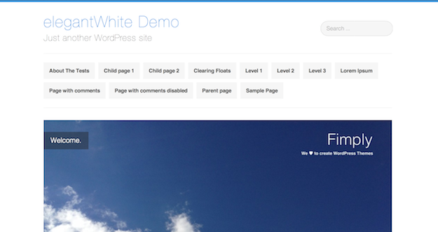
This theme suits its name well — it is both elegant and predominantly white. And given that I’m such a fan of simple designs with plenty of white space, this definitely gets my seal of approval.
elegantWhite is one of those themes where you can literally plug and play — as far as I can see, every last bit of formatting has been carefully considered. No dodgy margins on images or poorly spaced text — it truly is elegant. Oh, and responsive too, just for good measure.
Designfolio
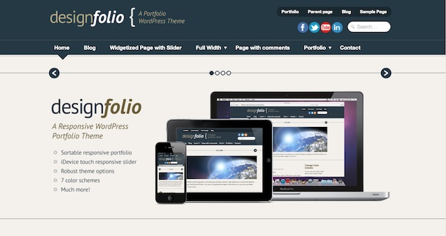
If you like the idea of a responsive theme but want something a little “busier” than elegantWhite, check out Designfolio. This full width design could be adapted to suit any number of sites. The generously-sized slider dominates the available space above the fold, but this theme’s got nothing to hide — both posts and pages look awesome.
It is clear that a lot of care and attention has gone into the development of this theme, and it really shows.
Clean Retina
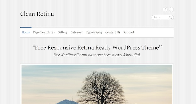
Yet another responsive theme, Clean Retina has a slider like Designfolio but offers a far more “bloggy” experience by default. Having said that, it’s not short on options with no less than nine homepage designs.
If you’re looking for a relatively calm and collected design for your site, this theme is a great option.
Spun
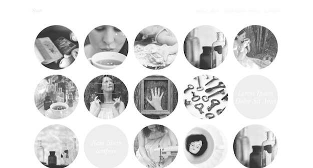
This theme really blew me away. I’m not sure how it could be used in terms of practical applications, but I almost want to come up with something just so I can use it. Spun was developed by one of my favorite independent theme developers, Caroline Moore, and as per usual she doesn’t disappoint.
Content is the sole focus here — each image represents a post, which reveal themselves beautifully when clicked upon. You have to see it to really appreciate it.
Deux Milles Douze
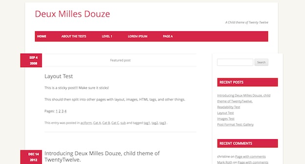
I love Deux Milles Douze for two reasons:
- It’s a great-looking theme
- It’s an example of what can be done in child theme development
It is in fact a Twenty Twelve child theme, which you can no doubt spot. However, the subtle changes are really effective, and I for one love this theme. The red on white contrast works brilliantly and has a far greater impact than a color-packed theme.
There are some really nice touches too, such as subtle bordering and shadowing on images and beautifully designed post formats.

Fakhar
Excellent share! ‘Spun’ is awesome. All of them are nice though.
James
Thanks for the share. I have already downloaded one. Great share
Alexis Cruz
Thank you for sharing this list.I already use Clean Retina on one of my blogs.
Prabhu
Great new collection of themes thanks for sharing…