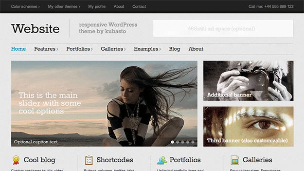
In this post I’m going to show you how to install and configure what I believe could be 2013’s best premium WordPress theme. Obviously that’s my personal opinion, but I think there’s a strong case can be made in support of it.
To start with this theme has tallied up some big league stats in the ThemeForest marketplace where it is sold. In the largest marketplace on the web for premium WordPress products, Website was one of the best performing WordPress themes of 2012 both in terms of user ratings and purchases. It has racked up an impressive 200+ five-out-of-five-star ratings and 2,200+ purchases! You don’t get numbers like that unless you’re doing something right.
So what’s got everyone so excited about this theme?
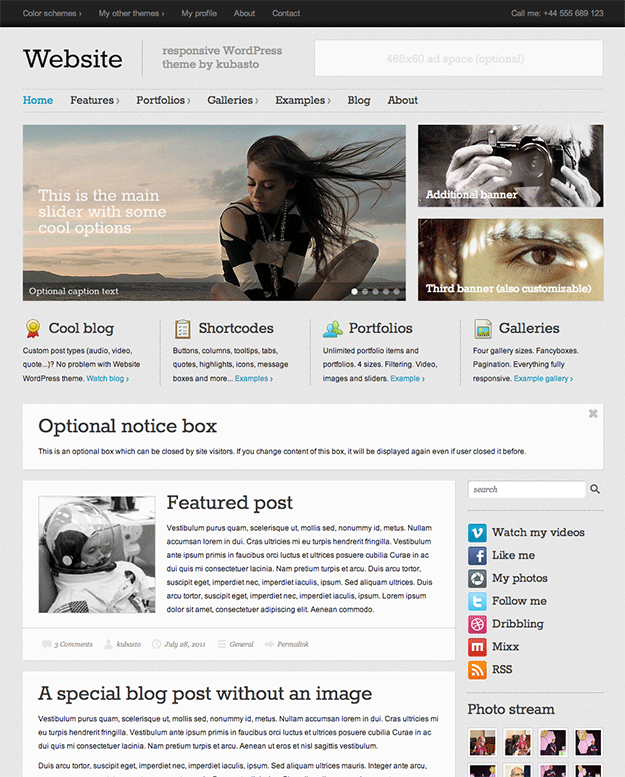
Well for one it boasts an extensive array of useful features. Website comes with simple to change color options, a flexible front page that’s great for promoting content, products or portfolio items, seven post formats, five custom post types, baked-in social media integration, nine custom widgets, multi-lingual support, twelve useful shortcodes, 500+ font options, 110 social media icons, 100 special purpose icons, independent menus for desktop and mobile versions, excellent free support, and more.
But of course, it’s not all about features when determining whether or not a theme is a good pick. It’s also about stability, regular updates, quality support, and ease of implementation – regardless of a user’s technical savvy. In this theme’s case it’s the combination of all these things that sets it apart as particularly excellent.
So if you happen to be one of the thousands of WordPress users taking Website for a spin this year then this post is for you. I’ve created four or five websites with this theme so far and enjoyed setting up each one. My goal in this post is to go as in-depth as possible and highlight the little details that make this theme great and can make your site better. I hope you enjoy reading through and if you have any questions at the end please feel free to leave them in the comments section!
Installing the Website WordPress Theme
Once you’ve purchased the theme you’ll be given access to download its zipped file. Some but not all themes download a single zipped file that you can install as is, in this case you’ll need to unzip the file you downloaded and then zip just the folder called “website”. Next, navigate to your WordPress Admin > Appearance > Themes > Install Themes > Upload > And install the zipped file you just created called “website”.
Upon a successful installation you will notice the following two sections have been added to your WordPress Admin side bar:
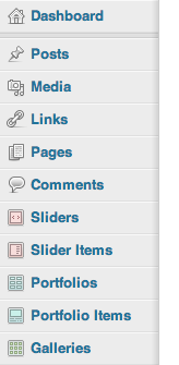
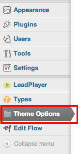
We’ll cover the custom post types shown in the top image in the configuration section below. To begin the configuration process simply click on Theme Options.
Configuring the Website WordPress Theme
To say that this theme’s options are anything but robust would be quite the understatement. Granted, Website is not a super theme like say, the Photocrati theme is, nor is it a framework like Pagelines; but its admin panel is still extremely well organized with extensive options for customization. These options are divided between fifteen separate tabs that help group potential changes into helpful categories such as general appearance, header, footer, front page, etc.
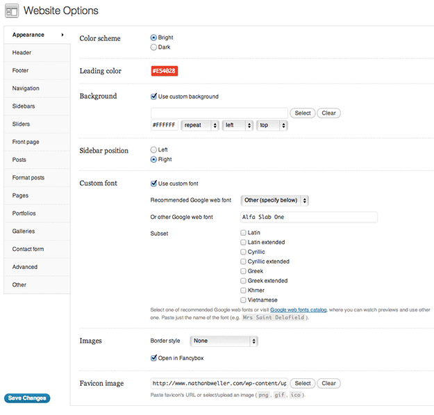
The first tab we land on is called Appearance. Here we’re able to change and adjust the theme’s broad stroke design elements. We can choose between a light and dark color scheme, select a custom lead color (read: link color), upload a custom background (or select a background color), choose the sidebar position, use custom fonts via Google Web Fonts, decide how images will display, and upload the site’s favicon.
Personally, I am a huge fan of the Google web fonts catalogue being a built in option. This theme is relatively text heavy and something as simple as changing your main font can drastically affect the overall design. For non-designers this can be a huge bonus. It means that one good decision, devoid of the need to ever touch or open Photoshop or Illustrator, and you’re well on your way to a unique design that’s all your own.
When you finish making changes under Appearance – or within any particular tab for that matter – you will always want to click the blue Save Changes button before moving on.
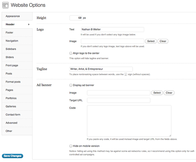
Next we have the Header tab. Here we’re able to adjust the header height (in pixels), upload or write-in the text logo, provide a site tagline, and even upload a banner ad. The two features I like best here are the ad banner option and being able to quickly and easily adjust your header height. The ad banner option is nice because you’re able to place an ad of your choosing in a prominent spot without getting into the code. But the header height adjustment is really nice because this simple little feature can have such a drastic effect on your design.
Most themes have a relatively rigid header height (unless you get into the code) that fits into their pre-designed look, but with this feature on Website you’re able to shrink your header down to just the bare minimum or go big and bold – or anywhere in between. Whatever you choose to do, it’s a great option to have and it can really make this theme “design” sink into the background as your unique look and brand begin to surface.
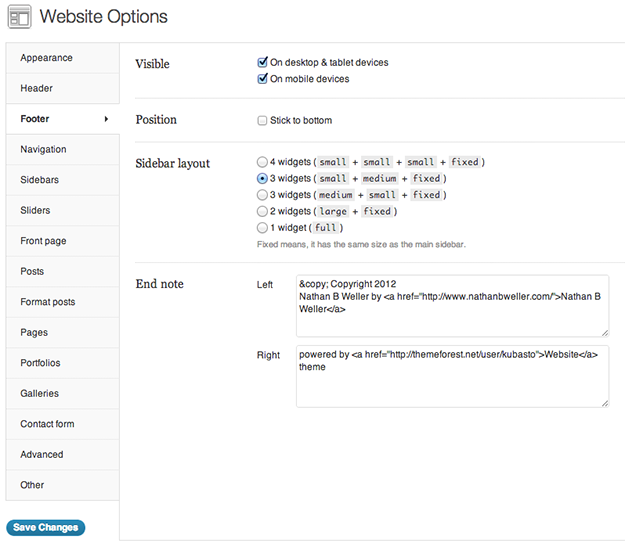
Up next is the Footer tab. In this tab we’re able to choose whether or not we’d like the footer to be visible on desktop/tablet devices and mobile devices. We can make the Footer “stick to the bottom” which means it will always be visible at the bottom of the screen. We can choose one of five different widget layouts and of course edit the end note that usually says something like, “powered by ____” or “Copyright 2012” etc.
Once again we have a series of simple choices that can make a big difference. This time, the difference isn’t in design as much as it is site/theme performance and user experience. Choosing the visibility by device can certainly help with readability and the right layout/sticky footer option can be used to keep sign-up forms and/or various calls to action in constant view of visitors.
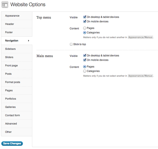
In the Navigation tab we’re able to determine the links that appear in your top menu and main menu. Pretty self explanatory.
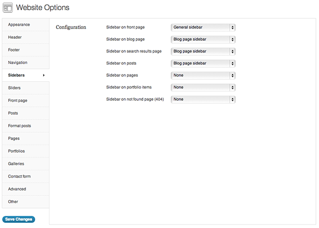
Next we have the Sidebars tab. In this tab we’re able to assign different sidebars to the front page, blog page, search results page, individual posts, individual pages, portfolio items, and error 404 page. While I personally am not utilizing a lot of different sidebar options, it’s nice to know I could if I wanted to. I see this as potentially coming in handy if I ever want to draw attention to different CTA’s or sign-up forms. Oh, and by the way, you “build” the sidebars by navigating to Appearance > Widgets and then dragging the appropriate widgets into the sidebar options provided.
Ok, sliders time! In the Sliders tab we’re able to select which sliders we want to assign to the front page, blog page, search results page, individual posts, individual pages, and the error 404 page. And of course, you can choose “none” when you’d rather not have a slider at all. There are also a few options for manipulating the slider settings such as animation type (slide or fade), animation speed, exposure time, and more.
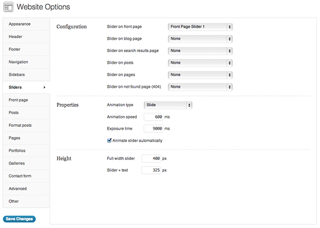
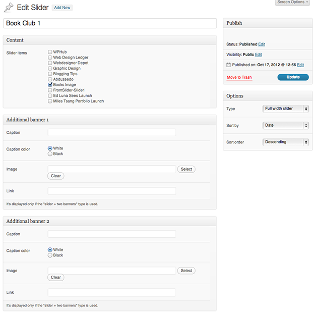
While we’re on the topic of sliders, lets take a look at the Sliders and Slider Items custom post types provided by the Website theme. After all, you won’t have any sliders appear in the drop down menus next to the options displayed in the image above if you don’t create any in the first place.
When creating a new Slider the first step is uploading Slider Items. So click on Slider Items > Add New and upload a file that matches the dimensions you set under Theme Options > Sliders. You can also use the video section at the bottom of the Add New Slider Item page to embed external videos as slides.
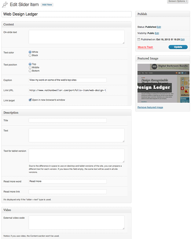
Once you’ve uploaded several Slider Items you’ll have a nice little library of slides to use in any slider you might want to create.
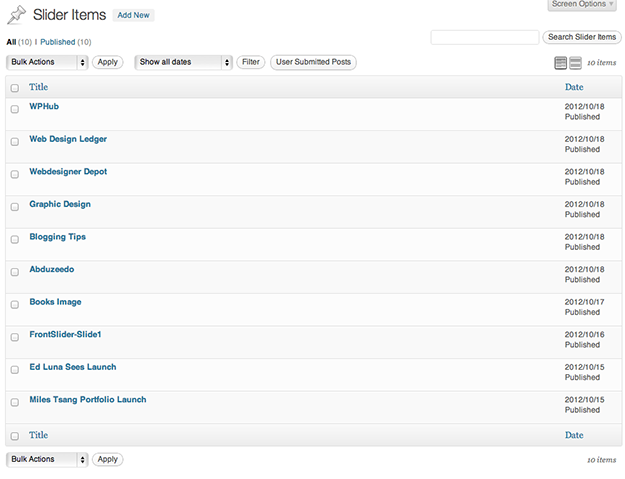
The next step in creating a Slider is to click on Sliders > Add New. At the top of this page you’ll see there’s a Content section that lists all of the Slider Items you’ve created. All you have to do is check off the slider items you’d like to use, attach the banners you’ve created (if you have that type selected), and then choose your Sort by and Sort order in the Options panel. Once you’ve got things looking the way you want them just click Publish and you’ve got a slider to choose from in Theme Options > Sliders.
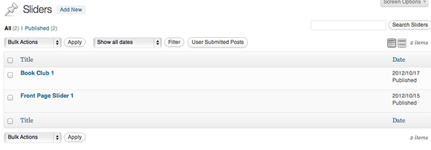
And of course you’ll always have an archive of Sliders to sort through just like any other post type. You can build and publish as many Sliders as you want. The only ones that will be visible to your site visitors are the ones you choose show via Theme Options.
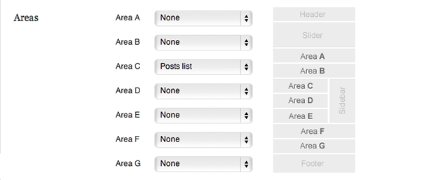
Ok, lets move on to the next tab under Theme Options: Front page. The Front page tab has a lot of options so I’ve broken it down by section. The first section is called Areas. In the areas tab we’re able to see a diagram of our front page with the various areas that make it up labeled with the letters A through G. Using the corresponding drop down menus we get to choose what page elements go where. We’re able to choose between adding a Notice Box, Featured Content, Posts list, or Featured columns; which I’ll explain in the following four sections.
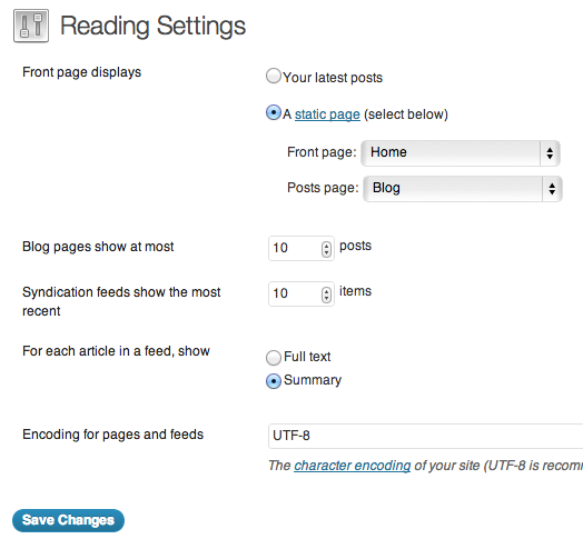
Note: If you’ve installed this theme and you’re wondering why the changes you’re making in the Front page tab under Theme Options are not showing up on your site’s Front page, you may need to check your Settings. Navigate to Settings > Reading and choose “A static page” under Front page displays. After that, simply select the page from the drop down next to Front page that you’d like to function as your home/front page. You may need to create one. In which case just create a new page called “Home” and publish it. Everything else can be customized for that page under Theme Options > Front Page.
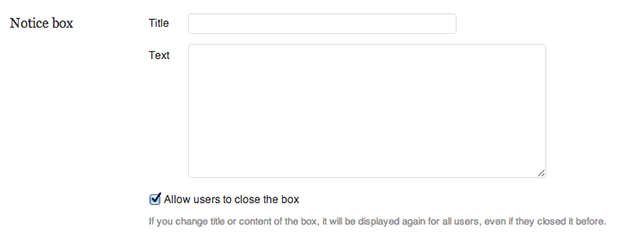
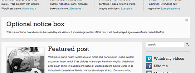
The second section under the Front page tab is called Notice box. This option is great for including announcements or calls to action on the front page. The fact that visitors can exit the notice encourages some sort of interaction.
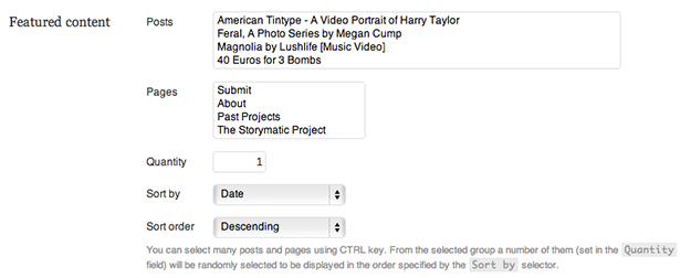
The third section under the Front page tab is called Featured content. This section allows us to highlight specific posts or pages and display them on the front page.
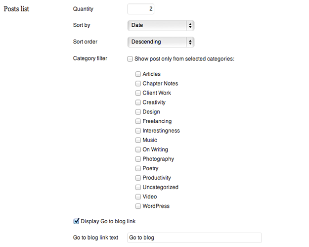
The fourth section under the Front page tab is called Posts lists. This section allows us to choose a select few blog posts on our Front page. These posts can be specific to category or simply sorted by date of publication.
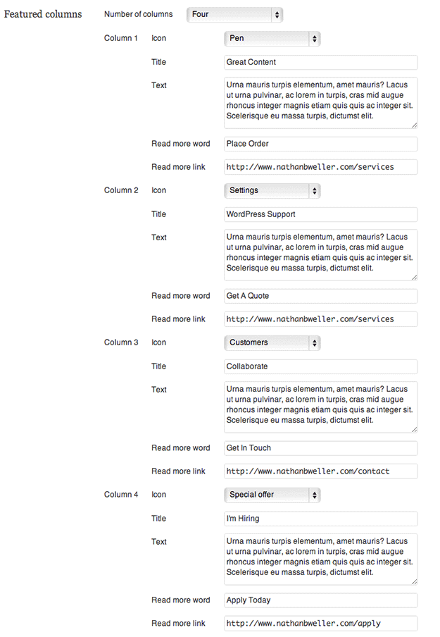
Finally, the fifth section under the Front page tab is called Featured columns. The Featured columns are perfect for highlighting services or site features. You can select any of the over 100 custom icons that come with Website to help make these service/feature columns stand out.
And that’s all of Front page! It’s an awesome group of theme options that help give this theme it’s name. When you have this much control over your site’s landing page it’s easy to take a blog and make it a Website in earnest.

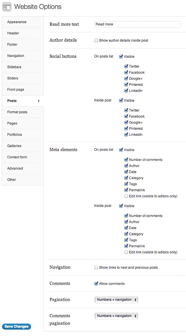
Next up under Theme Options is the Posts tab. In this tab we’re able to configure some theme specific post elements such as: Read more text, show/hide author details, show/hide Social buttons, show/hide Meta elements, show/hide next and previous post links, allow/not-allow comments, pagination preferences, and comments pagination preferences. While this may sound like a lot it’s all pretty self explanatory. Once you have some posts published, or if you are installing this theme as a replacement for a site/blog that already has posts published, it will be really easy to decide what you prefer here.
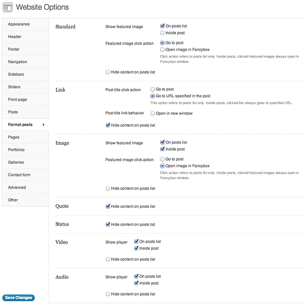
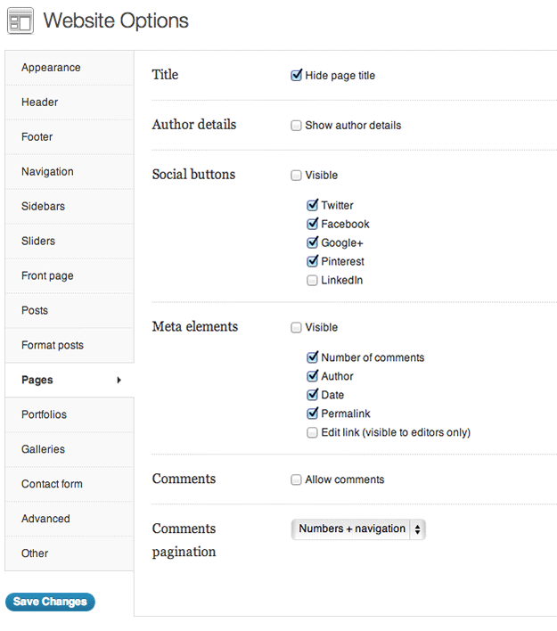
The same can be said for the next two tabs under Theme Options: Format posts and Pages. Each section under Theme Options comes with boxes checked by default. I recommend viewing how these default options perform and experiment with checking and unchecking different boxes to find out what you prefer.
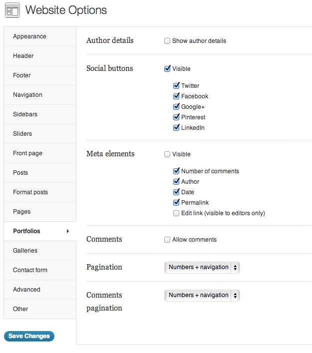
In the Portfolios tab we see settings very similar to the Posts tab, if not quite as many. There’s a good reason for this: Portfolios are a custom post type; so they are treated very similarly to a standard post on the back end. The more useful information – I feel – comes from answering the question, how do we create new portfolios in the first place?
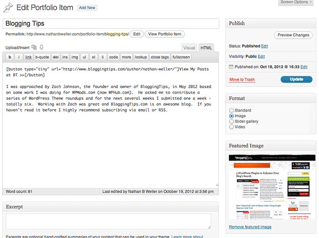
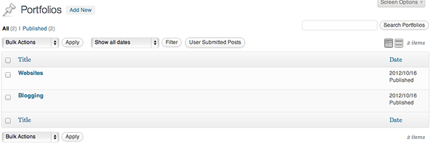
First we need to upload Portfolio Items with which to fill our Portfolios with. So you’ll need to navigate to Portfolio Items > Add New and get started there. You can choose between Standard, Image, Slider gallery, or Video for post format; add tags and categories specifically for portfolio items, which you’ll definitely want to do; And finally you can use the normal post section to describe your work.
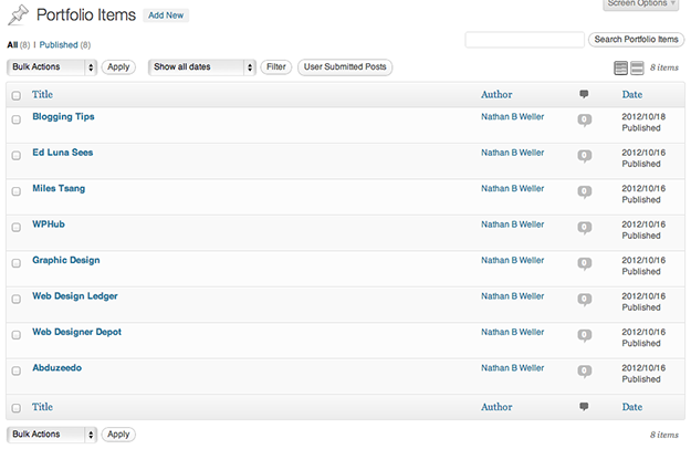
Once you’ve completed a Portfolio Item click Publish and it will be archived under Portfolio Items > All Portfolio Items for later use.
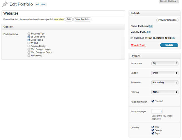
Next navigate to Portfolios > Add New. Similarly to the Sliders section above, Portfolios are made up of various combinations of Portfolio Items; which will appear in the Content section of a New Portflio. When you’ve selected the Portfolio Items you want and configured the other options under the aptly named Options section, click Publish.
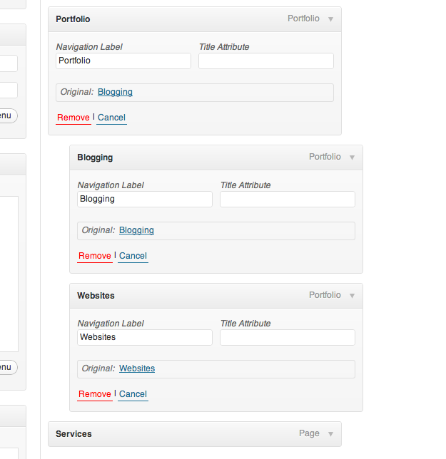
Once published, your various Portfolios will remain archived under Portfolios > All Portfolios. You can determine how they are displayed by going to Appearance > Menus and configuring your preferences there.
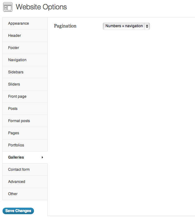
Back under Theme Options we have another tab that corresponds to a custom post type: Galleries. The only configuration option under the Galleries tab is the minor detail of pagination display. But again, how do we make new galleries in the first place?
After the other custom post type sections you’ve probably already guessed that we must start by navigating to the Galleries custom post type. Unlike the other two custom post types, this one has not “items” post type to compliment it; simply go to Galleries > Add New.
Once here simply upload all of the images you’d like to appear in your gallery as you would upload a large number of images for any other post, and then in the post section insert the shortcode [ gallery ]. After that configure the options under the Options section and click Publish.
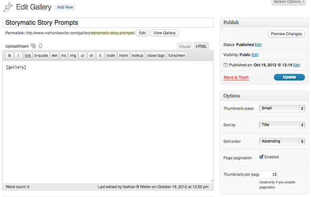
As with the other post types, all of your galleries will be archived under Galleries > All Galleries.

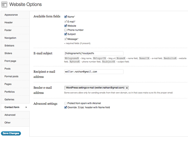
Next up under Theme Options we have the tab Contact Form. These theme options govern the built in contact form widget that can be found by navigating to Appearance > Widgets. You can choose to include or exclude the available data fields, assign the email subject, assign the sender/recipient email addresses, and more.
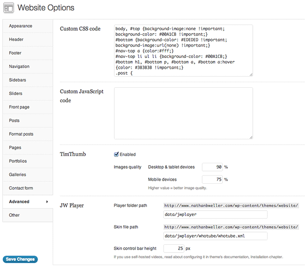
After the contact form options we have the second to last tab called Advanced. A lot of themes have a section under theme options similar to this and in my humble opinion I think it’s absolutely necessary for a top WordPress theme. It is within this tab that we are able to insert custom CSS, custom JavaScript, and configure other advanced options.
Why is this section so necessary? Because without writing over the code files found under Appearance > Editor you can enter any CSS or JavaScript you want here and it will automatically override what’s written in the uploaded files. This saves you from accidentally changing/deleting something critical in the Editor section while tinkering with more advanced customizations.
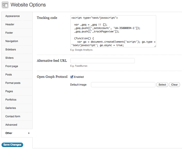
Finally, we have the last tab: Other. In this section we’re able to easily insert analytics tracking code, an alternative feed url, and enable Open Graph Protocol. Obviously these are really nice things to have and similarly to the Advanced tab above, this stuff is not uncommon but it is necessary for what I consider to be top quality WordPress themes.
And that’s Website!
In Closing
I’d love to hear from any of you who have used this theme for your own projects. Feel free to leave a link in the comments and I’ll be sure to check it out!
Also, if you would like to see an example of this theme in action on a site that is not the developer’s demo site, you can go here, and see how I used it on my personal site.

Jason West
This theme still ties your hands behind your back. The Warp framework with yootheme is the place to be moving forward, in my humble opinion. To each his own. 😉
Nathan Weller
https://managewp.com/theme-framework/comment-page-1#comment-106263
Nathan Weller
After taking some of the above comments to heart I wrote a follow-up post that you can read here: https://managewp.com/theme-framework
Deano
Articles like this should also address moving an existing site to a new theme. I recently bought a Themeforest theme, and when I Applied it, all of the drop down page menus disappeared.They were replaced by text links, but as a novice, there was no way to work out how to change that. I’m now back to using a free theme, which does the job without me having to worry about it.
This theme looks interesting, but I don’t want to spend days working on it just to get it to perform how I want it.
How about a post on the most simple themes to use?
Deano
Dan
A couple of clarifications about my earlier comments. This particular “website” theme has had upgrades offered through ThemeForest. Not all theme authors there do this. It seems to be very hit or miss. Updates for “Website” are announced in your WP backend, but there is no direct one-click upgrade process. You need to have access to the account and code of the original purchaser. This is a pain in the neck for organizations who had a former staff member or contractor buy the theme.
This “Website” theme has a number of widgets included that are not packaged as plugins. They are lumped into functions.php along with the code that creates the custom post types for the slideshow and galleries. That functionality should be portable and optional by having it run out of plugins for many, many reasons.
Here are some terrific articles by some of the wise elders of the WordPress community about why custom content types and functionality MUST go in plugins. (If the WP Codex itself is not good enough reason.)
Justin Tadlock:
http://justintadlock.com/archives/2012/09/17/themeforest-an-experiment
Carl Hancock of Gravity Forms calls a spade a spade — bad ThemeForest themes cost others a lot of time and trouble:
http://wpliving.net/in-response-to-justin-tadlockss-project-themeforest-an-experiment/
Read that thread from the beginning:
http://themeforest.net/forums/thread/wp-theme-forward-compatibility-shortcodescpts/75050?page=1
Response to Tadlock that engages the elephant in the room, Themeforest’s economic self-interests being at odds with quality products:
http://wpliving.net/in-response-to-justin-tadlockss-project-themeforest-an-experiment/
Mike McAlister on why custom post types are often needless bloat:
http://mikemcalister.com/i-dont-use-custom-post-types/
jezweb
Plus you can bypass all this nonsense about having the whole build a front page from within the theme options which i detest because if you ever want to change themes you lose the lot. Much better to use shortcodes or a plugin like visual composer which lets you manipulate the page structure easily as part of the page rather than adding an administrative layer to wordpress that is particular to just that one theme.
jezweb
There are lots of great themes on theme forest as good or better than this one. The developers have done a terrific job but I think to say it will be the best for 2013 while it makes for an attention grabbing headline is a bit of a stretch of the imagination.
Dan
This theme is fairly awful to deal with. I picked up a client who is using it, and I highly disrecommend it. They got hacked because of it, but that’s not even the main reason I dislike it. Here’s the main reason why “Website” is a bad theme:
It violates the officially recommended and proper practices for theme development by adding extensive functionality and custom content types to the theme’s functions.php file rather than separate plugins. You’ll lose all your custom content and those plugins if you ever switch to another theme. You’d have to extensively modify the new theme to work the same wrong way, or else do what the developer should have done and move all the custom content and functionality to plugins. Most people who buy these themes can’t do this themselves or even understand the issue.
This is not an isolated story. It’s well known that many Themeforest developers ruin the flexibility of WordPress by refusing to separate functionality and content from presentation. You may not even need or want all the bells and whistles they pack into their themes, but like it or not, you get it with no way to cut it off.
Expect support to suck as well. Upgrades may never be offered, and when they are then tend to be patches emailed on demand (if your emails aren’t ignored) or zip packages to download and install over the old version.
Nathan Weller
Hi Dan, thanks for sharing your story. Obviously you’ve had your own experiences with this theme and you didn’t enjoy it. However my own experience (and many others) has been vastly different. Since I’ve owned a license to the “Website” theme I’ve had consistent updates as well as reliable and quick support response. Which is why I feel your accusations at the end of your comment a bit unfair as they do not seem to reflect the reality experienced by this theme’s actual customers.
On the other hand, I understand your critique about added functionality in certain themeforest themes. Obviously this is a hotly contested issue and there are multiple viewpoints on it. I have found that some (if not most) users find the extra functionality now helps them get where they need to be in the future – regardless of the possible challenges as a result. I’m not saying that is always the case, but it stands to reason that someone – like you said above – without the ability to add functionality themselves might lean on a robust theme to help their site get traction for a year or two. After that they can make changes, hire help if need be, and “do things right.”
Dan
Nathan — It’s not a matter of “not enjoying” the theme or some kind of “controversy” about which people can reasonably disagee. Themes like “Website” violates the consensus standards of the best WP theme developers, the WP codex, and common sense. They do it to lure and lock in amateur users and to simplify work for themselves. Period.
I have access to updates for this theme through the license holder. They never applied any of the updates because they had someone customize it directly, and the updates would overwrite the modifications. A child theme should have been created to prevent this, but unlike BETTER theme developers, Website does not come with a blank child theme and is built in a way that makes it especially challenging to work with through a child theme, which is also the officially recommended way to customize themes.
Your argument makes no sense — buy a badly written theme, load it with content, and a year or two later spend a lot of time and money porting it to another theme? If you get a properly contructed theme in the first place, all your content and functional customizations are instantly portable to any other theme — anyone could do it. Huge difference. Themeforest junk like “Website” just adds a huge hidden cost that will come due on the unwitting user in short order if they have any significant content that is not something they consider disposable.
Nathan Weller
Dan – You’ve brought up some excellent points. I can only say that I will have to look into these issues more thoroughly – possibly resulting in a follow-up post. I wrote this post because I have used this theme a lot and found it (and the theme developer) to perform excellently.
Michael
I’ll chime in with support for dans admonishment of wp-standards violation in this theme, and corroboration as well as to the developers laissez-faire (sp) attitude towards support of child themes.
To be honest, I bought this theme based on a walk-through at theme forest, an in particular due this well-written, if not glowing review. The point made by that preface, is that at no time would I have assumed/presumed the lack of child theme functionality.
I’ll use it for its intended purpose, but not as a satisfied purchaser.
It almost feels like this theme has seen ports to other CMS platforms as well as a this WordPress “theme”
chriscob
I love this theme as well, and used it here: http://www.brittany-cottages.co.uk/. One thing you didn’t mention that I found incredibly useful was the shortcode that allows you to display different content based on media queries. In fact, this theme has the best implementation of shortcodes I’ve seen anywhere.
Nathan Weller
Chriscob, thanks for mentioning that! You’re right, this theme does a lot of great stuff with shortcodes.