Alternatives to Using a Slider for Better Home Page Conversions

Alternatives to using sliders on websites

The question of whether to use a slider on a home page can get people really riled up. It’s like arguing about the direction the toilet paper should be facing.

In doing a Google search, you’ll come across many articles that argue against it, based on conversion tests. Here are the reasons why you would not want to use sliders on a website:

In short, study after study and test after test has revealed that sliders are a major ‘hashtag-fail’ in the web design world. We should be embarrassed for using them when they were hot, like our 80s hairstyles.

So why do we keep using them? Well, likely because our customers and designers keep asking for them. Ugh. Sigh. Shake-that-head. Let it out.

Fear not – there is a way out of this. Our websites still need to dazzle and be great eye-candy for the folks upstairs. As Lee Duddel has been quoted in one of our above links,

Carousels are effective at being able to tell people in Marketing/Senior Management that their latest idea is now on the Home Page.

So we can’t forget that part.

That’s why today is your lucky day. I’m going to showcase some alternatives to using sliders that will be equally as stunning, and yet more effective at the same time.

Slider Alternative #1: Use No Slider

Settle down, settle down. This has a point. Homepage web designs these days work really well without a slider. They have meaning and purpose, and actually ask the user to do something or otherwise understand in plain English (or whatever language), what on earth these sites are about.

But they don’t compromise design standards. Check out these examples:

Mindvalley.com uses a hero background image along with some great typography to give an intro to its organization. Yes, it’s a bit wordy, but notice how nothing moves or ‘swishes’ from side to side. If you’re a slow reader, you can take your time to learn what they are about. Then if you want more, you can click on the very noticeable yellow “learn more” button, scroll, or use their navigation menu.

mindvalley-no-slider

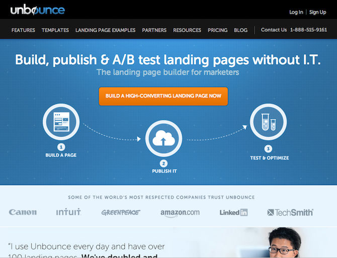
Unbounce.com uses great illustrations and a clear headline to explain their most important selling point: that their product is easy to use. This beats a slider any day. It makes a user want to buy for the benefit that’s in it for them.

Further down on their home page they go straight into credibility boosters: logos of big-name clients and testimonials. No sliders necessary to sell this product.

unbounce-no-slider

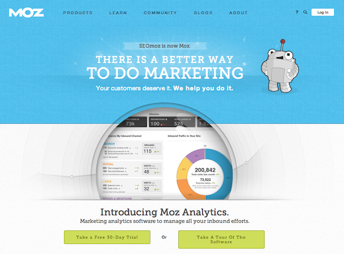
Moz.com has chosen to use their home page’s primary real estate to showcase a single product. However, regardless of strategy, the design demonstrates that a no-slider home page can work and be less confusing to users. This page is only asking them to focus on one thing, and one thing only. Further down they have two options: start a free trial, or take a tour. Remember the saying “keep it simple stupid”? That totally applies here.

moz-no-slider

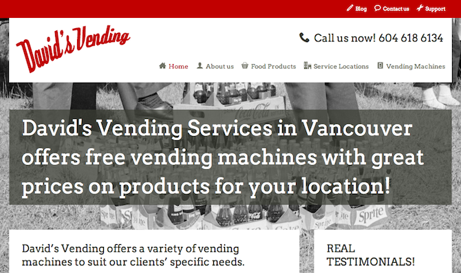
DavidsVending.ca is a local business in Vancouver that also skipped out on the slider idea. Instead the site favours what would have been a spot for a slider, for simply stating their value proposition.

It’s like the “elevator pitch” people use in sales meetings; just tell people in a few seconds what you can do for them and why they should care. This is especially important as an e-marketing strategy for lesser-known brands.

davids-vending-no-slider

Slider Alternative #2: Use a Call-to-Action in Conjunction With a Static Image

A good, strong call-to-action (CTA) can do wonders for your conversion rate. If your CTA is high up on your home page, it will do even better. If your site is full of CTAs, well, more power to you.

Here are some examples:

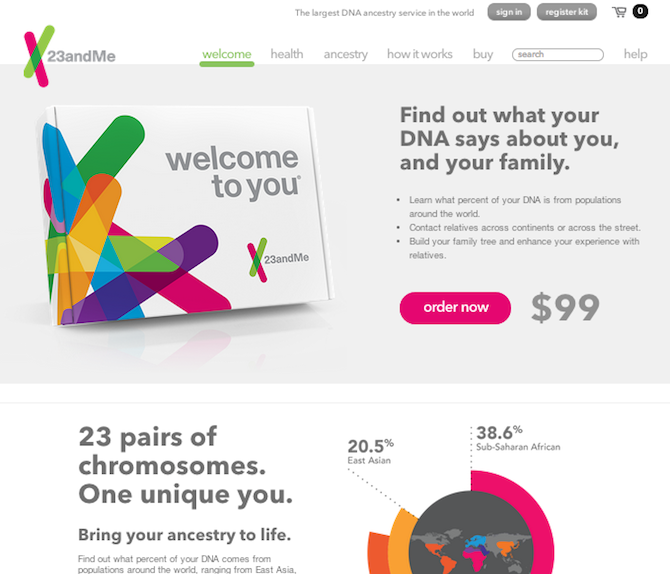
23andme.com uses lots of CTAs throughout its site, but its most important and compelling one is right on its home page. Right away they give you a reason to buy and a price, so there’s no guesswork. They don’t remove graphics altogether in this ‘top spot,’ but they keep it to one static image, since that’s all the user needs to make their buying decision. Any more would only distract from the “order now” button, which is the main goal of the site.

23andme

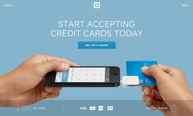
Squareup.com gives us something that looks like it could have been a slider, but isn’t, thankfully. It’s a photographic image of hands using their product. It demonstrates how it works. The photo couldn’t be clearer. Then it asks the user to do one thing with their CTA: “Sell with square.”

Wanna know more before you buy? No problem, just scroll or click around. But the ‘top spot’ has done its job without a slider. Bada-bing, bada-boom. Done. Woot!

square-call-to-action

Slider Alternative #3: Use a Sign Up Form

Sign up forms are a great replacement for sliders when your business requires registration or a booking of some sort (even if it’s to come in for a free consultation, for example).

Or perhaps your business can’t operate without gathering information from users, such as a search service or online membership. In those cases, the best scenario is to ‘cut to the chase’ by keeping your sign up form high on the home page, eliminating the need for a slider.

Here are some examples:

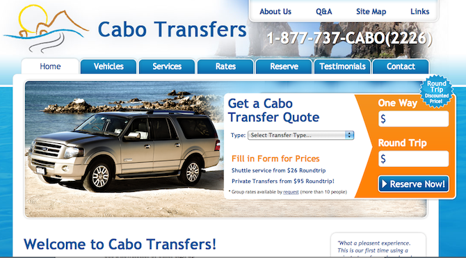
CaboTransfers.com is in the travel industry, so it makes sense to have a form at the top of their home page. In this case it’s to get a quote and then book a service. But notice how the form shares space with an image to the left of it. It’s a static image, so it’s not distracting. Remember, the idea is to draw the user’s eye to the form, and encourage them to fill it out.

cabotransfers-form-no-slider

WideWorldEd.org is a non-profit startup that uses a sign up form to gather subscribers. The organization is prepping to grow their offering of open education courses. Thus, the announcing of news to site visitors after they leave is critical. The ‘big thing’ is keeping in touch with interested parties, so a newsletter subscribe form is perfect. Again, imagery is not compromised in this design – the newsletter form easily layers on top of a single banner photo. If it were moving and sliding, a user would have a hard time keeping it still long enough to fill in their information.

using a sign up form instead of a slider

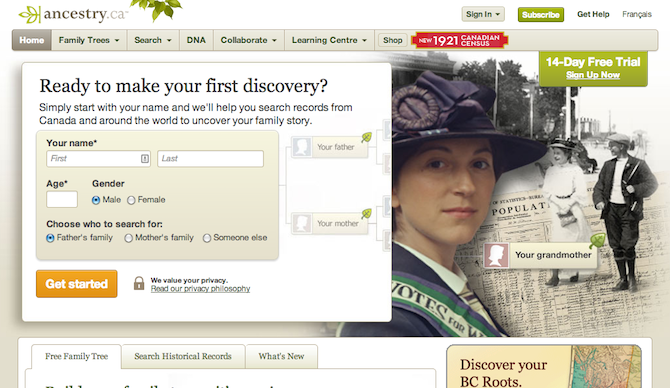
Ancestry.ca is one of those sites where you don’t really get to the ‘meat’ of their product until you fill out some important information about yourself. So it makes perfect sense to use a form and not distract users with sliding images. Although it is a bit busy, the design still makes room for branding and graphics. The form doesn’t have to occupy the entire space of a home page to be effective.

ancestryca-form-no-slider

Slider Alternative #4: Use a Video

You might be thinking, ‘what’s the difference between a video and a slider?’ Well, apparently there’s a lot of difference, since videos seem to convert really well, whereas sliders don’t. Perhaps it’s that videos give the user control since they can stop and play the video as they please. A slider just slides without their so-called ‘permission’ or forewarning. Plus with a video, the user is still only focused on one thing – whatever is playing in the video. The premise with sliders is that they distract with too many moving objects, not just one story-telling object.

Here are some examples:

LewisHowes.com uses a creative technique by making it seem like the entire hero image background is a video that can be played. But it’s not. It’s just that if you click on the “play” button you get a video Lightbox that starts playing a normal-sized video for you. The idea though is that the “play” button is the bull’s-eye of the top portion of the home page. The way it is placed makes you really want to click on it. Then the video sells you on the product. A slider can’t accomplish all that, even with multiple slides!

lewis-howes-video-no-slider

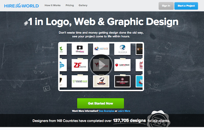
HireTheWorld.com is a site that holds design contests. In this case a video is very fitting, because the process of their service is relatively new in the industry, and requires explanation. A slider could show some case studies, but it wouldn’t reveal exactly what this company does in an easily understandable way. Sometimes, nothing beats the spoken word, coupled with diagrams.

hiretheworld-video-no-slider

Slider Alternative #5: Minimize the Size of the Slider

This is almost cheating, but for those who need to please their clients, or can’t get away with this any other way, you can use a small slider. This means making sure that while you include it, it’s not intrusive, and not the main item the eye is drawn towards on a page. With this alternative, you may have to pronounce other parts of your home page such as bright call-to-action buttons, forms, clickable items or otherwise.

Here are some examples:

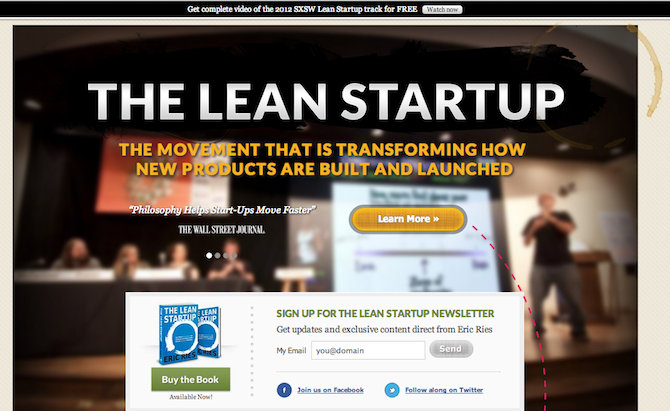
TheLeanStartup.com is the site used to launch the famous book by Eric Ries. It uses a strong headline to start, followed by a call-to-action and a sign up form. But if you notice carefully, the left hand side next to the “Learn More” button is using a slider to rotate testimonials. It’s not the focus of the page when someone first lands there, and not the first thing the eye is attracted to. But it’s still there.

the-lean-startup-small-slider

KayakBritishColumbia.com uses a half-half approach to the slider. They’ve kept the slider on the left, while using their main navigation as big circle-buttons to the right, directing users to a destination on their site. On the one hand, the slider is hard to keep a user’s focus, but the user can also opt to navigate using the right-side links, without having to scroll to obtain that control.

wildcoast-lesser-slider

Slider Alternative #6: Move the Slider Down — Way Down

Sometimes, you can get away with a slider — just not so high up on your home page. Even if it’s one of those things no one uses, at least it won’t be in the most noticeable spot where conversions are critical to sales. Plus, if people are scrolling, they are probably looking for more info. So that’s when sliders can be the ‘more’ that they’re looking for.

For example:

PaoneCreative.com uses a slider near the bottom of the home page to display testimonials. It’s not intrusive, not distracting and if anything, only helps build credibility for the sale. If this slider were at the top of the page, that would be a different story; we wouldn’t know off the bat what this site is about or why we should care. So since that information has been taken care of on the top parts of the home page already, the testimonial slider is ok.

paone-creative-slider-lower

Sliders Aren’t Completely Useless

If you read some of the many articles that attempt to slaughter slider usage, you’ll notice most of them do include a statement about when it’s ok to use them (like this one). Or a statement about analyzing their usefulness first. Or, about making sure to conduct tests to see what really works for you. For example, one company found that their slider worked better than their video at converting users (my first question, however, was, ‘how well made was the video?’).

When dealing with products, sliders may not be such a bad idea, especially if they demonstrate your product’s usage. Sliders also work when selling something that is very visual-based, and subjective to a person’s tastes, like photography services or real estate. However, a recent post by Thijs de Valk on Yoast.com strongly disagrees and says that even photographers should use static images.

Here are examples of when they can do favours for a business’ homepage (granted, user tests may dispel everything I’m about to say below, which is why they’re so awesome – they always surprise us):

JadeWorldTrading.com sells jewelry. Jewelry is visual, and really a fashion statement. With fashion, sometimes you need to envision what a piece will look like with a coordinating outfit. A slider can do that well. It also sets the mood for what type of styles a person will find on this site. Seeing these slides makes me think, “ooooh, I want that…” and would make me start shopping. But if I saw only product images, I wouldn’t be helped in the sales process because I wouldn’t be inspired by their potential.

jade-world-slider-fashion

ExecutiveSuite.ca is a site that leases staffed, pre-furnished office space and virtual offices. Among their top selling points are their location and interior. You know what they say about real estate: location, location, location. So for a company like this, showing their address on a map, the Starbucks right outside, and their high-quality, executive-looking office furniture was paramount for their target audience.

executive-suite-slider-ok

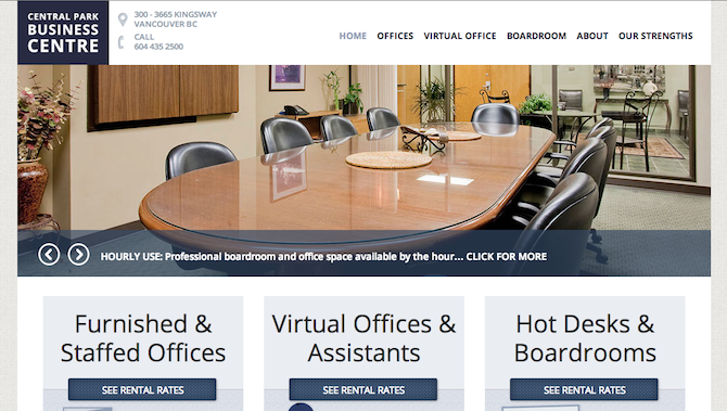
Their site visitors are looking for office space, and have likely ‘been around the block’ searching for other spaces. They know the drill. The first thing they want is something that suits them. Prices and details come later. In this case, the large photographs were important enough in the business’ sales process to make a slider prominent on the home page.

To Conclude: You Have Options

There is more than one way to do one thing. Feel free to experiment with these slider alternatives mentioned above. Don’t feel like you’re ‘missing out’ because you have to ‘sacrifice’ a slider. In most of the cases listed above, you’d be getting something better than a slider, and something that will probably make you more money too! Plus, leaving the slider out doesn’t mean you won’t have a nice website anymore. That’s a false belief.

And remember, just because your competitors have sliders, doesn’t necessarily mean they know what they’re doing! You don’t have to copy them. After studying the link resources above, you’ll be a step ahead by leaving the slider out and going with a higher-converting alternative.

Photo credit: Brandon King

Joyce Grace

A Vancouver Internet marketer and freelance writer who loves making WordPress websites, writes with pencil, owns a paper agenda (still), gets ignited by anything Dutch, and is probably the only person on the planet who doesn't like cheesecake. Follow Joyce on: Instagram: @thoughtsofjoyce YouTube: /thoughtsofjoyce Twitter: @thoughtsofjoyce Google Plus: +JoyceGraceontheweb

46 Comments

  1. Atul Mandal

    Thanks for this great alternate ways, Thanks again for useful example also, this makes very clear idea.

  2. Al Lemieux

    These are valid options, but what if your slider contains an ongoing set of reports that updates monthly? Using a carousel or slider allows you to show multiple reports in a single location and is pretty easy to update. How could that be represented on a page outside of a slider and still call attention to itself?

    1. Joyce Grace

      Author

      Hi Al, I’m not sure why reports require a slider. I’m sure there are plenty of alternatives like tabs, a custom post type set up, some sort of widget, or just plain text links with a PDF icon, and so on. If you really feel that the content can’t be displayed any other way except with a slider, you probably know your client and the site better than I do 🙂 This may come down to particular needs.

  3. Suz Dukums

    wow horrible examples. first one is so bad, tons of text, no one will bother to read.seriousl?? that’s your example of a good homepage??

    1. Joyce Grace

      Author

      Hi Suz, I’m sure the community would love your expertise and the better examples you have on hand. Thanks for your comment!

  4. Steyn Viljoen

    Hi Joyce, I’m 2 years late to this conversation, but I hope I can still add value to it. ?

    I would like to add a 7th alternative to this list:

    It’s a pattern I first saw being used on Amazon and after 3 months of extensive research I recreated it. It works really great to solve most of the usability issues standard image sliders pose. The most important problem it solves is by displaying all the products at a glance and therefore enables all products to have an equal chance of being interacted with. It’s also fully responsive and has great navigation.

    You can get it for your website here for free: thispattern dot com

    Steyn

  5. Susan

    I’m not a designer nor a techie. I came across a site that uses sliders and I just loved it – I think it’s because it’s interactive. I’m pretty sure these guys do testing – so it’d be interesting to see if they keep using it (I’ve seen it up for over a year). Web pages seem to be longer these days and Google seems to like them (altho you never know how long that relationship might last) and sliders give you that feeling of being able to do something on a page instead of clicking away to the next page. I think there’s something to that point. I think something that engages you – gets you to take action – helps retention. I’m selling a concept that’s really tough to get in with a sound bite so I need a fun way to teach. I agree though sliders that are auto are a pain. In this case, the slider is farther down, you control it and it gave information in bite size chunks. Notice how the size is more human scale too – not overwhelming. It was nice to have an image beside the text to create balance. I’m in the process of re-doing my site and was planning to use similar ones. This article was good cause it made me re-think on load time…something I had forgotten about. Also thank-you to the person who warned about Revolution Slider – I bought it – took me half an hour to figure out how to put in a support ticket (admittedly I’m not a techie). Thanks Joyce.

    1. Joyce Grace

      Author

      Hi Susan, I think testing would confirm or denounce most of what you’re saying here. There have been plenty of people who have tested the slider engagement theory, among other things. In general most studies or articles I’ve read show it comes up unfavourably. However, knowing the context of how the test was conducted, its control factors, and so on, probably can change this bias.

  6. Alix

    This is great Joyce. I have to confess I love sliders in general (I am not a designer). But I am getting ready to launch a blog and am so glad you educated me before I did. Now I can think about what purpose our landing page is serving and lay it out better for that purpose…and I may use the small slider at the bottom to feature our images, very smart. But either way, I now know that I have options. I really appreciate the detail on why and the great examples. Thanks for saving me from myself!

    1. Joyce Grace

      Author

      This is great to hear, thanks Alix. I think the first thing is, as you say, to consider the main purpose and goal. If the slider is useful to your audience, it may very well work out well for you. A good A/B test (or more), would probably help you make better decisions about any feature on your site over time, as it relates to your very specific audience.

  7. Kevin Trye

    I try to discourage clients from using big home page sliders for SEO and site performance reasons. Where clients insist, we use a slider that has minimal overhead, avoiding bad ones like the popular revolution slider with is the worst one by a huge margin. But the main reason most sliders are inherently bad is that the images used are usually not well optimized and up to 10x larger than they should be, giving page load times of 8-10 seconds instead of 1-2 seconds.

    From my research it would appear that a couple sectors can benefit from using small sliders. eCommerce sites for display purposes and realty sites. But in both cases they must be post, product or article slider, under the control of the viewer and not automated with fancy transitions etc. Acting more like you’d flip through pages in a book.

    1. Scott

      Hi Kevin,
      My eye was drawn to your comment about Revolution slider. My site uses it and I am wondering why you think it is so bad? I know the code to drive it is massive but is there anything else??

      1. Kevin Trye

        Revolution slider has more features, meaning more coding css and js elements the browser must download and process. Fancy themes and even woocommerce sites with loads of plugins and moving elements have a lot of these too. But, it gets back to the old 80/20 rule. The biggest issue is often not these extra bits, but the images themselves being too big, uncompressed or the wrong file format. We’ve fixed sites running revolution slider that were taking 30 seconds to load, finally getting it down to 3-4 seconds just by fixing the images and only then adding in some modest, optimised caching.

        A very typical slow website using a fancy layer slider with big images is http://www.palmers.co.nz
        Here’s a speedtest of this site. Note there’s almost 200 elements being downloaded, plus the images are far bigger than they need to be. http://www.webpagetest.org/result/160305_9K_1DC1/1/details/

  8. CS Guru

    Hi Joyce

    Thanks for such an elaborate explanation. This was a great comparison between Sliders / No Sliders Approach.
    I personally like and insist on my customers to use the top real estate of the screen to utilize as the best marketing place. I had always supported sliders, if not always image based but with text sliding on a static image. I agree sliders can sometimes be a nuisance than being helpful to customers but definitely they make the eyes roll. Therefore using a slider deep into the page seems to be a good approach. Also to turn nuisance into an instant customer interest sliders can have slow animation, smoother transition, good transition effects, good navigation and top of all An Awesome Message – A Tickler.

    And by the way has comparing Sliders with toilet papers resulted in threat calls from the great slider developers :P?

  9. Steve Sims

    I’m researching alternatives to website sliders and found your article – It mkaes good reading and is better than some other similar posts I have found out there, but it doesn’t cover one of the main reasons we use sliders in our designs ‘SEO’. I keep reading that sliders are bad for seo, but they aren’t? They enable the designer to position target keywords in headings, bold text and paragraphs at the very top of the page, with the aim of achieving a high search engine ranking (in tandem with any off-page seo work) and it works….

    The trade-off is that when visitors come to your site they see your slider, aren’t engaged and head off elsewhere straightaway!

    I’m looking for/trying to design something that achieves both…eg. Gets across a chunk of content, is seo friendly and engages the user…..I’m still looking!

    1. Mark

      Great article – thanks. Some of our clients had researched sliders and started using our interactive video player in place of the slider (forgive the mercenary, shameless plug – but they showed us a use we would have NEVER thought of on our own).

      The results for them have been outstanding…and it’s been fun to watch the big web providers in their industries backpeddle! Thanks again for the information in this article – it helps immensely.

      1. Joyce Grace

        Author

        I’ve seen different articles point out the video conversion as being better than a slider. However, I also saw one article that mentioned the video did worse. But detail is important here: the video was not well done, and long, boring, etc. So then of course you need to consider the qualitative aspect and not just the quantitative in your tests. Thanks for your comment.

  10. Mark

    In my recent experience I’ve both used a slider on the home page, and also advised against it. It really depends on what the project would benefit best from, and how the page will be used. If I need to get the user to successfully complete a call to action, I’d design without a slider. If I’m presenting bold imagery to develop a brand or presence, then perhaps a slider is the way to go.

    1. Paul

      Oh, by the way Mark, the title of the article is, “Alternatives to Using a Slider for Better Home Page Conversions.” Your statement is, ” If I need to get the user to successfully complete a call to action, I’d design without a slider.” If the article was titled, “Sliders Should Never be Use,.” then your statment might have a point. Since the article is not about branding or any other purpose for using a Slider, but is about conversions, then it seems that your statement is pointless. It seems that you are disagreeing by agreeing.

  11. Thomas

    Good article, but one thing that wasn’t discussed is alternatives to sliders for different types of sites. For example, both ecommerce sites (with lots of products/categories in particular) and news sites don’t just have one CTA on a page like many of the examples. If you have one product or service, the examples are great. But what if you have thousands of products on a site, or you add multiple news articles per day? I can think of a couple examples off the top of my head of news/content sites that do this, for example –

    http://www.newrepublic.com/

    https://medium.com/

    http://qz.com/

    None use sliders but are content / article heavy.

    1. Joyce Grace

      Author

      Hi Thomas, thanks for the comment. We don’t cover everything that’s true – but that’s because we are writing articles and not text books here 🙂 It’s a struggle to keep my articles short because there is always so much to say about a topic and all the different angles it can take. So the comments are a great way for the community to add to the discussion.

      Regarding sites with lots of options, if you see the Yoast article linked to, you’ll see that they make a point that sliders shouldn’t be used because you have too many options. It’s important to narrow in on what you want the user to see.

      Also Neil Patel just released an article showing a convincing case that reducing options results in more sales: http://www.quicksprout.com/2014/02/24/how-reducing-options-can-increase-your-conversions/

      This article was meant to show how some sites that want to use sliders can replace that area with something else. But I do see how an e-commerce site with thousands of products would have a totally different home page layout to begin with. Though many still use sliders unfortunately.

      Thanks for your examples though!

    2. Paul

      Your comment doesn’t make a lot of sense Thomas. First of all, what are you going to do? Put a thousand images in your slider. Second of all, you can only see one slider at a time. If I had a site with thousands of items and I wanted to use images to catch peoples attention, I would put thumbnails in rows with small captions that name each category on the home page. That way people can view the images at their own pace and when they see the category they want, they can click on it. If thers’s a slider, then they don’t know if their category is going to be the 6th image any more than they would know if it’s the 10th image or if it’s even there, So they have to waid 60 to 100 to who know’s how many seconds before they see their category. If you have thumbnails with category captions that’s way more user friendly.

  12. Thomas

    Good article, but one thing that wasn’t discussed is alternatives to sliders for different types of sites. For example, both eccommerce sites (with lots of products/categories in particular) and news sites don’t just have one CTA on a page like many of the examples. If you have one product or service, the examples are great. But what if you have thousands of products on a site, or you add multiple news articles per day? I can think of a couple example off the top of my head of news/content sites that do this, for example –

    http://www.newrepublic.com/
    https://medium.com/

    Neither use sliders but are content / article heavy.

  13. gkosovicster

    Thanks for providing so many good ideas to think about. Timely for me, and a much appreciated article.

  14. Anthony Hortin

    Great post Joyce! You’ve got some great examples of alternatives to the overused slider. I’ll definitely be keeping these examples and accompanying links in mind when I need to convince new clients that maybe a slider isn’t the best way to go. Thanks!

    1. Joyce Grace

      Author

      Thanks Anthony! I’m glad this was useful to you! That always makes the hours of research and writing worth it 🙂

  15. Benbodhi

    Thanks for the great article Joyce!

    This is something I have had trouble explaining to people and it almost always comes down to the fact that there is not enough written content. I agree with all of this, there most certainly is a place for them in some circumstances, but the majority of the time you just make a site look generic and old.

    I have managed to convince people that the “Call-to-Action in Conjunction With a Static Image” is essentially a single slide with more impact on the reader… To which I have been called a genius 😉 (and I’m not really).

    1. Joyce Grace

      Author

      Lol Benbodhi, I think that IS genius 🙂 Milk it while you can 🙂

  16. Tom Townsend

    Very good article. I like the options of Good Slider implementation vs. Yoas,t NO GOOD NEVER use…there are some cases as you have pointed out that make very good usage of sliders.

    I have a client that wanted slider prominently featured on their home page – with Manual Controls and Calls to Action…mainly with regards to Testimonials. Tried to talk them out of it…but when they insist…you just try to do your best with what you have to work with.

    Check out http://www.strategicrecruitmentsolutions.com/

    1. Joyce Grace

      Author

      Yeah, in that case I would recommend a compromise by moving it down. If the client really insisted well…I guess they’re paying to keep your lights on so you have to roll with it. It’s not going to kill your portfolio to do that, so sometimes compromises like this are ok 🙂

    2. Skip

      Tom, that site is horrible! Ouch!

  17. Deborah

    Thank you for the great article on sliders, and for offering all the alternatives to using them. They’re very common in higher education, where I worked for several years. It’s a way to stuff lots of content on the home page, but no one looks at it.

    Not sure you’ve seen it, but Jared Smith created a simple site, shouldiuseacarousel.com to highlight the issues with carousels/sliders.

    One of his points is taken from Erik Runyon’s study of the University of Notre Dame’s carousel: 1% clicked a feature. Of those, 89% were the first position.

    1. Joyce Grace

      Author

      Wow that’s really cool! Thanks for this!

  18. Dave Young

    I have no real opinion regarding sliders. I like both sites with and without sliders, I think it’s more a case of looking at the quality of the slider and what it can do for the site.

    I also don’t have an opinion one way or another with regards to which direction the loo roll is facing either… just so long as there’s loo roll around when I need it!

    1. Joyce Grace

      Author

      Lol Dave thanks for yet another laugh about the toilet paper roll 🙂 I think you are right, I’d rather just have that be around when I need it 🙂 I was in a country once where some guy was giving out paper towels at the door to a bathroom and I decided I’d rather just not go.

      But with sliders it’s a bit different, since we rarely ever need them. Maybe my analogy was the wrong one to pick 🙂

  19. David Abramson

    Well-written article and thanks for linking to my article about sliders!!

    I’d say at least 75% of my clients initially want a slider. It’s great to educate them on why sliders aren’t ideal in most cases and give them options for alternatives as opposed to just telling them “no”.

    I’ll add this article to my “other articles” section of my post and add it to the workflow of “things to send clients who ask for sliders on their website” 😉

    1. Joyce Grace

      Author

      Lol I love it! That’s often why I want to write these articles, because I have to convince clients a lot 🙂 So glad it is helping your business as well!

  20. Ed

    Thanks for such a great article! I’m in the process of putting together my coaching website and I was planning on using a slider at the top. Now I know that I have better options!!!

    1. Joyce Grace

      Author

      Yay! Making the web a better place, one website at a time 🙂

  21. Thijs de Valk

    Nice article Joyce! And thanks for the mention and link 😉

    Of course, I completely disagree with the second to last chapter, but the rest are awesome alternatives!

    1. Joyce Grace

      Author

      Hi Thijs! Thanks for the comment!!! I’m so glad you liked it, and it’s so gezellig that you joined in the conversation here 🙂

      I don’t know how to spell gezellig but it is my all time favourite Dutch word. To me it is a verb. I tell my Dutch friends, “are we going to have a gezellig?” – it is a very funny joke among us because I used to really believe it was an activity and not an adjective. Ok now I’m off topic.

      About disagreeing, I think that’s totally fine! We can still be friend 🙂 New thoughts are welcome and help us learn and explore new ideas 🙂

  22. Joyce Grace

    Author

    Hi Brin, thanks for the great chuckle! 🙂

    I can see how sliders and large photographs can make a design look nice. But the way I see it, you can have your site look nice, or you can have your site make you money. I care about making money more than looking nice (otherwise what’s the point of investing in the website, or any marketing?). The thing I was trying to show in this article is that you don’t have to compromise looking nice and making money at the same time.

  23. Brin Wilson

    The toilet paper had better be facing me such that the squares roll off the top – if I see it facing the other way, anywhere, I’ll not only reverse it but also go and find the person who thinks it should be the other (wrong) way and give them a piece of my mind (joke!)!!! P.S. some sliders can make all the difference to a design – in the right place, they can make a website really stand out from the crowd!

    1. Joyce Grace

      Author

      Hi Brin, thanks for the great chuckle! 🙂

      I can see how sliders and large photographs can make a design look nice. But the way I see it, you can have your site look nice, or you can have your site make you money. I care about making money more than looking nice (otherwise what’s the point of investing in the website, or any marketing?). The thing I was trying to show in this article is that you don’t have to compromise looking nice and making money at the same time.

    2. Vladimir Prelovac

      Hah! This is exactly what I did today (flipped the toilet roll). I even wanted to base my UX presentation around that idea 🙂

      1. Joyce Grace

        Author

        Vladimir, you can bring a toilet paper roll maybe 🙂 I thought of using that for the featured image but then I thought people might not understand why there is a roll of toilet paper at the top of an article about sliders 🙂

Leave a Reply

Your email address will not be published. Required fields are marked *

Over 65,000 WordPress professionals are already using ManageWP

Add as many websites as you want for free, no credit card required. Sign up and start saving time!

Have questions? Get in touch!

Over 65,000 WordPress professionals are already using ManageWP

Add as many websites as you want for free, no credit card required. Sign up and start saving time!


Have questions? Get in touch!

Over 65,000 WordPress professionals are already using ManageWP

Add as many websites as you want for free, no credit card required. Sign up and start saving time!


Have questions? Get in touch!

Over 65,000 WordPress professionals are already using ManageWP

Add as many websites as you want for free, no credit card required. Sign up and start saving time!


Have questions? Get in touch!